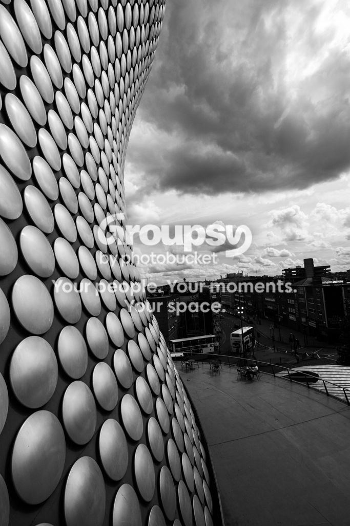
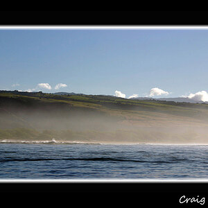
Nice. I do wonder though if it could benefit a crop utilizing the rule of 3rds? Just noticing all your lines are pretty mid point.
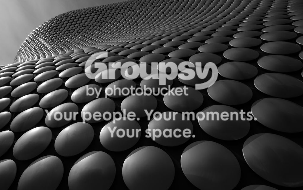
Personally, I think this is an instance where it works; you have this curvy line midway through the photo that creates a very interesting (to me) impact--a single photo that is really two different photos. If anything, I'd be tempted to center it a little more.
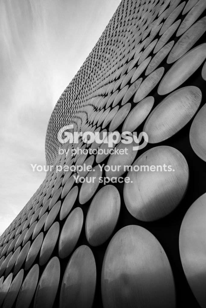
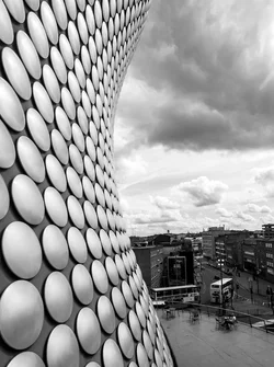
I LOVE #2--I'd love it even more if it was cropped at the left and top just enough to eliminate the sky completely.
However, since the theme is "City" I'm inclined to think #3 (the lightened version) might be the one to go with. Still, if it was me, I'd be really tempted to go with a cropped version of #2. I assume that in your city, this is an extremely "recognizable" building, and so it might work to enter an abstract of it. It would at least be really different!







![[No title]](/data/xfmg/thumbnail/31/31037-35b917d9eb4d044981e83ac234757e09.jpg?1734159136)


![[No title]](/data/xfmg/thumbnail/41/41786-0de67cacf7270937b4833f67d003f9c2.jpg?1734176090)