Couldn't find this one on any reverse searches. Nice, if you actually took this.
Funny, jowens!!! and at the same time, indicates some type of slam against the OP (who I think is a pretty alright guy in his own right...) not sure what the beef is here, but there must be some kinda' back story...
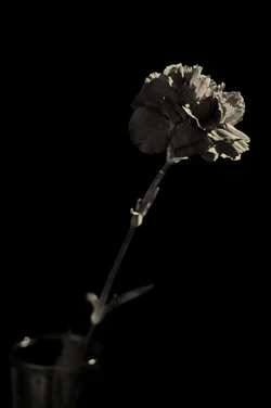
I think the lighting looks a bit too flat...and by that I mean the highlights seems too dark, and the shadows seem a bit close in tonal value to the highlight tonal value...something just appears "not quite right". I looked at it on-screen, then clicked to "embiggen" ( a new web-word!!) the shot...just not quite "right"...
I sometimes ask myself, "Is this just a digital thing? Is this my preference for a traditional, film-like tonal representation, showing its deep-rooted nature?" And then I think, "Naw...". I see a LOT of images that look like this one now that digital and PS post is the norm...this shot just doesn't quite convey that type of lighting scenario to me in a way that feels "true to life", OR "photographic". With post-processing being what it is today, there could be 50 different reasons "why" (yes,
reason why is oft considered redundant, but in this case...it's for clarification) this lighting is not reading well to me...
Anyway...an exercise like this is of little value without detailed C&C from others, so, there you go....my C&C, my thoughts on lighting. Compositionally, the space in the upper left quandrant feels excessive, and it feels to me like the flower is tipping the frame right over,so to speak. Perhaps that was the intended response--because the feeling of imbalance, or "real weight" is VERY strong!





![[No title]](/data/xfmg/thumbnail/39/39182-efc21fe87c9b5f9b2fa9ab0f8f01c205.jpg?1734173056)