Ummm... maybe? I'm not actually sure. I found a copy of it on my local system with my OLD logo, which means I at least edited it and INTENDED to put it up a while ago, but I didn't recall actually doing it.
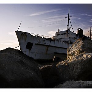
I like the lines as they form a random pattern (oxymoron?). The OOF metal rod in the front is distracting, perhaps a deeper DOF would have worked better or a different angle to keep that out of frame if nothing else. The rod on the left is lit nicely towards the bottom but then goes blocked black at the top. I'm not sure this lends itself well to the photo. Down by the bottom of the frame there is an overexposed highlight right next to blocked red. This, too, is a distraction that could be minimized in post-process.
What was your original intent of this photo? What were you attempting to show us?



 And yeah, mechanical stuff is kinda more my thing.


![[No title]](/data/xfmg/thumbnail/34/34056-de7cd932b4cd702c2f77e0f5c9ec1aa2.jpg?1734164470)