Cat on a hot tin roof C&C (BESP)

pharmakon

TPF Noob!
Joined
Aug 7, 2009
Messages
365
Reaction score
7
Location
Western NC
Can others edit my Photos
Photos OK to edit
Not sure what kind of attention the title will draw but I figured what the heck. (It's from an old Johnny Carson episode featuring "Alf" by the way)

This is my submission for week 2 of Bitter's Evil School of Photography. This week was an Abstract project using Line as the subject. We had to submit 2 photographs for C&C this week.

I had a really hard time trying to make a compelling abstract composition. I have never tried it before, and though it looks simple it really is a challenge!

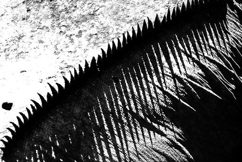
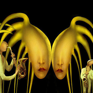
Photo 1: The Cat's Diversion
1/200 sec, f/8, ISO 400, 135mm
Lit via off-camera flash camera right, Homemade diffuser.
4433443367_17a5396683_o.jpg


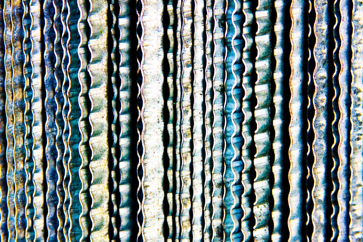
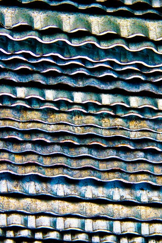
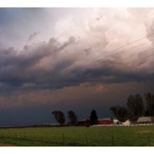
Photo 2: Calm before the storm

1/200sec, f/5.6, 109mm, ISO 400
Lit via off camera flash, Camera left.
I first thought of using b&w for this, but found oversaturating to bring out unseen colors had a nice effect.
4434214980_f006d019b4_o.jpg


All in all this was a good but frustrating experience. I tried many different things, both living and man made, and these were the two I ended up liking the most.

Your C&C is greatly appreciated.
 
Last edited:
I like both of these to some degree.

#1: The lighting is dramatic, which matches the diagonals. Interesting pattern.

#2: A striking image really. It is grainy and highly processed, but the variety of colors works for me and the grain adds to the edginess of it.
 
2 is messing with my eyes, but is very interesting. I think the lighting could be a tad bit improved.

1 is an interesting pattern, but the lighting makes it dull, and a bit to contrasty.
 
I like them both. I would guess # 1 is a ball of twine and #2 is a radiator of some sort...?
I really like the colors in #2 excpet the one bright large line down the center. If it was a little darker i think it would blend a little better and not draw my attention away from the lines.
I think they both have good detail. #1 may be considered abstarct to a certain extent, but i think #2 fits best.
 
You got 2 abstracts which is good.

#1. When I see it, it shows me sadness. I don't have anything else to comment.

#2. It is really good. I have not idea what is that. I like the shapes and the pattern shown. There is something that hurts when I see it, I think is too much exposition, it is a personal thing, I understand you did it on purpose.
 
If abstract is to make the viewer ponder as to what it is, then the second shot is the winner but certainly looks like a radiator.

If indeed my assumption that the subject is not to be easily identified is correct, then this shot of mine may qualify:

P1010199sm.jpg
 
For #1, I think it would have been better served if the depth of field was deeper. I mean if more of the twine was in focus instead of fading away so quickly.

With #2, I think it's the brightness of the colors that kind of puts me off. You have lots of lines, some meshing and others not. But contrast kind of makes you want to look away after a short bit.
 
I mentioned it on one of the other entrants thread...... I feel your pain on #1. :biggrin:

Kinda diggin #2. I like the oversaturation here. Although distinctive patterns can be found, the breakup is interesting. Just wondering what this radiator came off of. I think this could also work nicely in portrait orientation. :thumbup:
 
Thanks for the replies!

Interesting shot Ron, is it a file?

#2 is actually a stack of Hurricane panels. Maybe not so familiar to those not in danger of windy peril every other year. They had a bit of corrosion on them with subtle color that I oversaturated to make the bright colors you see.

I agree that I pushed the PP a little too far, and it feels a little gimmicky to me now that I look back at it.

The ball of hemp I admit was taken in despiration after an hour or so of failing to get something else to work the way I envisioned it. I also spent a whole day wandering aimlessly through a local theme park looking for inspiration, here's the best from that just for kicks:
4433438559_3794bd8bc7.jpg


(it's a Big lizard if you couldn't tell)

And here's another from the Hurricane panel bunch with almost horizontal orientation:
4433442365_924b29a7e8.jpg


I have others, but on a different computer, these were my "finalists" that I uploaded to flickr last night before posting.
 
For #1, I think it would have been better served if the depth of field was deeper. I mean if more of the twine was in focus instead of fading away so quickly.

I agree with this and also was thinking that a different lighting angle would have helped. The ball has at least 2 more "layers" of twine visible when not hidden in the shadows.
 

Most reactions

Back
Top