C&C per req:
The images may be speaking, but they're doing so very quietly. #2 is the only one from which I really get anything; I like the capture of the sign and the pedestrian, but find the dark bands at the top and bottom/left of the image distracting.
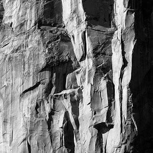
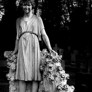
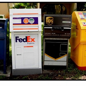
In general these images seem to have exposure issues, are very midtone-rich and subject matter which (at least to me) doesn't come and grab my attention the way a good photograph should.
Perhaps if you did share some of your thinking with respect to the composition, it would help us provide more effective critique.
Just my $00.02 worth - your mileage may vary.
~John