Ummmm... where to start? To be brutally honest, this one is a 'bin and reshoot' in my opinion.
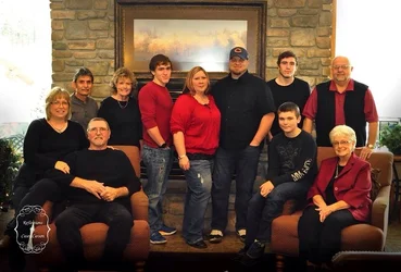
The composition doesn't really work; your standing subjects form a 'ragged edge' with their heads, and the seated subjects don't balance each other and everyone is doing something different with their pose and hands.
The lighting is... lacking. Your windows are horribly blown out, there's a nasty reflection in the painting, and in the glasses of the gentleman standing image right. The white balance is wayyyy off; everyone looks like they have jaundice.
Start by getting your exposure right; meter the windows and then balance that with your lights so that you have a nice, even exposure; remember that the eye is drawn to bright over dark, and with a large blown area on each side of the frame, no one's really looking at the subjects. Once you've got that sorted out (and you've made sure there are no flash reflections anywhere), set your white balance (either with something like an Expo Disc/Lally Cap, or a grey card) and then bring the people in. Remember that we want diagonals and triangles in groups like this, so compose your sub-groups with this in mind. I would probably start with the two tallest men at the centre and their spouses next to them, have the senior members of the group seated, and the child maybe cross-legged in the middle.
Also, don't forget to discuss clothing. This is probably one of the single most important aspects of the pre-shoot consult (You did do one, right?) It's not as if everyone has to match, but some cohesion is important and torn jeans? Really? Baseball caps in the portrait? Come on!
All of that is not to say that this is a horrible image, it's not, but it does have a LOT of room for improvement, and if you're going to be a professional retail photographer, these are day-one issues.
Just my $00.02 - YMMV
~John





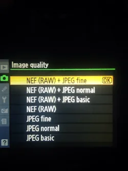
 And as tirediron said, shoot always in .raw