Lovely model, nice work and as always, very nice of you to share.
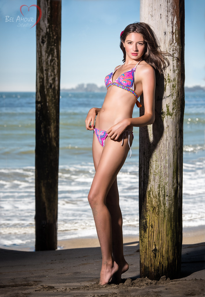
#1. The light is stronger/brighter than usual for your shots (which usually have a softer feel). It feels like a speed light or soft box to the left of the photo aimed at the front of the model. I like the pose. I also like how she's framed by the two pilings from the pier. The rear piling bothers me...it's dark (that's fine) and out of the DoF (that's fine) but combined with everything else, my first assumption was that it was a composite--that you'd added it from another photo--I'm not saying you did, only that it appears that way to me. And the glare on her forehead and left shoulder bother me a little. Overall, lovely model, lovely pose, terrific location.
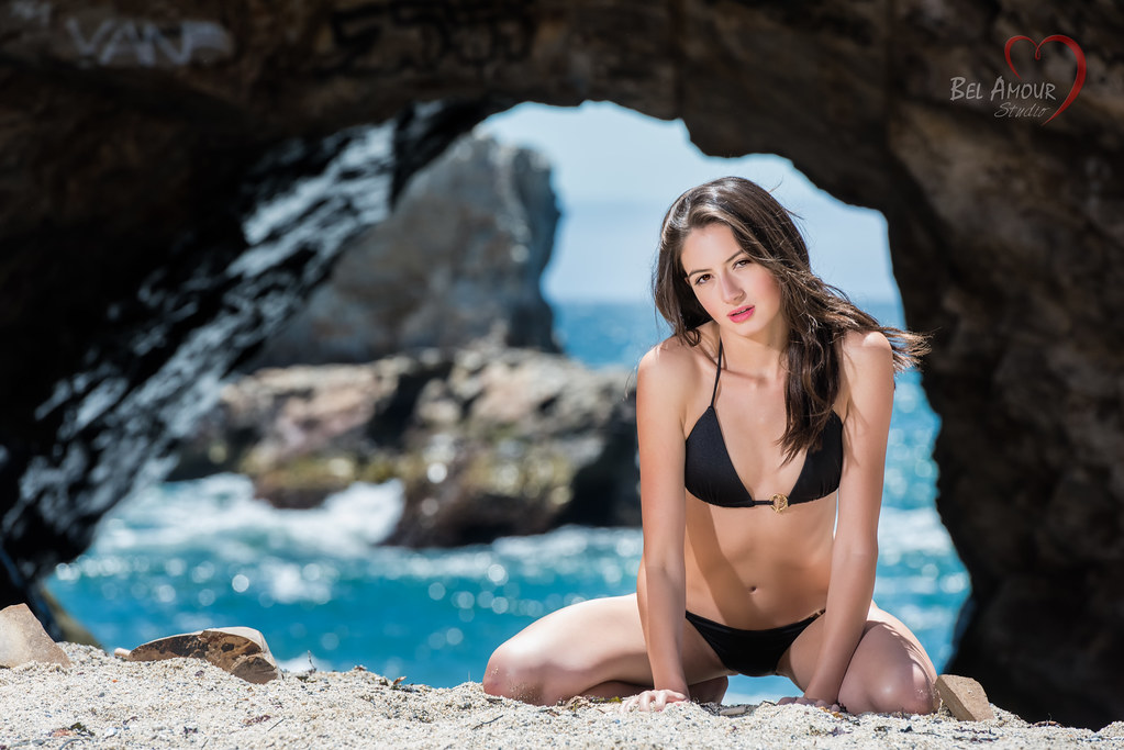
#2. I really like the concept and the general pose. But the specifics of the pose have some issues to me in this case. I really wish I could love this photo b/c conceptually there is a lot going for it. For one, as wyogirl points out, her hands are buried in the sand so it cuts off the flow of her long, lovely arms. For another (and this is the bigger one for me), she's got curves but you can't tell b/c of the positioning of the arms. If you had the arms so that the wrists met in the center....we'd see her hips and an hour-glass shape. Oh...and that would also push her breasts together and she'd get a cup size bigger (which...if we're talking any kind of glamour look or sexy swimsuit, would be a plus--no pun intended). Or if the arms instead took 15 degree angles to the outside (exposing her hips). In short--I want to see some air/space between each arm and her torso. Instead, the current positioning makes her 5-10 pounds heavier. But I really like the color, how you framed her with the rocks, the concept of the pose, the angle--lots here that I think is good.
And we all know how challenging it is to shoot at the beach. If it isn't blowing sand that makes it suicide to swap out lens or filters, it's blownout highlights from glare and sun.
")


![[No title]](/data/xfmg/thumbnail/36/36300-760519cb9a8ebbfc57cc3d1fda5dd37c.jpg?1734168623)


