What's new

Cheap Advertising & Redoing Website.....AGAIN!

I like the red lettering for your site address. It was one of the first things I read and I would have an easier time trying to remember that than your phone number if I drove by it in traffic.

Thanks! yes that's what I was thinking too.....should I worry about the photography part being a hilight too? or that's a given by my name? Maybe I will keep to the red lettering for the website and keep everything black. So the 2nd version

I agree with ajkramer about the red lettering. It was much easier to read and I am more likely to remember a web addy rather than a phone number, especially these days. My opinion is that I consider myself an educated woman that would know that the name of your business references the service it provides. The type of clientale you are probably after should appreciate the name of the business and would not need it referenced with the additional coloring of the letters. Since you are in marketing, do you have any idea of how long the average person spends reading advertising signs? I have no idea but I would think it would be very short depending upon the name of the business and the service provided (if they needed it or were interested). Since they will look at the sign, most likely think about if they are interested or not and then look for something easy to remember, I wouldn't waste their time on highlighting the other pieces.

Just my two cents or in this case, my dollar since I wrote a lot. :-P
 
I like the 3rd screen shot for the web design. And I also like the red lettering for your website. It does burn into your brain. Now a days I always look for a website rather than trying to remember a phone number. So I think hilighting the website maybe a little more benificial. Oh and I think it's a HUGE plus maiming it iPhone and iPad friendly! Just wanted to contribute my thoughts. You are inspirational Mo.
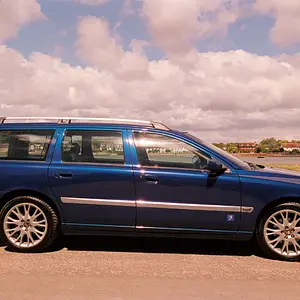
Blue
 
163839_10150373964335226_882565225_16727362_1690826_n.jpg

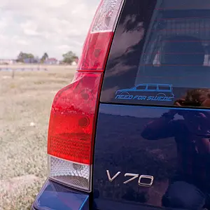
That is my favorite so far. What color is your vehicle? Make sure the color you pick for the magnets doesn't clash with it. Your company name is great because I think it will be easy to remember and it is also easy on the eye.

Instead of making the lettering red for the url, you could make it white in a red box. White on red reads very nicely. Worth a try. Whichever one you want to go with make sure and blow it up to life size on your monitor and look at it from a distance to see how readable it is.

Last thing about this design, the logo, the fonts, make sure you like it/them enough to use the same on your business cards, website, brochures, etc. That's called corporate identity. You do not want all of those things to look different.

Now, a couple tips on telephone numbers. The phone number on your magnet should be your landline so that you can get a listing in the yellow pages. Yes, people still use those. And if you don't want it to ring at home, it is easy enough to make it transfer your calls straight to your cell phone all of the time. I used to carry two cells for two different businesses for that reason but I think now you can program some cell phones for different rings depending where the call comes from so you can probably do the same thing with just one.

Cheers.
 
Thanks again. My car is black. The font I use always. It's the same as in my business card and my website. Well the "Foto by momo" part at least.
 
Sorry to bring this up again but here's another option I was going with for my rear window. Top part

167090_10150375692665226_882565225_16770513_3550359_n.jpg


or

166158_10150375692735226_882565225_16770515_4248188_n.jpg


or

164308_10150375695485226_882565225_16770580_3202703_n.jpg
 
Can you get the .com added to your original logo to make it look like it flows? That is what we tried to do with our logo. The different font and color are distracting for me and it doesn't seem to flow. The red part also looks really crammed in compared to the white on black part.
 
Can you get the .com added to your original logo to make it look like it flows? That is what we tried to do with our logo. The different font and color are distracting for me and it doesn't seem to flow. The red part also looks really crammed in compared to the white on black part.

I can do the whole thing w/ the same font

I would like to see it all in the black and white theme with one font. Maybe keep the .com the same font but make it smaller than the FOTO BY MOMO part?
 
Hey Tbini so I went and talked to the fast signs guys and here are the 3 versions I came up with

I might go with 1. #3 just looks a little too busy for me.

168864_10150375908100226_882565225_16774640_6116790_n.jpg


167636_10150375908130226_882565225_16774641_5456317_n.jpg


168505_10150375908185226_882565225_16774643_5871074_n.jpg
 
Second website design but put the options in one row across the top.
 
Post #27.

I prefer #1. I would take off the photography at the end of portrait and center it up. I think the photography is understood and it makes it appear off center.
 
Post #27.

I prefer #1. I would take off the photography at the end of portrait and center it up. I think the photography is understood and it makes it appear off center.

you'd be surprised how stupid people are :lmao:
I will keep it on just in case to be honest. if fotobymomo doesn't give it away then i think photography is much needed there.
 

Create an account or login to comment

You must be a member in order to leave a comment

Create account

Create an account on our community. It's easy!

Log in

Already have an account? Log in here.

Back
Top Bottom