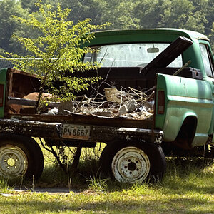
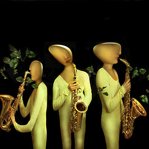
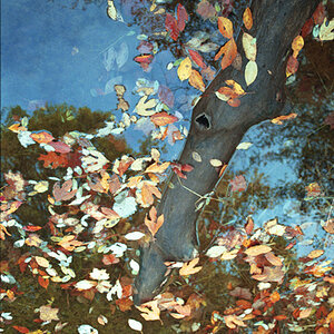
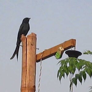
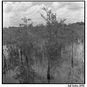
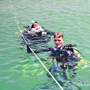
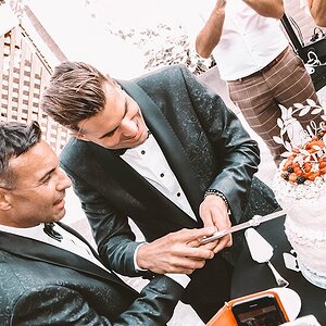
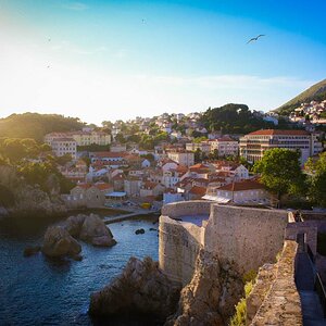
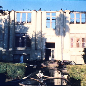
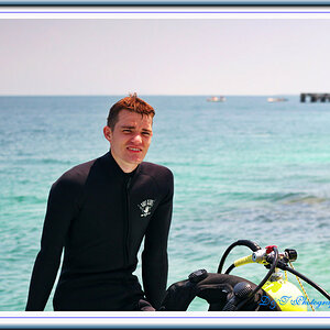
Check out my photography skills!

az0123456789

TPF Noob!
Joined
Aug 28, 2007
Messages
4
Reaction score
0
Can others edit my Photos
Photos NOT OK to edit
Hi!

This is my FIRST photography skills showcase so I would appreciate any kind of feedback (good and bad)!

Thanks!

__________ INNOVA STUDIO __________
Visit now my Web Site! / Visita ahora mi Stio Web!
www.innova-studio.co.uk
 
There are some nice images on that page, but then there are some in between which spoil everything. You seem to try to include images of everything. But you should leave those out, which went wrong (the image of the Earl's Palace (Mainland Orkney) is an example, also the Kirkwall harbour).

If you are in Edinburgh, why do you use an English flag ;)
 
I'm not sure if I understood you! I do want include images of everything but there are only lanscapes and scenary at the moment anyway!

Why should I use a Scottish flag just cause I'm living in Edinburgh? I mean I'm not Scottish and I'm not English either but for sure everyone will understand that the English flag is for the English version of the site, won't they?
 
I'm not sure if I understood you! I do want include images of everything but there are only lanscapes and scenary at the moment anyway!

I was trying to say that the quality of images you show varies alot. And my suggestion was to leave out those images from your portfolio which look not so nice. But of course this is up to you to decide.

Why should I use a Scottish flag just cause I'm living in Edinburgh? I mean I'm not Scottish and I'm not English either but for sure everyone will understand that the English flag is for the English version of the site, won't they?

I know you are not, and that one came with a smiley ;)

Anyway, I just thought since people use the American flag for Americanised English, they use the Union Jack for British English, but you used the English flag for British English ... so I was just kidding regarding Scottish/English rivalry and that nobody in scotland would usually dare to use the English flag here ;)
 
Flags icons issue fixed!
 
I like the lightbox effect on the "Photography" page, but the cloudy/dark photos seem out of place. For a minute there I thought you were one of the people I helped on the JAlbum forum to make the lightbox effect black instead of white, but it appears you've done your own implementation. You might want to look into JAlbum to automate adding new photos (the Lightbox 2 skin allows previous/next by clicking the left/right sides of the lightbox photos, and SlimPowerBox adds a slideshow effect).

On the Portfolio page you should move the Killarney School to the top and make it more clear that the site was designed by your studio as opposed to just a random site you're linking to. The deviantart link only takes the visitor to the same set of photos as you're displaying on the Photography page so it's much less important (if necessary at all).

The Google ads at the top aren't overly obtrusive, but the Google AdSense referral at the bottom is a bit much. The chances of actually getting a referral that meets all of the qualifications for you to get paid is so low that it's not worth displaying (trust me, I tried). Other referrals, like Picasa and Firefox, aren't worth it either.

People visiting a photography website aren't looking for solutions to make money on their own sites, they're there to look at your photos, hopefully to decide whether or not to hire you for a job. If your studio is successful you'll make much more off sales revenue than ad revenue from the site so you should consider removing all of the ads entirely.
 
Hi,

Had a look at your site & thought I'd give you a bit of feedback...

There's some very nice shots on the site, you've certainly started well. I would agree with the previous poster though that there are also some that don't showcase your skills quite so much, I'd be tempted to concentrate on the best ones.

Regarding the site layout I don't really get on with sites hitting me with advertising etc - as you're just starting out I think you would be better off removing the "distractions" so that visitors can focus on the objective of your site - showing your photography skills

These are just my own honest, personal opinions so please feel free to completely ignore them if you don't agree :wink:

regards

simon
 
I agree with previous post there some extremely goods images on the site, the castle at night is one example, but there are some images that are no so good.
 

Most reactions

Back
Top