What's new

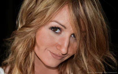
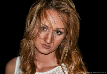
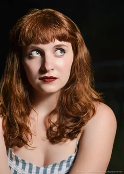
Close-Up Headshots C&C requested

#2 isn't bad, but it's not great. I think you could pull something out of it if you work on bringing out her eye. It should be the focal point, but it looks slightly out of focus.

I prefer the colors of #3-- 1 and 2 look washed out in comparison, might be from the additional side lights you were using.

The light pattern is odd. Looks like on on-board flash for main and two fills low on the each side? All three are too far away from her and the on-board is cast an ugly shadow.


I threw your #2 into the free Polarr Online Photo Editor (basically LR) and spent two minutes on it:

DSC_0163.webp
 
Last edited:
It's good, Braineack, but it's not his anymore.
 
Ok, what were you thinking about using them for? I asked that long ago on a different post of yours and you did not answer. Now I'm just curious again.

Most of the time I reply to constructive feedback. If I didn't respond to you, I either didn't see it, or your feedback was counterproductive. In either case, my bad.

Use, as in, put on my Facebook page. I probably wouldn't add this one to my site. It's nowhere near perfect enough.
Ok ok constructive feedback. Try more interesting lighting. Sav is pretty but this shot is too in your face without being truly Interesting.
There is no real expression in her eyes and her hair isn't messy enough to be different.
 
Thanks for the feedback.

I'll admit I kinda just threw it up here without a ton of thought. I was looking more for an immediate reaction to the composition.

I'll do some editing myself and see what it looks like though.
 
I like them all, but then I am only a hobbiest so what should I know.
 
Some edits.

DSC_0163f.webp DSC_0169f.webp
 
That looks much better, but that last shot still needs to be shot.

I'd be curious to see what it looks like with a redder lip and the catch-lights edited to look like one larger source.
 
I like them all, but then I am only a hobbiest so what should I know.
Hey!

I'm a hobbyist as well, so don't denigrate our position.
 
The colours look muddy, her skin unnaturally matt and flat, the lighting is not very flattering and it seems as though your retouching needs to be pulled back a lot. In all honesty I agree with the chap above.

I agree, nice looking girl but they're bad mugshot pics - lighting, color, etc.
 
Haha you're right. This was a last minute shoot and I drove two hours to find out my remote flash trigger decided to stop working.. so I tried to compensate with slave mode.

Eh, I'll try those other edits to see what I get, but I agree that this isn't my best work.
 
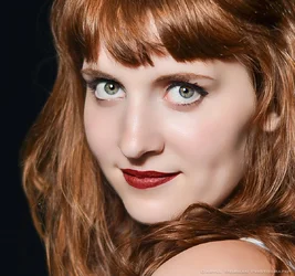
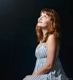
I did a similar setup with Rachel, but I think the photos turned out much better.

What do you think?

DSC_0391f.webp DSC_0446f.webp DSC_0477f.webp
 
I like that first one, but the skin smoothing seriously distracts.

I personally dislike skin smoothing, but look at what Dan O or Emily Rose are doing--you can clean up bad skin and/or smooth it out without losing the original character/detail. These shots are the epitome of the "plastic look".
 
I did a similar setup with Rachel, but I think the photos turned out much better.

What do you think?

View attachment 104777 View attachment 104778 View attachment 104779

These look much better overall in terms of being a usable, portfolio headshot. Previously, you mentioned that you did no retouching (on the Sav pics), but the skin and eyes look overdone on these in my opinion. I'm all for retouching, but these seem to cross the line and make the model look plastic with unnaturally wide eyes. Granted, I understand her eyes might naturally be that wide - but in that case, I'd have her narrow them a bit.
 

Create an account or login to comment

You must be a member in order to leave a comment

Create account

Create an account on our community. It's easy!

Log in

Already have an account? Log in here.

New Topics

Back
Top Bottom