Color Isolation Project - Joia Sofia

RoRoCo

TPF Noob!
Joined
May 4, 2006
Messages
270
Reaction score
0
Location
Silver Spring, MD
Hey all... It has been a while since I have been here. The reason? My daughter was born a few weeks ago and I had to get the room ready for her. :D Her name is Joia Sofia. Joia means "jewel" in Portuguese and the name is made up of her grandparents first initials.


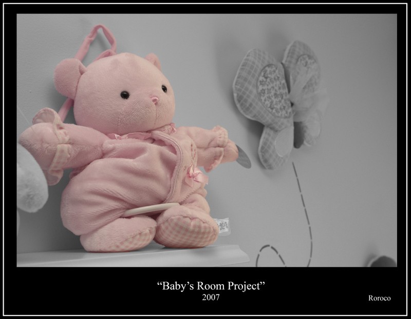
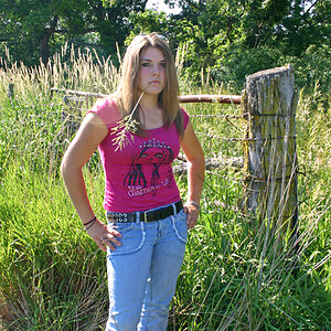
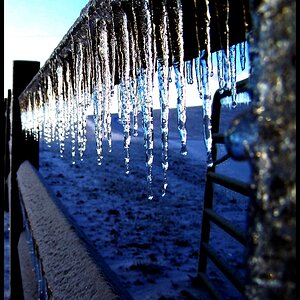
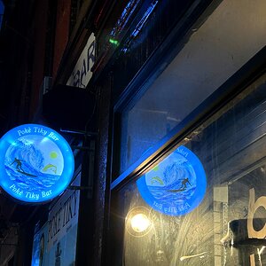
To celebrate, I made a series of 4 color isolation prints to put in my home. What do you all think?

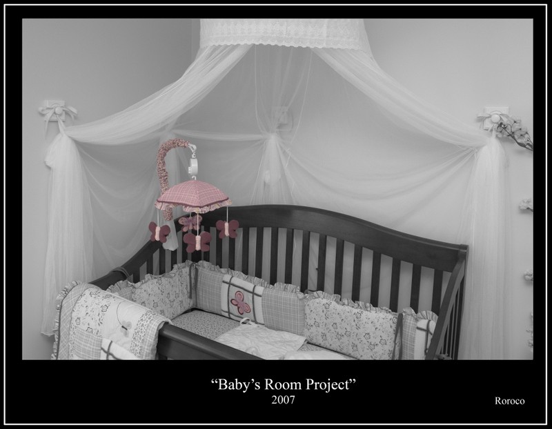
1790613704_1c4dded51d_b.jpg


1565170476_8ab92a5cfa_o.jpg


1564288149_f3cf6835ca_o.jpg


1564288001_b08054e9dc_o.jpg
 
What a cutie! Congratulations!

Of the four, I like the last one the best because of your composition and the selective color comes off more successfully in that one.

I think your black and whites could benefit from a boost in contrast. There is no true white or true black, just all middle grays which makes the tonal range very dull. You could also play around with adding more contrast to the pink also to make it pop more.

In all, I think this a cute idea for a nursery and I like your composition and angles. #1 is completely precious and I love your crib setup! Looking forward to seeing more of your beautiful girl.

Oh, I would also get rid of the tag on the bear in #3.
 
i love them.


she looks peaceful

happiness to you all
 
What a cutie! Congratulations!

Of the four, I like the last one the best because of your composition and the selective color comes off more successfully in that one.

I think your black and whites could benefit from a boost in contrast. There is no true white or true black, just all middle grays which makes the tonal range very dull. You could also play around with adding more contrast to the pink also to make it pop more.

In all, I think this a cute idea for a nursery and I like your composition and angles. #1 is completely precious and I love your crib setup! Looking forward to seeing more of your beautiful girl.

Oh, I would also get rid of the tag on the bear in #3.
I was actually going for a softer look - aka less contrast. I usually have more of a tonal range in my B&Ws (there are some others in my flickr site in my sig), but I wanted to have a softness to this series because of the subject.

I even turned the saturation down on the isolated - after color matching the pinks - color for the same reason. I am just not a big fan of too much saturation with a color isolated print for the most part.

As for the tag... damn... Now that is going to bother me but nothing I can do with the prints for now... They are already mounted. :meh:

And the last one is my favorite technically too... but I have an irrational soft spot for the first one. :D

Thanks for the critique... It is much appreciated.

Then I think you succeeded beautifully. :blushing: Would love to see a shot of the whole nursery. Looks like you decorated very creatively.
 

Most reactions

New Topics

Back
Top