Color or B&W version? And some c&c please

SquarePeg

hear me roar
Staff member
Supporting Member
Joined
Mar 18, 2013
Messages
15,458
Reaction score
15,353
Location
Boston
Can others edit my Photos
Photos OK to edit
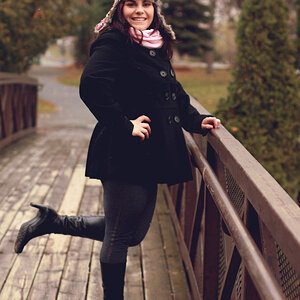
Looking for some feedback on these. Which do you like better the color or the b&w? I prefer the color version which surprised me because when I took it I was actually picturing it in b&w (which is not usual for me).My critique is that it's too cluttered/busy. My angle was limited as the bridge is closed and fenced off. Suggestions for what I could have done differently? Feel free to crop away if you want to give an example.

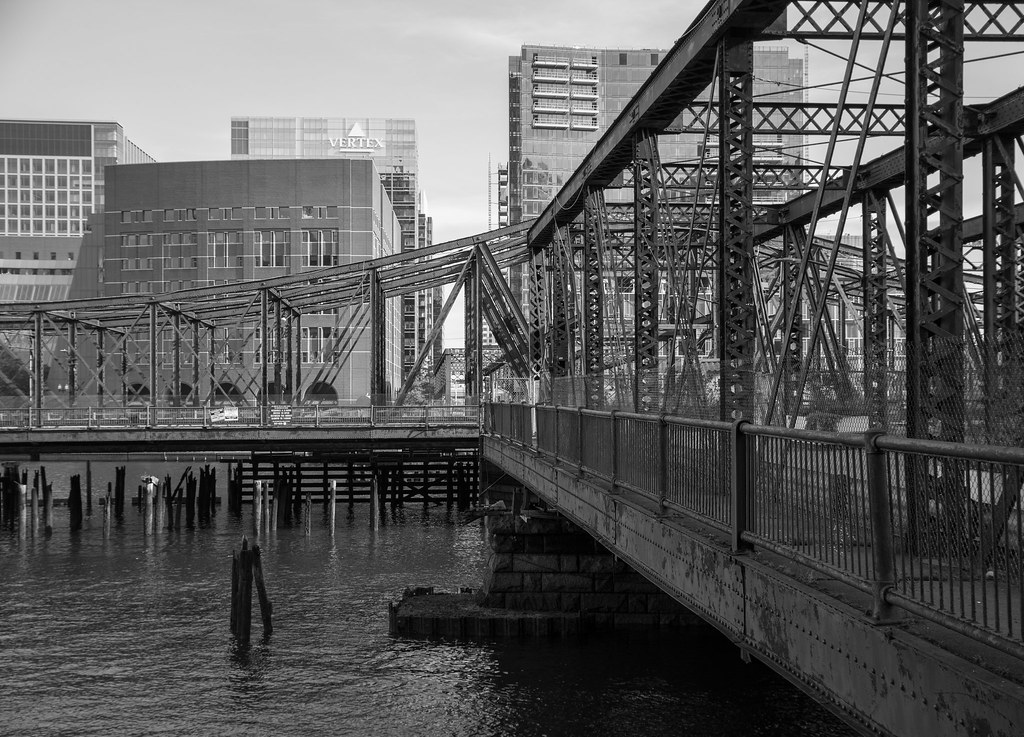
Fall16_7778_edited-2 by SharonCat..., on Flickr

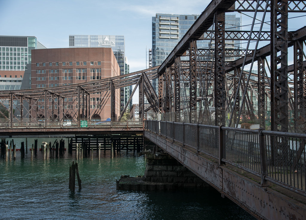
Fall16_7778_edited-1 by SharonCat..., on Flickr
 
I definitely prefer the monochrome, but I'd like to see a bit more contrast; right now the mid-tones are just a bit too predominant.
 
I definitely prefer the monochrome, but I'd like to see a bit more contrast; right now the mid-tones are just a bit too predominant.
Also agree with tirediron. The color tonality is nice, but nothing stands out. I would prefer a bit more contrast in the B&W, although it currently looks a bit too HDRish.
 
Color for me.
 
I agree with the comments about the B&W being better... The lines are more clean in the B&W, the colour image muddies the lines of the bridge to much for me and my eye doesn't know where to go. I don't think it needs a crop at all but it does need a little tweaking to get more contrast between the dark bridge and the lighter background.
 
Bump up the clarity, great eye young lady that claims she is not but her avatar shows different and thats ok because thats what an avatar is for.....
 
Bump up the clarity, great eye young lady that claims she is not but her avatar shows different and thats ok because thats what an avatar is for.....

LOL. the avatar pic is only about 6 months old. I'm 51. Not young. Not old. 50 is the new 30.
 
I'll take one of each please!!! Good eye.
 
It's not the midtones or contrast but that it's too busy. The foreground bridge and background buildings compete with each other. There isn't one main object. You have to go back at night when there's fog blocking the clarity of the buildings dropping them to a soft focus while the lights on the bridge bring it out..
 
I totally agree about the busyness.
 
Busy smezy.... Great line and composition.
 
I always like more information to be conveyed, so I like color. The color one here looks a little flat, but so did the BW one, more contrast is needed in both I think.
 

Most reactions

Back
Top