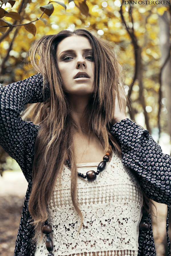
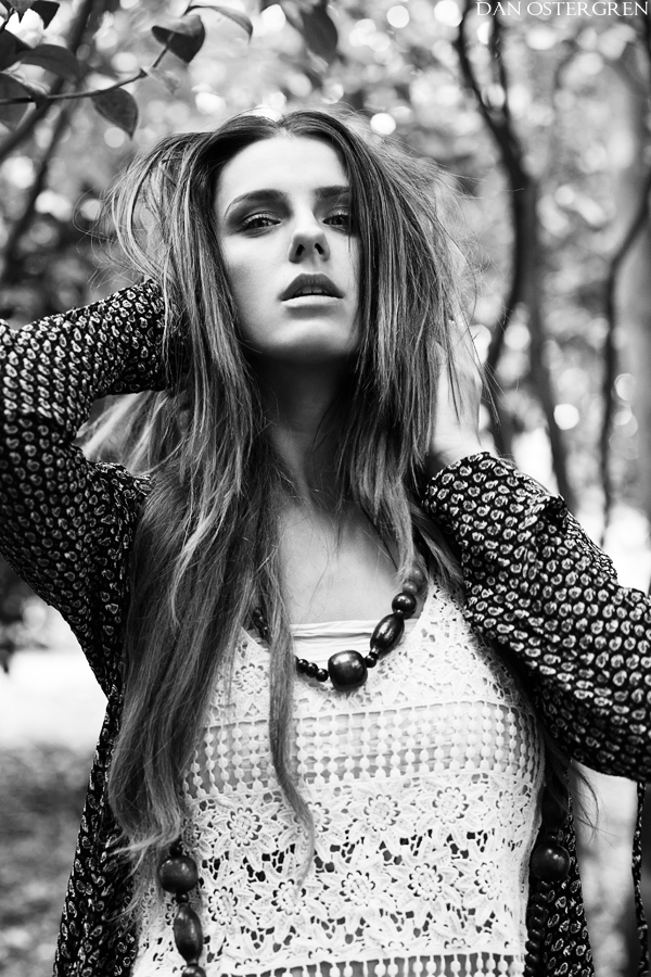
I'm gonna say, Color, because her hair, clothing, necklace (or how do you say it?) go nicely with colors in the background. I like how you processed the photo
For me, the color version helps the eyes pop a bit better - so important with portraiture. I'd say that makes the color version stronger. It's not really the colors themselves that matter, since they are so soft, muted and lovely they don't overpower anything. She is literally wearing B&W, so there is little difference in the two aside from the background, brighter eyes and flesh tones. Your B&W processing is very good here - if it weren't for my own nitpick about the eyes, it would be a tossup!











![[No title]](/data/xfmg/thumbnail/37/37606-3c9ffb5906173fa2aa489341967e1468.jpg?1734170733)