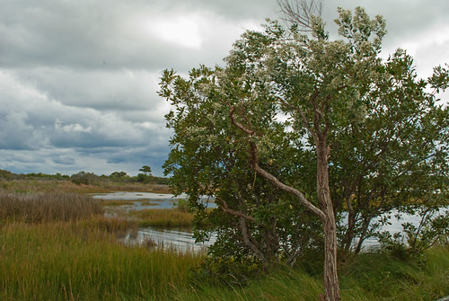
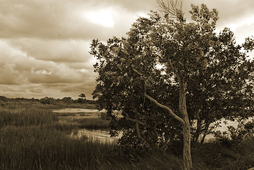
Of these two I prefer the color. I think the shades present in the color version work well together - the green of the leaves and grass, the brown of the tree trunk (and other grasses), the blue of the sky and water, and even the grey of the clouds. In the sepia version, because of the original color palette and the overcast day, you don't get a broad tonal range. For instance, you lose the detail in the grasses that some of it is green and some brown; likewise for the blue in the clouds. You also lose some identification of the water behind the tree. In the sepia version, without the blue as a clue, I can't really be sure if that's a pond or, say, a strip of sand (the terrain seems flat enough I could believe it is coastal).
Which brings me to composition, per your request. I like the tree being so far off-center - you are allowing it to dominate the foreground in its portion of the frame but leave enough cohesive space to provide a setting for it. However, though admittedly I don't know what's going on just to camera right of the tree, I would have liked to see it not extend off the side of the frame, to stand on it's own as a subject. (Think of it as a person standing there instead of a tree. Would you want to crop off just a bit of the person's left arm?) Similarly I'd like to see more space up top, so that the tree doesn't extend off the top of the frame either. Or, even better, edit out those bare, scraggly branches which seem out of place on that tree anyway.
I'm also not thrilled that the water (pond?) is so largely hidden behind the tree. I already mentioned that in the sepia version the little peeks you get of it make it harder to identify (and unless the point is to make people ponder, you probably don't want to include elements which take their concentration away from the real subject). But even in the color version it's a little bit distracting. I would have tried walking to your left, keeping the tree in the same position in your frame - this would let more of the pond be visible among the grasses in the left of the frame and might not have taken much of a change in position to make me happy. (Again, the caveat that I don't know what the entire scene was like...and it's not like you could just turn the tree to keep a good angle of the trunk/branches as you moved.)
Your horizon is fairly close to the middle of your frame. Generally this is a no-no, but it's not too bad here. Since the subject here is that single tree, not the clouds in the sky or the landscape as a whole, the almost-centered horizon is not as big a deal to me. I would suggest, however, that if you shot from a bit lower (keeping the same portion of the tree in frame, which would have dropped your horizon lower) you would have had the benefit of more of the tree being against the contrasting cloud backdrop.