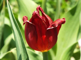
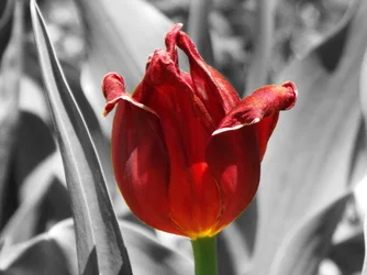
The idea of selective colouring (the common name for this method) is to bring attention of the viewer to a specific and key part of the photo via the use of selective colour. It's a method often used (like HDR) by people who don't quite appreciate how to use it and thus it has gained itself a very unpopular title within the general photographic community (Esp when its used "incorrectly".
In this case you're bringing attention to the rose - however the rose itself is already the focus of the viewers attention in the colour version. The composition has the rose head right in the middle and very dominant against a generally mono-colour and fairly blurred background. The only draw to the background in the original is brightness; brighter points draw the eye's attention and in the colour version its very clear that the rose is darker than its background; shadowed by either the camera and photographer or other elements in the environment.
Shifting to selective colour does defeat the brightness attention draw and ensures 100% focus on the rose; at which point the question becomes is it interesting. And sadly the answer is no, its not. At least to me once I'm focused on the rose there isn't anything that really makes it interesting; nothing to make it stand out and really "pop".
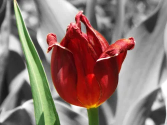
The choice to highlight the leaf in the second shot doesn't really help, its drawing attention to that element, but again its not really being that interesting.
You could try cropping vertically; use the leaf on one side as a part of the boarder element. The photo is quite "squat" feeling in its aspect ratio, but the flower is distinctly vertical in its appearance and composition .








![[No title]](/data/xfmg/thumbnail/37/37602-1ef8dbb1c2d0e4ff347ee65d328c3603.jpg?1734170730)
![[No title]](/data/xfmg/thumbnail/41/41895-34e19a98c1811c8d543811c45d6ca604.jpg?1734176248)
![[No title]](/data/xfmg/thumbnail/41/41897-ea48d59eea1540d700b6e9051bce38da.jpg?1734176250)