amolitor
TPF Noob!
- Joined
- May 18, 2012
- Messages
- 6,320
- Reaction score
- 2,131
- Location
- Virginia
- Can others edit my Photos
- Photos OK to edit
I made some snarky remarks about contemporary landscape photographers in another thread, which got me to thinking.
Here's a capsule sketch of color theory for decorating rooms, or dressing women:
There's a thing called a color wheel, which arranges the colors in rainbow-order around a wheel, with the purple/violets connected back up to the deep reds. The order is always the same, the details of what's opposite what vary a bit. Anyways. Colors that are close to one another on the wheel are analogous and colors that are opposite one another across the wheel are complementary. We may take "complementary" to mean "pretty darn far away." The basic way to build a color scheme is:
There's more, but that's the basics of a simple color scheme a decorator might pull together for a room.
Ok, so what?
Let's say you want to sell pictures to decorators to put into rooms. You're going to want to fit into the color scheme reasonably well. This means that:
Things to avoid:
I reserve judgement on what these guys are up to, or why. I reserve judgement on whether it's good or bad. I do, however, claim that the work *I* have looked it appears to be peculiarly well-suited to "matching the couch" applications, by which I mean, really, fitting in with a coherent well-designed decorating scheme.
Here's a capsule sketch of color theory for decorating rooms, or dressing women:
There's a thing called a color wheel, which arranges the colors in rainbow-order around a wheel, with the purple/violets connected back up to the deep reds. The order is always the same, the details of what's opposite what vary a bit. Anyways. Colors that are close to one another on the wheel are analogous and colors that are opposite one another across the wheel are complementary. We may take "complementary" to mean "pretty darn far away." The basic way to build a color scheme is:
- pick a color, any color. Maybe at random. Maybe you own a piece that is that color.
- now pick some analogous colors, similar but not the same as your main color, about the same degree of saturation as your first color.
- finally pick a complementary color, one that's across the wheel more or less. There's some latitude here. Usually you pick this one to be as saturated or more than the first one.
There's more, but that's the basics of a simple color scheme a decorator might pull together for a room.
Ok, so what?
Let's say you want to sell pictures to decorators to put into rooms. You're going to want to fit into the color scheme reasonably well. This means that:
- you can draw your colors from a single palette. smaller prints might match the decorator's "accent" color, and larger ones might match the main palette.
- you can draw your colors from two palettes as long as they are roughly complementary. Then you hope that you hit the main room palette and the accent, close enough to "work"
- you can add whites, greys, blacks to your picture as you like
Things to avoid:
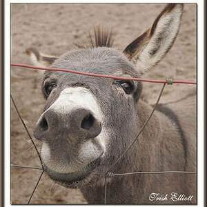
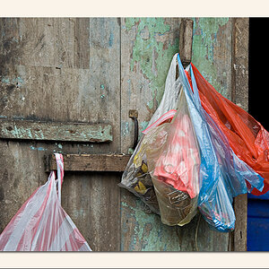
- do NOT use more than two palettes of color in your prints. Small amounts of other colors are OK, but not much, and best unsaturated. "Riot of color" prints are right out.
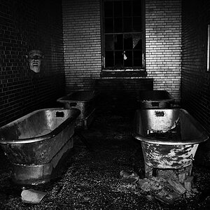
- b&w is probably a bit iffy.
I reserve judgement on what these guys are up to, or why. I reserve judgement on whether it's good or bad. I do, however, claim that the work *I* have looked it appears to be peculiarly well-suited to "matching the couch" applications, by which I mean, really, fitting in with a coherent well-designed decorating scheme.
Last edited:
") But the ideas are the same!
But the ideas are the same!
![[No title]](/data/xfmg/thumbnail/37/37092-c446ffb89610a57384a51ac5254beffd.jpg?1619737881)
![[No title]](/data/xfmg/thumbnail/37/37096-449bdc6a1e392458a52fd1cca97c6b2e.jpg?1619737881)
![[No title]](/data/xfmg/thumbnail/42/42230-fa8ace50a80342c7d91db1431f911bab.jpg?1619740048)
![[No title]](/data/xfmg/thumbnail/32/32930-09414fc020c2a60a456ff59a05c5ef8f.jpg?1619735759)


![[No title]](/data/xfmg/thumbnail/37/37095-648a4e65f10e6fdeeb231be5ed8c3152.jpg?1619737881)