Tee
Been spending a lot of time on here!
- Joined
- Mar 26, 2010
- Messages
- 1,954
- Reaction score
- 625
- Location
- South central PA
- Can others edit my Photos
- Photos NOT OK to edit
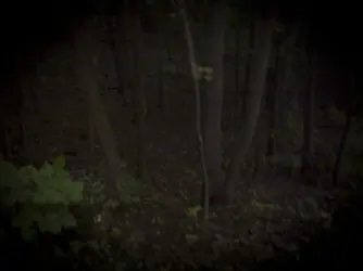
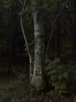
I get this feeling that when someone says it's underexposed the receiving person thinks that means they have to go blow out the image. Not at all. You can create dark, moody, low key images that are properly exposed. In fact, the OP proves my point with the images posted.
I think that's the issue that the member in the other thread is not understanding.
I think that's the issue that the member in the other thread is not understanding.
")
")


![[No title]](/data/xfmg/thumbnail/32/32935-452d7573a35ee2f5d0b9ad6463de680e.jpg?1734162731)


![[No title]](/data/xfmg/thumbnail/34/34686-9d6b51a2427064204f762b07c8b00f70.jpg?1734165692)


