Destin
Been spending a lot of time on here!
- Joined
- Sep 11, 2010
- Messages
- 3,867
- Reaction score
- 1,385
- Location
- Western New York
- Can others edit my Photos
- Photos OK to edit
I've gone out the last two mornings to photograph sunrises, and neither morning has gone according to plan. Yesterday I overslept and didn't have time to get to the location I had planned to shoot at so I had to find something close to home and only had about 20 minutes to find it. I saw the light hitting this soy bean field and really liked it.
I'm aware that I blew the highlights on it pretty severely, but it's a quite accurate representation of what the scene actually looked like.. the human eye also did not have the dynamic range to see the full tonal range here, so it would look very fake to not clip the highlights.
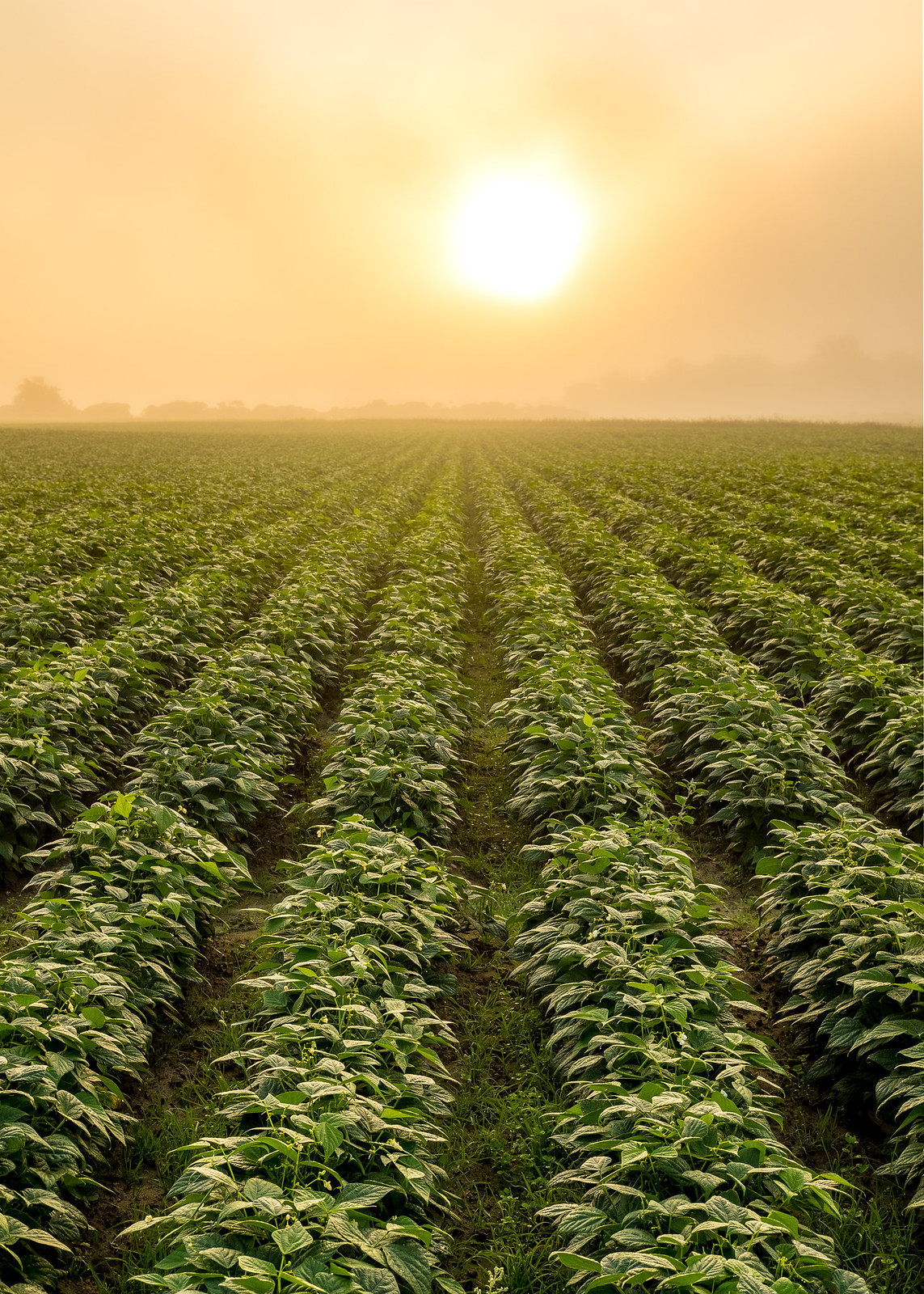 Soy Bean Sunrise by Destin Danser, on Flickr
This morning I got up and headed out to shoot the scene I had intended to capture yesterday. Left the house at 0430 and arrived at the location at 0530, 90 minutes before sunrise. Sat on the pier and just listened to the waves crashing while waiting for the dawn to break. As soon as the first light started to appear I knew that I'd be photographing the dramatic cloudy sky instead of a sunrise, but I don't mind this photo either.
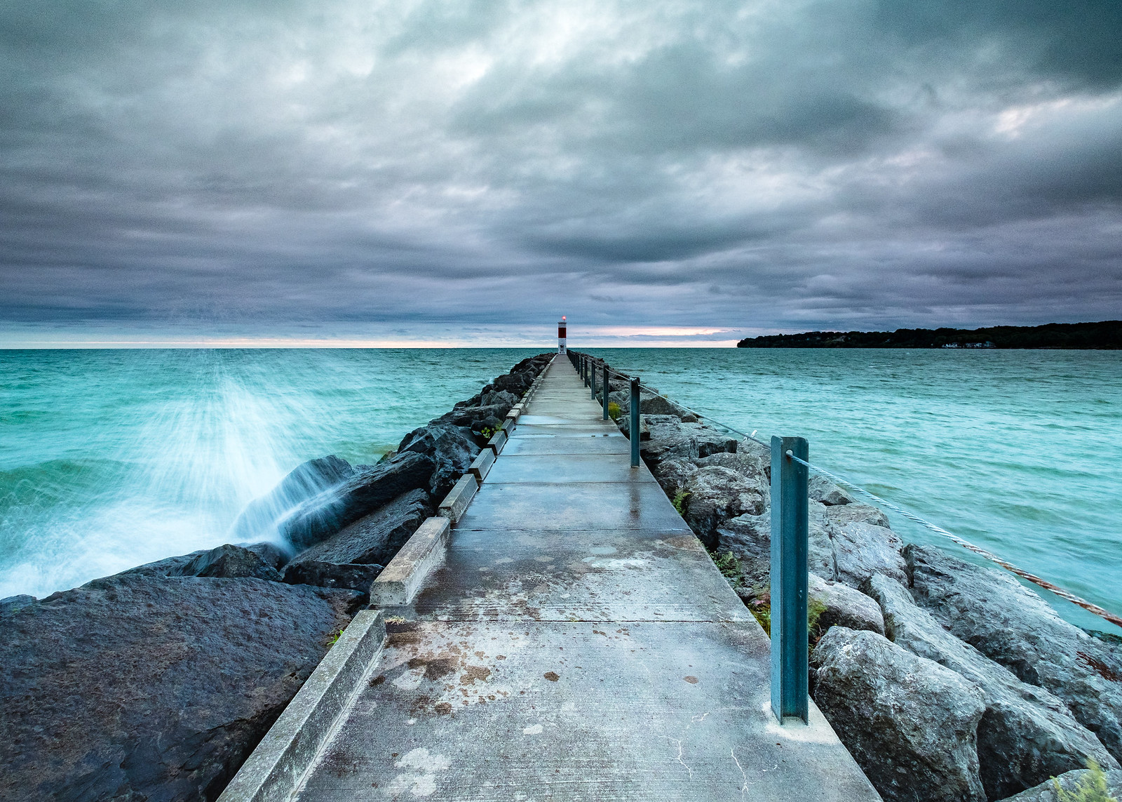 Stormy Dawn by Destin Danser, on Flickr
Side note: I dropped and shattered a $150 6 stop ND filter this morning on accident


I'm aware that I blew the highlights on it pretty severely, but it's a quite accurate representation of what the scene actually looked like.. the human eye also did not have the dynamic range to see the full tonal range here, so it would look very fake to not clip the highlights.
Soy Bean Sunrise by Destin Danser, on FlickrThis morning I got up and headed out to shoot the scene I had intended to capture yesterday. Left the house at 0430 and arrived at the location at 0530, 90 minutes before sunrise. Sat on the pier and just listened to the waves crashing while waiting for the dawn to break. As soon as the first light started to appear I knew that I'd be photographing the dramatic cloudy sky instead of a sunrise, but I don't mind this photo either.
Stormy Dawn by Destin Danser, on FlickrSide note: I dropped and shattered a $150 6 stop ND filter this morning on accident


