Could use some critique on a few photos...

Baaaark

TPF Noob!
Joined
May 27, 2009
Messages
414
Reaction score
0
Location
North or South Pole... it depends
Can others edit my Photos
Photos OK to edit
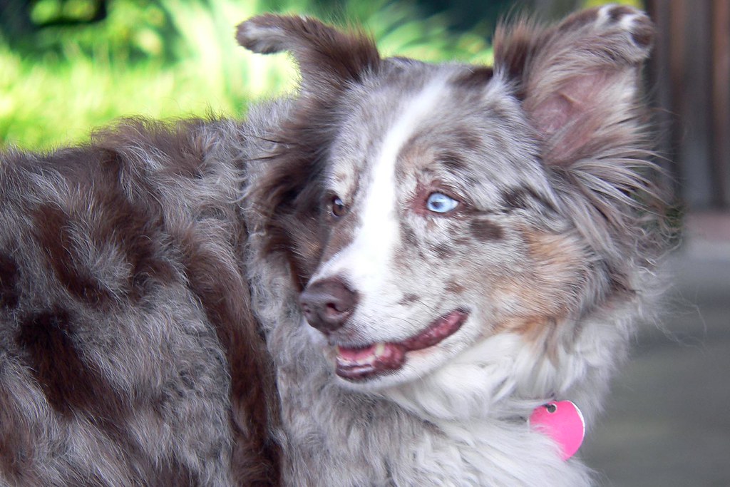
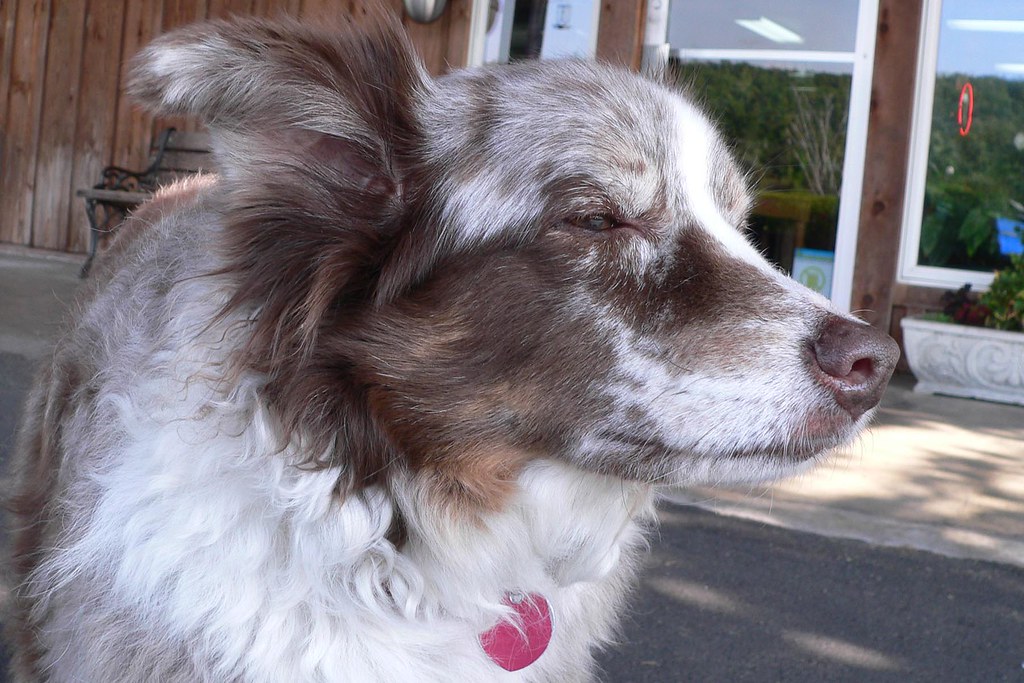
So for a present, I took photos of my friend's dogs and decided to put each of them in a 5x7. But, I don't know how good my stuff is, and would like some feedback. I know the last one is going in, but don't know which of the first three to pick. Also, any standard CC would be helpful.
3640699868_fbb07724c3_b.jpg


It drives me crazy I got motion blur on this. I like it so much otherwise.
3640700248_8940a7d4fc_b.jpg


I wish she wasn't squinting in this one. It makes her look more serious, though.
3640699542_a4f86a6ebc_b.jpg


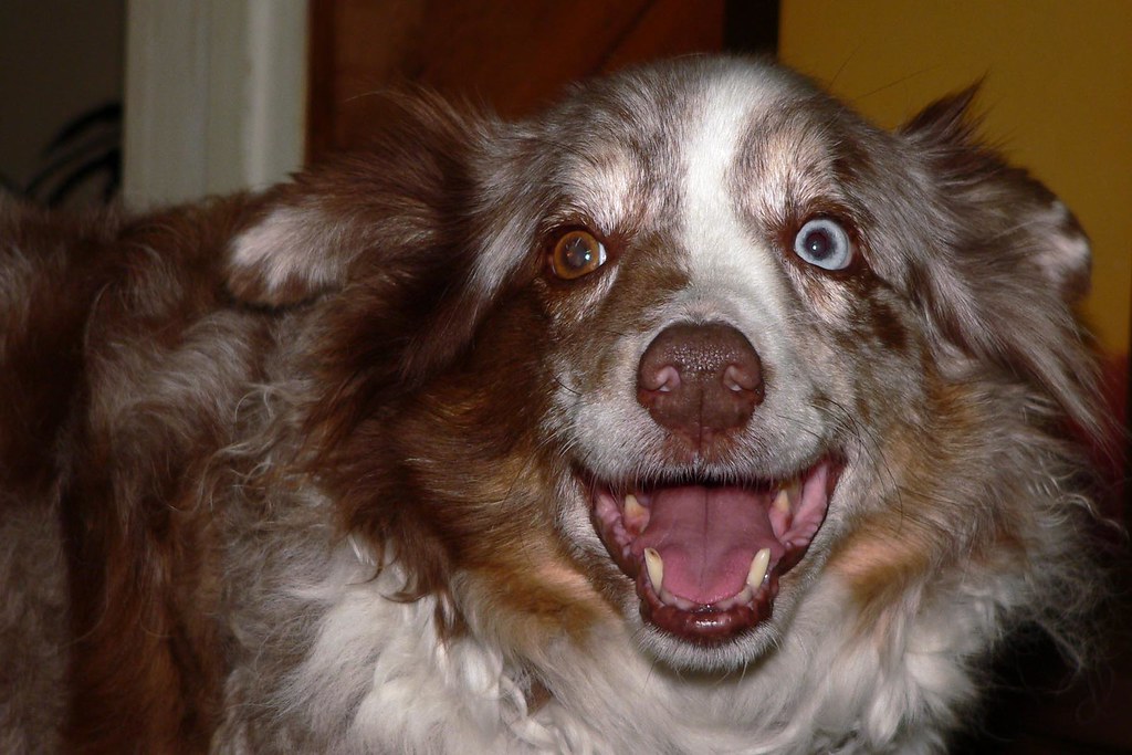
This one is fun, but with the teeth showing and all it may not be very appealing. Plus she had red eye. I tried to take care of it, but I really don't think I did a good job. What do you guys think?
3640700624_d5d220974e_b.jpg

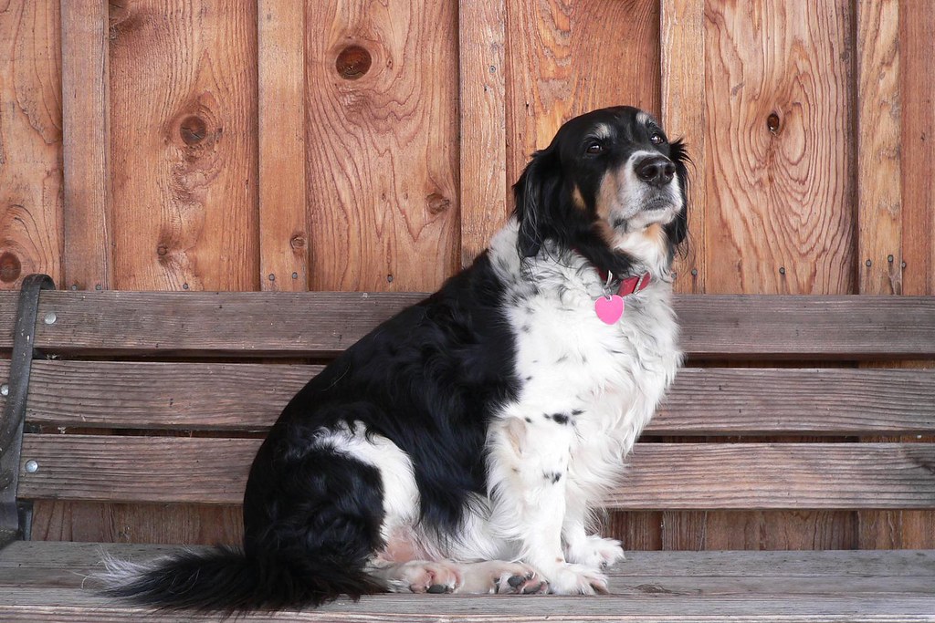
I like his expression in this one. It matches his personality to a tee.
 
1. You missed the focus on the face. I'm guessing it's hard to get if they're moving around a lot.
2. Better focus but no eyes and a distracting background. Watch what is behind your subject at all times.
3. White balance is off, he should have a similar color to the first two. The on camera flash did a number to that eye too.
4. Best of the group, but the centered composition is kind of boring. I know everyone goes tossing around the ROT, but centered can work if you find the right stuff to frame it with. In this case the setting is pretty bland.
 
The first is...well...blurry. The second is pretty awesome. I'd like a little more contrast for my taste (I like lots of contrast in my photos though, most of the time). The heterochromatia bugs me a bit in the third; how did a dog get red eye? I would expect the reflective tissue behind the retina to have bounced back a bright white-green light. (It's more obvious in the left eye that you PP'd it, btw). Try bouncing the flash off another surface to minimize this, and at the same time you'll be getting more even lighting and more direction to the photo.

The fourth is centred, and the eyes are too close to the edge frame for me to really focus on them.

Edit:

4. Best of the group, but the centered composition is kind of boring. I know everyone goes tossing around the ROT, but centered can work if you find the right stuff to frame it with. In this case the setting is pretty bland.

:thumbup:

Centred also works if you roughly follow a golden rectangle. ^.^
 
The name of the game is to fill the frame. There's more room to work with in the above photo. Here's a suggestion for a tighter crop:

3640772816_0e2169e04d_b-e.jpg


I also boosted vibrance, contrast on the wood, and contrast and brightness on the dog (I darkened the white blown-out fur with another adjustment layer; editing in RAW would yield better results). It's about a two-minute PS job by someone inexperienced (moi), though it did give me another chance to play with my new tablet (and discover that PS won't interpret the pressure I'm putting on the pen...blast).
 
Last edited:
It's about a two-minute PS job by someone inexperienced (moi), though it did give me another chance to play with my new tablet (and discover that PS won't interpret the pressure I'm putting on the pen...blast).

What pen tablet? Do you have your brush set to "shape dynamics"?
 
I'm using the Intuos 4. My reaction to "shape dynamics" is "shapey...whatey?" >.< *searches though PS' menus*
 
f5 for brushes, check shape dynamics. Should react to your pressure now, but you may have to do it for all your tools.
 
So THAT'S where it is. Bloody settings are buried all over the place in PS. Thanks Sherman. :D
 
The only problem is that I wanted his tail in the shot too. Don't ask why.

The real question is which of the first three would you put in a frame?
 
That's the question you gotta ask yourself! If you have friends over who see the photo and ask about it, you don't want to say "Well Sherman Banks on the Photo Forum said I should use this one". I personally would do a reshoot, and really focus on the composition. Get your backgrounds to compliment your subject and do your best to avoid the on camera flash (High ISO noise is better than on camera flash and far less noticeable on a 5x7 print). But if you really still want to know, the last one is the best of the set IMHO.
 
In this situation, I would ask to do a reshoot. Most people don't mind if you take pictures of their dogs, and dogs aren't going to care if they look bad or not - so you might as well practice as much as you can!

First work on your backgrounds. The easiest is getting a simple grass background, or the fence in the last one also works well. You want the attention to stay focused on the animal, not on all the things going on in the background (unless they are relatable to the photograph) I have found that an easy, portable background is a black mat board. It doesn't wrinkle like cloth, but it is stiff enough to stand up if propped against something.

I think the third one you got a nice expression. The flash unfortunately kind of ruins the shot. The last is the best shot.
 
I can't reshoot, as unfortunately I don't live near the dogs. I think I will send them all three, and tell them to put which ever one they feel is the best in the frame. Its not my best work, but hey, they're really nice people, and the ones who bought me this camera because I told them I wanted to learn photography. I kinda owe it to them.

I do have one of the brown dog in a grass field. And she looks like a buffalo! I like it, but its not something you'd put up on a wall (its funny).

3643002806_692fbf9f53.jpg
 

Most reactions

Back
Top