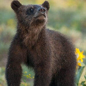
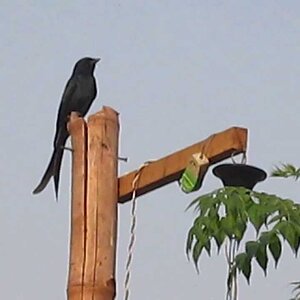
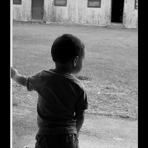
I do like the saturation of the colours in the images, nicely done.
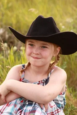
I think you need to look at composition in your images. Start with the rule of thirds, where you dont center your subject in the middle of the frame. Lots of places to read up on that, check google. Dead center is not usually the highest point of interest and needs to be avoided.
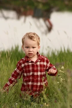
I'd also watch how you fill the frame with your subject. I'm an advocate of making your subject the main focus and making sur ethey will your frame enough (your boy has alot of empty space over his head, apply rule of thirds and you should be good), but you are cutting off parts of them or making some parts really tight in the frame.
The boys hands disappear in the grass and appear almost cut off. The girl's hat is cut. While cutting things can be ok, in this case I find it unbalances the image.
Keep up the good work though!




![[No title]](/data/xfmg/thumbnail/37/37629-fa70c9f81cc7da4d6a9b512502f9bf84.jpg?1734170753)
![[No title]](/data/xfmg/thumbnail/36/36681-6b091a8cd7318d47018c823a2eff3185.jpg?1734169175)
![[No title]](/data/xfmg/thumbnail/41/41891-e5bba75ac5ce57c6892ade4cfc3f7d4c.jpg?1734176244)