stevengriffin
TPF Noob!
- Joined
- Mar 11, 2015
- Messages
- 20
- Reaction score
- 6
- Can others edit my Photos
- Photos OK to edit
Follow along with the video below to see how to install our site as a web app on your home screen.

Note: This feature currently requires accessing the site using the built-in Safari browser.
Thanks, sorry this is my first time posting.if you post less photos you'll get more responses and better critique
it's okThanks, sorry this is my first time posting.if you post less photos you'll get more responses and better critique
")
Thanks I appreciate itit's okThanks, sorry this is my first time posting.if you post less photos you'll get more responses and better critique
just edit your first post, choose which ones you'll delete and which ones you want the critique on

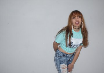
Thanks for the feedback and I tried incorpoStarting with an attractive model, male or female, is a good way to get some eyeballs, for sure. My biggest suggestion on the three photos of the young woman would be to turn the camera to "tall" orientation on most standing poses where the emphasis is supposed to be on the person. "Tall" camera orientation works to help drive the emphasis toward the person, and allows them to be shown quite literally larger within the frame--bigger face, bigger eyes, just bigger! More eye-catching! Horizontal aka landscape aka wide orientation of the camera's field of view often forces you to crop off part of the person's body or hands/arms, or the top of their head, and that can work against many photos.
i understand that post-editing is often considered a must these days, and I'm very fluent in Photoshop. I just try to refrain from it I guess. I'll probably do it more in the future. Thanks for the feedbackThese are a great start IMO. I can tell you have some good fundamental ideas and are thinking creatively in your head. You do have some good idea of what looks to be good with natural lighting.
I do recommend, reading up a little on post processing. Being good at post processing will definetly set you apart, but do realize post will not fix significant errors in shoot. Also , with the studio shots, think of some interesting ways toposition your lights.
Thank you for the tips, I'll definitely work on it and post some more soon.Image by image:
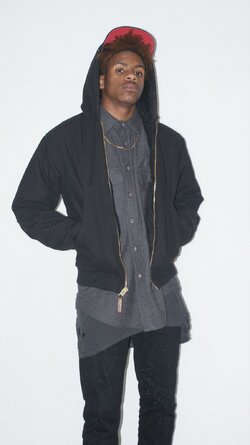
The guy in the hoodie: My favorite. I like it a lot in terms of composition and expression. The only problem I see is the background isn't truely white, its a muddled gray. This can be fixed by making your background light brighter or by pushing the whites when you post process the image.
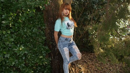
The girl leaning against the tree: Nice Pose and a good environment. You've definitely got a knack for this portraiture thing. The thing is that the subject is directly in the center.. central compositions when there are other elements in the frame that can distract the eye are a bad idea. My eye is constantly running away from her in this image to look at the tree to the right or the leaves to the left. Speaking of... you could easily crop half the area those leaves on the left take up and none of those problems would be happening.
Girl in the field: This is good. The only qualm I have with it may just be a matter of personal preference as I don't like the look of the barns in the background.
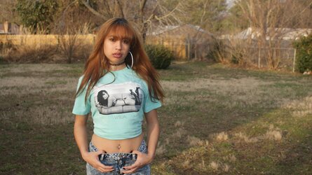
Girl with "white" background: Again you captured great expression, again there is a muddy gray background instead of white. Also I could do with less empty space to the left.
You have got some skill for only having done this for two months!! I can't wait to see how much you improve in the next two months!!


![[No title]](/data/xfmg/thumbnail/39/39499-b11b4321c0f029e3a5523ccab621b71c.jpg?1619739057)
![[No title]](/data/xfmg/thumbnail/32/32930-09414fc020c2a60a456ff59a05c5ef8f.jpg?1619735759)

![[No title]](/data/xfmg/thumbnail/31/31754-af76ae89cc75bd1855937374ff359efe.jpg?1619734992)