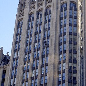
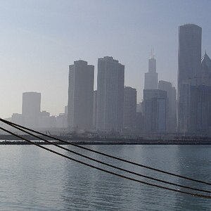
any helpful critique? I was going to crop it to comply with the thirds, but i couldn't find what i wanted to take off. I kinda like the space on the left...
My advice would be to find a better subject, or any subject at all for that matter. You've got some nice colours in the sky, but that doesn't mean much if the main subject in front of the sky is doing nothing.
The shot is essentially an essay in shapes. The color of the sky adds the 'excitement'.
The slanting diagonals on the right work well to draw the eye to the colorful central area and its detail.
However, the strong vertical 'noise' at the left constantly interrupts and, unfortunately, does not lead back into the picture. The eye is stranded there.
I opt for cropping off the vertical bars on the left, leaving an evenly-toned space.


![[No title]](/data/xfmg/thumbnail/39/39448-28e9a5e96080f7edcaf8e4226d8a0a6c.jpg?1619739036)