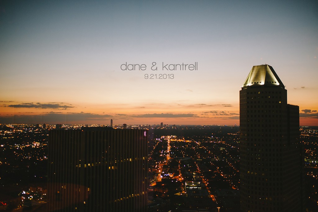
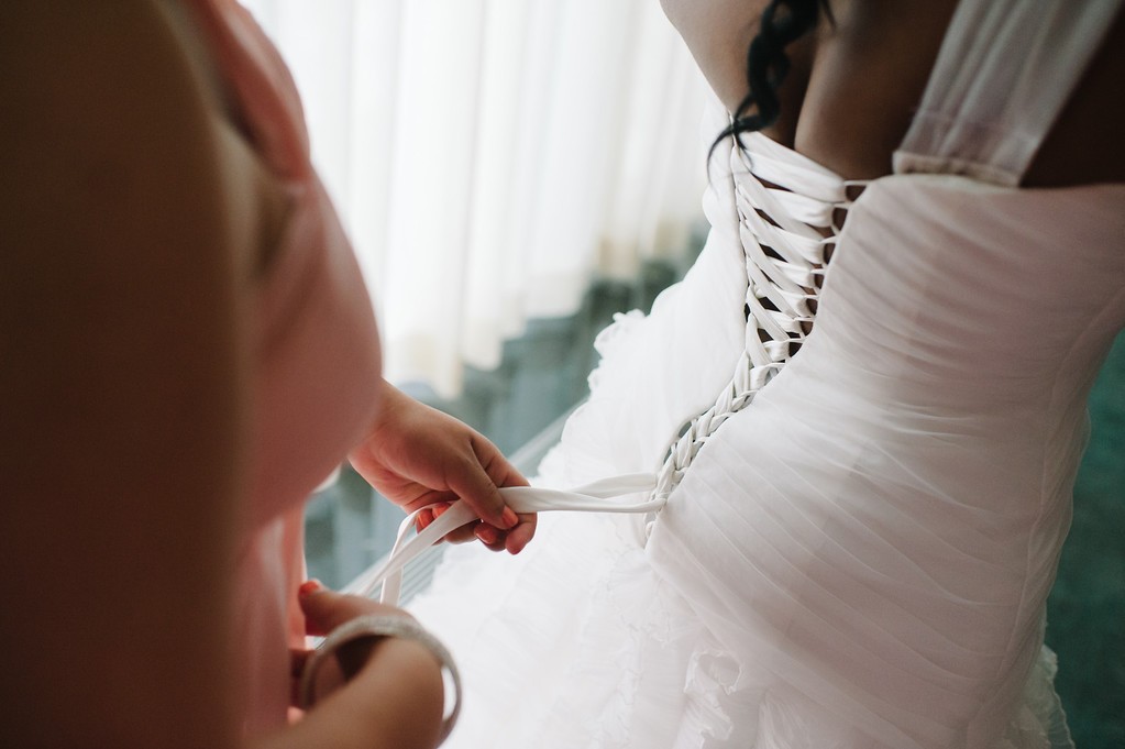
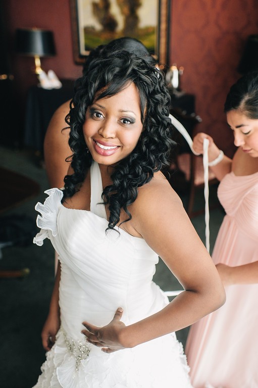
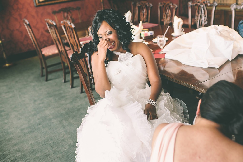
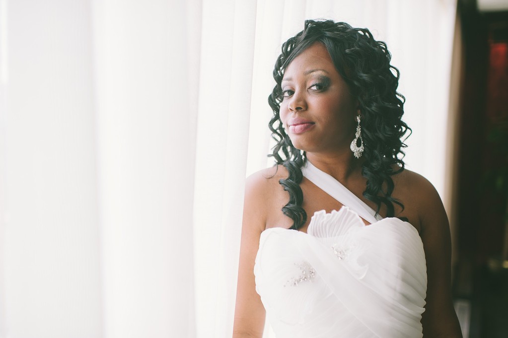
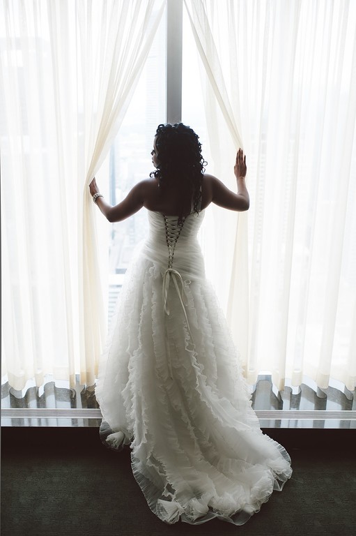
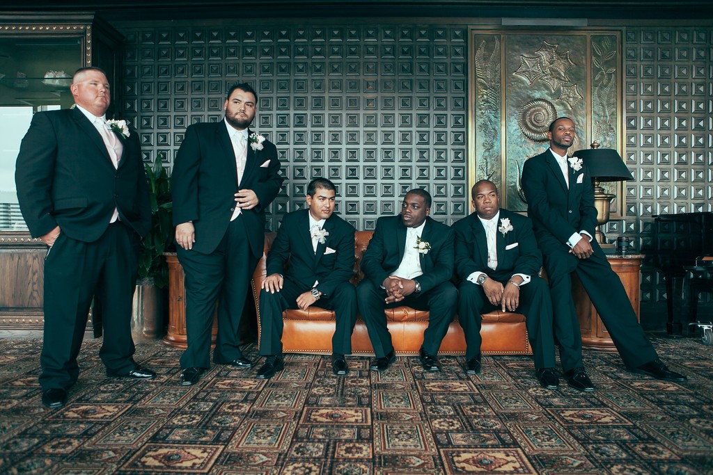
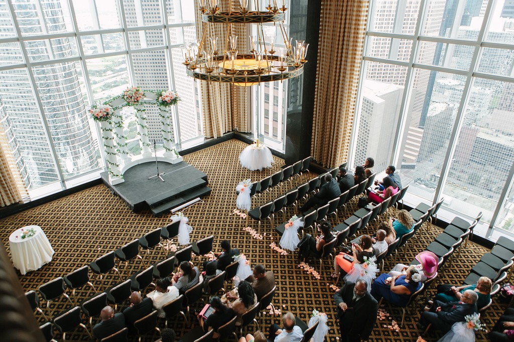
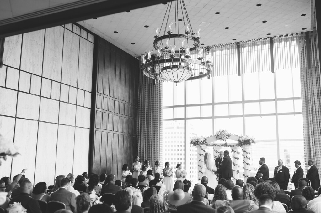
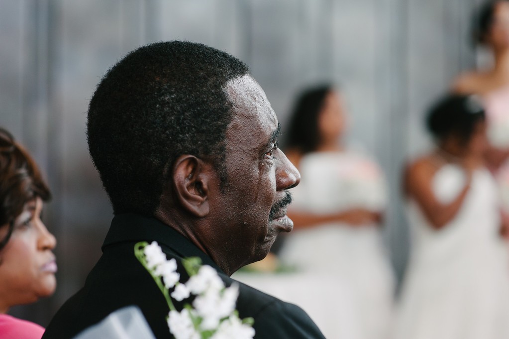
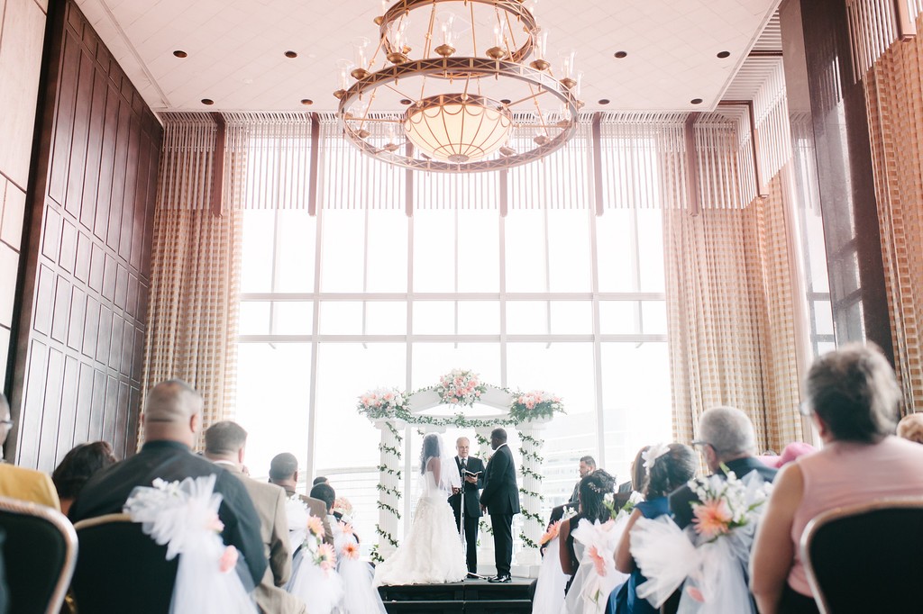
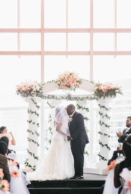
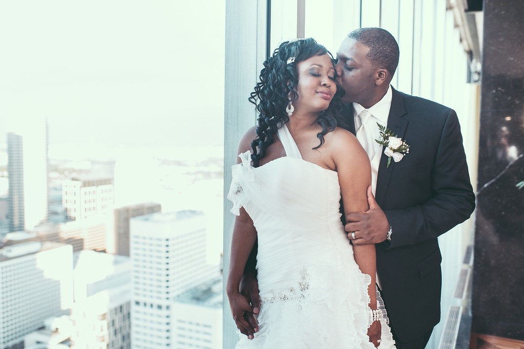
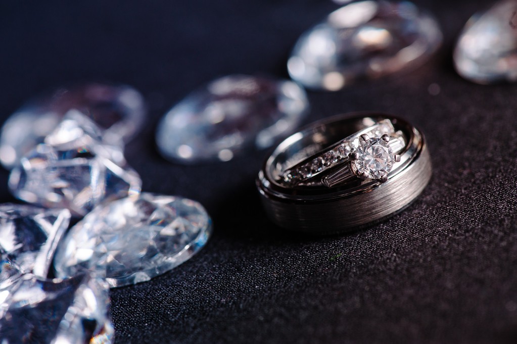
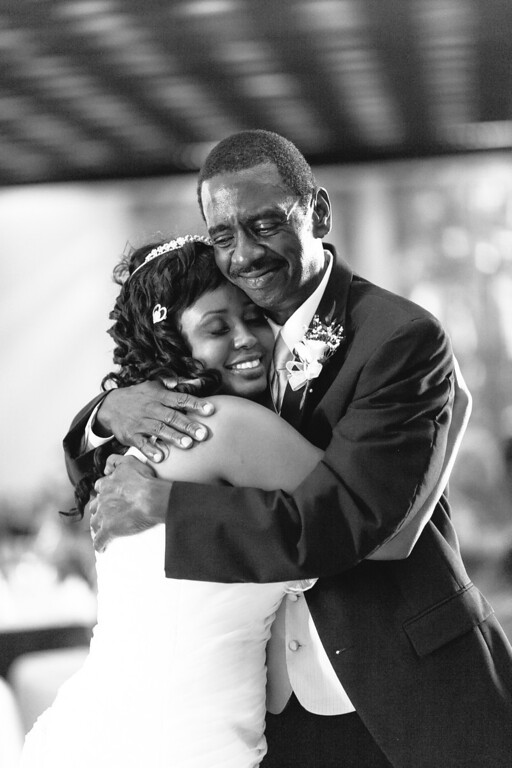
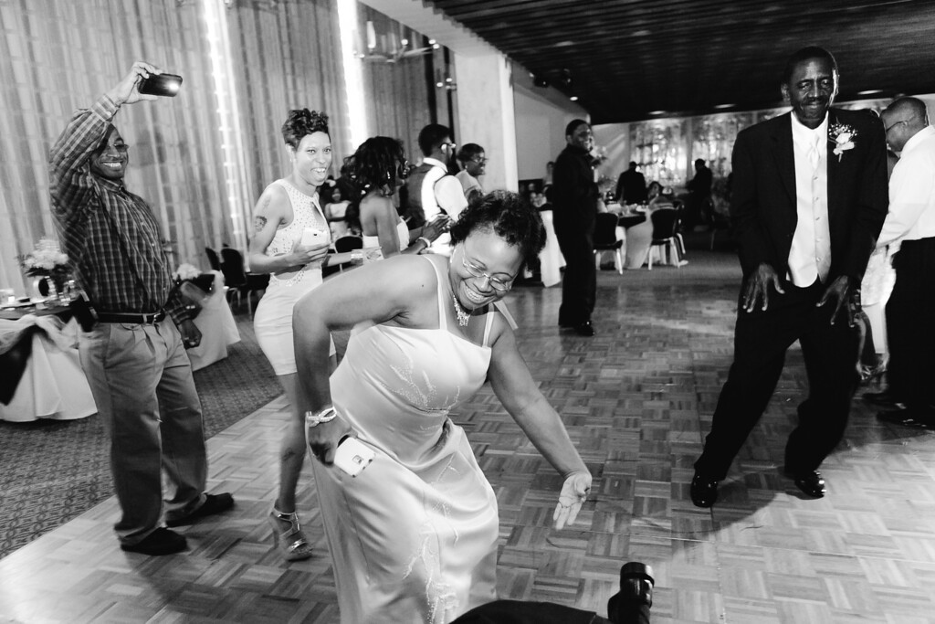
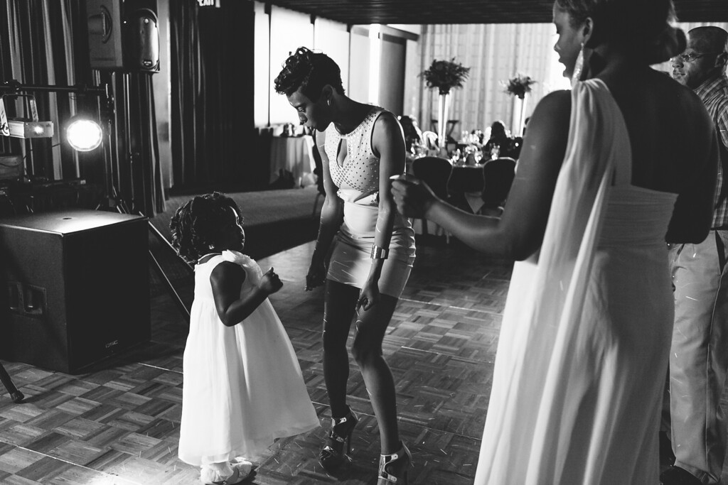
some of these are great. I'm not sure I'm a fan of all the processing choices. For example, I like #30 a lot, but I don't like what you did to ones like #31 or #10. I'm not sure this "matte" processing adds anything...where I'm drawn to 11,13,20, & 30 that have a lot more contrast and richness in the colors.


![[No title]](/data/xfmg/thumbnail/32/32947-11daccca0ca979c310e3963ceb9d01d8.jpg?1734162797)

![[No title]](/data/xfmg/thumbnail/31/31740-83040d547efdbb1f87736f24d2e9985c.jpg?1734160457)


