What's new

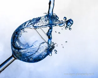
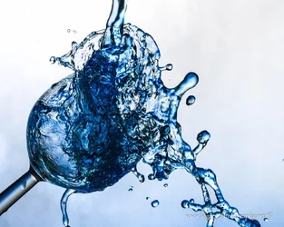
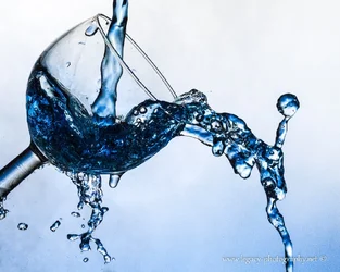
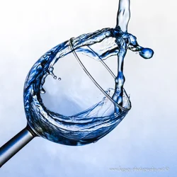
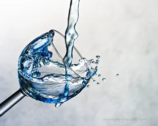
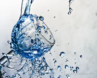
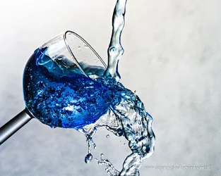
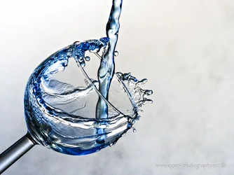
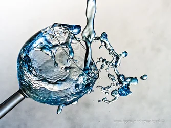
Darn!! I spilled my drink!! Over, and over, and over again. C&C Please.

Tight Knot

No longer a newbie, moving up!
Joined
Nov 30, 2010
Messages
1,398
Reaction score
159
Location
Boca Raton, FL
Can others edit my Photos
Photos OK to edit
Hi all,

I can't tell which of these are better or worse. Something about "can't see the forest for the trees".

I'm sorry there are so many, hope it's not way too many.
 

Attachments

  • $Overflowing glass - 3.webp
    $Overflowing glass - 3.webp
    136.4 KB · Views: 175
  • $Overflowing glass - 4.webp
    $Overflowing glass - 4.webp
    188 KB · Views: 179
  • $Overflowing glass - 5.webp
    $Overflowing glass - 5.webp
    175.5 KB · Views: 208
  • $Overflowing glass - 6.webp
    $Overflowing glass - 6.webp
    192.9 KB · Views: 206
  • $Overflowing glass - 10.webp
    $Overflowing glass - 10.webp
    166.2 KB · Views: 186
  • $Overflowing glass - 11.webp
    $Overflowing glass - 11.webp
    212 KB · Views: 205
  • $Overflowing glass - 14.webp
    $Overflowing glass - 14.webp
    194.9 KB · Views: 202
  • $Overflowing glass - 16.webp
    $Overflowing glass - 16.webp
    159.4 KB · Views: 185
  • $Overflowing glass - 17.webp
    $Overflowing glass - 17.webp
    209.1 KB · Views: 186
Second one down on the right.
 
1,2,4 are all pretty neat! 6,7,and 9 I think are not very good.
 
1,2,4 are all pretty neat! 6,7,and 9 I think are not very good.

Thanks Derrel.
What do you feel takes away from 6,7 and 9? Too much going on?
 
#4 for me. The reason behind that pick is the motion of the water. It encircles the inside of the glass creating a fluent line for my eye to follow. Fun stuff! Nice job.
 
#4 for me. The reason behind that pick is the motion of the water. It encircles the inside of the glass creating a fluent line for my eye to follow. Fun stuff! Nice job.

Hi Mishele,

Thanks!! Great C&C as usual!!:thumbup:
It sure was a lot of fun. I got to play with food dye, and spill stuff :wink:. Although I had to take close on 100 photos to get these few, playing with all different settings until I got those just right (I think), and then pouring away. Over and over and over. A fun 2 hours.
 
I think number four is definitely the winner. The motion of the water most resembles a stereotypical water flow, and is nice and clean. Whereas the others, the water is everywhere, it is too chaotic. The eye doesnt know where to start and end. Whereas number four has a definitive path that the eye follows. Also, the composition and square crop appear to work for this image.

In my opinion, numbers 5 - 9, the post processing removed the blue in the background. Thus removing the 'watery' feel IMO.
 
I think number four is definitely the winner. The motion of the water most resembles a stereotypical water flow, and is nice and clean. Whereas the others, the water is everywhere, it is too chaotic. The eye doesnt know where to start and end. Whereas number four has a definitive path that the eye follows. Also, the composition and square crop appear to work for this image.
9
In my opinion, numbers 5 - 9, the post processing removed the blue in the background. Thus removing the 'watery' feel IMO.
Dankie meneer. Ek het die selfde ding gedink
Makes a lot of sense.
 
I think number four is definitely the winner. The motion of the water most resembles a stereotypical water flow, and is nice and clean. Whereas the others, the water is everywhere, it is too chaotic. The eye doesnt know where to start and end. Whereas number four has a definitive path that the eye follows. Also, the composition and square crop appear to work for this image.
9
In my opinion, numbers 5 - 9, the post processing removed the blue in the background. Thus removing the 'watery' feel IMO.
Dankie meneer. Ek het die selfde ding gedink
Makes a lot of sense.

Dis 'n plesier, waar het jy afrikaans geleer?
Haha, dit was nogal 'n verrassing om afrikaans op hierdie forum te sien.
 
I think number four is definitely the winner. The motion of the water most resembles a stereotypical water flow, and is nice and clean. Whereas the others, the water is everywhere, it is too chaotic. The eye doesnt know where to start and end. Whereas number four has a definitive path that the eye follows. Also, the composition and square crop appear to work for this image.
9
In my opinion, numbers 5 - 9, the post processing removed the blue in the background. Thus removing the 'watery' feel IMO.
Dankie meneer. Ek het die selfde ding gedink
Makes a lot of sense.

Dis 'n plesier, waar het jy afrikaans geleer?
Haha, dit was nogal 'n verrassing om afrikaans op hierdie forum te sien.

Ek was gebore in Suid-Afrika, maar my afrikaans is nie regtig goed genoeg.

LOL. I thought you'd get a good laugh out of it. It's not everyday you meet others online that speak Afrikaans.
I left South Africa +- 25 years ago. I would love to came back and visit. My in-laws still live there. So many photographically beautiful locations.
 

Create an account or login to comment

You must be a member in order to leave a comment

Create account

Create an account on our community. It's easy!

Log in

Already have an account? Log in here.

New Topics

Back
Top Bottom