decisions, decisions (night shot)

crawdaddio

TPF Noob!
Joined
Dec 5, 2005
Messages
1,157
Reaction score
15
Location
Central IL
Please help me decide which is the better version.....................
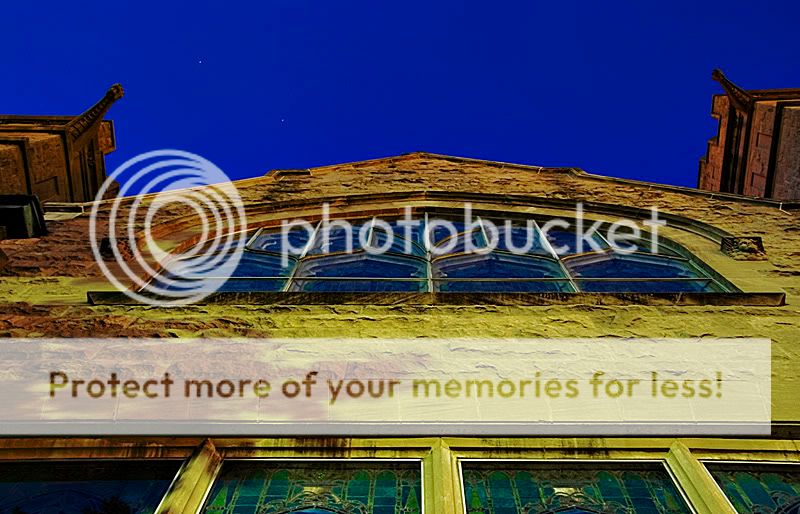

twotowers.jpg


twotowersBW.jpg


?:blushing:? It seems a shame to lose all that color, but I love black and white. What do you think?
 
Ooooo the black and white makes it so dramatic. My vote goes to that.
 
"Dramatic' is the right word to describe it. I love the perspective you took with this shot, but I am curious if you have tried 'straightening out the lines' just a tad bit. (Might be from lens distortion, but I just feel like I want to take a single step to the right)
 
Thanks WNK.

Peanuts-- Yes the lines have been straightened. There was alot more distortion before editing. If you look at the horizontal line just above the bottom of the frame, it is straight. I chose a slightly off centered composition purposely. The towers of the building are not perfectly aligned on the church (the one on the right is closer and taller).

That said, which version do you like better?

Thanks fer looking.:)
 
You name this thread right: "Decisions, decisions".
This is a tough one.
If I had only known the black and white version, I would have said "Ooo, all that drama" and "very interesting perspective" ...

... but now I have also seen that blue!
And now? :scratch:

Man, it is only 10 past 7 in the morning!
What can I say at this hour?
 
Now that you mention it, that is right that the towers are a tad bit off. Oh well, great fix up job though, I wouldn't have been able to tell it had been 'distorted' before.
Whoops! I did forget to mention which I liked better. Black and white for me.

Actually, oh crumb, I just read LaFoto's post and I can't make up my mind.
 
I like the black and white alot, but I think you should dialate the detail of the building. I think it would be awsome. Hey ote?
 
The first one is a bit too much on the yellow side for my tastes. Maybe if it were a bit desaturated.

I love the B&W one though. So my vote goes there.

One comment...I would {sit down for this one} shop out the stars ...I know...I know...if there was more of them it would be great, but the just two stars are a bit distracting.
 
tehbuffalo said:
I like the black and white alot, but I think you should dialate the detail of the building. I think it would be awsome. Hey ote?

Sure let's see what you got. I don't think more detail can be brought out of the building without oversharpening, but I'd love to see what you can do.

Quote RoRoCo:
shop out the stars

Blasphemer!! J/K I might try it out.........


for me I find the coloring very interesting. The black and white is great too, but the color just pops out...
 
Yeah I'd stick with the colour as well, you can nearly always make a photo look dramatic by putting it in black and white but its much rarer to get a photo with colours that great.

Tried this but it seems to me like the worst of both worlds as it doesnt have those vibrant colours from the building or the impact of the B&W.
blackandblue4py.jpg
 
LensBaby said:
Yeah I'd stick with the colour as well, you can nearly always make a photo look dramatic by putting it in black and white but its much rarer to get a photo with colours that great.

Tried this but it seems to me like the worst of both worlds as it doesnt have those vibrant colours from the building or the impact of the B&W.

Lensbaby... good start, but it looks too shopped along the edge. Maybe just desaturate the build to almost B&W and soften the edges of the building.
 
crawdaddio said:
Sure let's see what you got. I don't think more detail can be brought out of the building without oversharpening, but I'd love to see what you can do.
Actually I was going for less detail. Here.

twotowersBW.jpg
 

Most reactions

Back
Top