What's new

Decline of American small towns concentration

nreed_94

TPF Noob!
Joined
Aug 6, 2012
Messages
41
Reaction score
3
Location
North Carolina, USA
Can others edit my Photos
Photos OK to edit
Hey everyone,
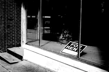
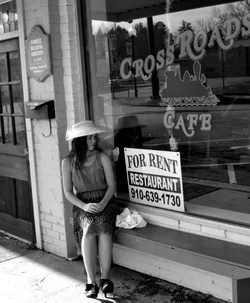
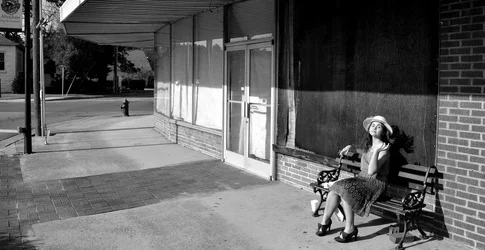
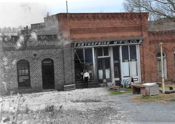
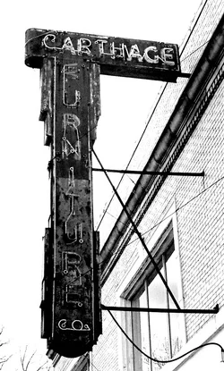
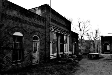
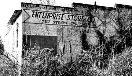
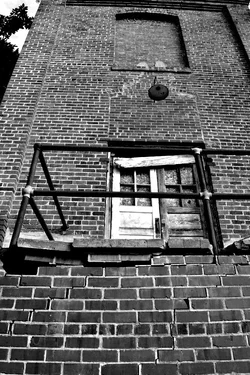
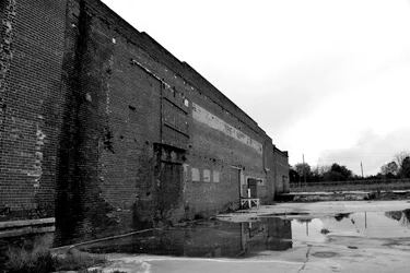
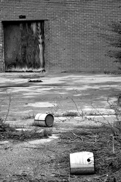
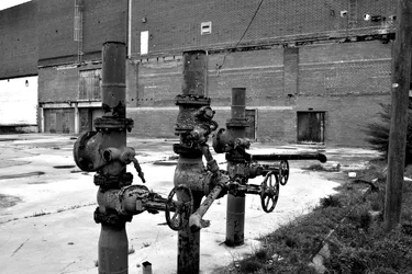
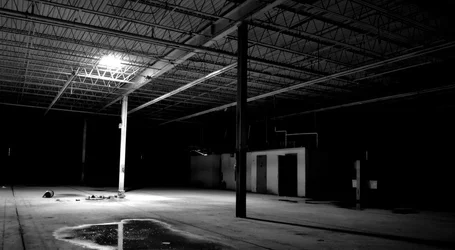
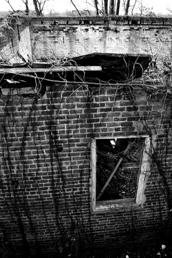
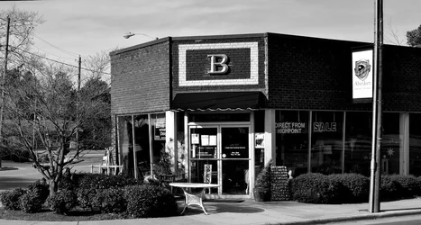
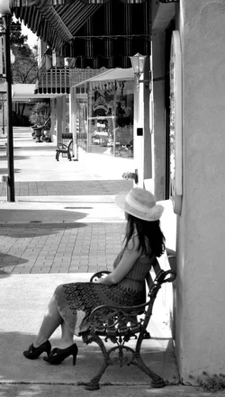
Last year for a photo project, I created a concentration of 15 works, all aimed at the decline of small American towns. I live in North Carolina, and rural communities are all around me. Driving through some smaller towns, I often see abandoned building, or run down businesses. I have taken a liking to photographing old building, in particular, businesses that once used to be great money making machines. My concentration is in three stages: 1) The successful town 2)The struggling business/on the brink of decay 3)The long forgotten and decaying business. I even have a before and after transition, showing one particular store at the height of it's business in the 1920s, and what the store looks like now. I took literally hundreds of photos AP Art class that I used this project for. The final result is a group of narrowed down works, selected by myself with the recommendation of my teacher. I have posted my results below. I can only post ten at a time, so I will put everything in ten posts. I hope everyone enjoys them. $DSC_0527.webp$3.webp$8.webp$7.webp$6.webp$10.webp$9.webp$11.webp$12.webp$14.webp
 
Last edited:
Other photos
 

Attachments

  • $18.webp
    $18.webp
    100.8 KB · Views: 180
  • $22.webp
    $22.webp
    152.9 KB · Views: 178
  • $23.webp
    $23.webp
    155 KB · Views: 183
  • $26.webp
    $26.webp
    59.5 KB · Views: 166
  • $13.webp
    $13.webp
    170.5 KB · Views: 167
Last edited:
i love them, im into photographing abandoned buildings and houses, love the look and feel of these
 
As a retired photography teacher, I only have one major tic and a few minor ones. The biggest detractor to me is the girl, not that a girl would or would be there, but that she looks contrived in her stance. the lesser ticky things are your blacks tend to block up too much. Open up your black or shadow slider a bit. Also, learn to get down on the ground or up on a ladder to break the eye-level shooting. Yes, you are shooting up or down as well as level, but this still limits your perspective considerably.

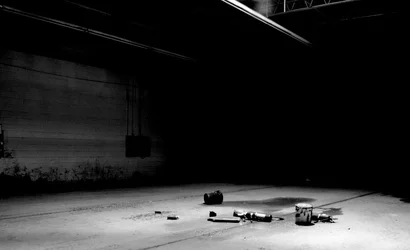
Go back into your editing software and upen up the dark areas in your last posted image as to me, that's your A level work. Do the same for the bottom left image in your first post. I want to see them, grasshopper.
 
Go back into your editing software and upen up the dark areas in your last posted image as to me, that's your A level work. Do the same for the bottom left image in your first post. I want to see them, grasshopper.


What do you mean by open up the dark areas? Do you mean make them lighter to show more? For that particular photo, the dark shadows that you see are how the inside of that factory actually looked. I tried making the shadows lighter to show more in Photoshop, and was unable to because the photo literally turned out with a "wall" of black all around that center ray of light. Below is another photo that demonstrates this better
 

Attachments

  • $27.webp
    $27.webp
    37.6 KB · Views: 177
Yep, the girl is no good. What on earth is she doing in the photos? Are these towns going to the dogs because we're allowing women to wear skirts above the ankles, and also high heels? She's pretty, and distracting.

You've got too many For Rent signs. One is enough, we get it. Too many pictures of "Enterprise" as well, we're supposed to buy a theme of decay when apparently all you can find is one business that's tanked, and you're just photographing it from every possible angle? Undermines the message, big time. Ditto brick buildings -- maybe that's all there is, but again, to give us a sense of breadth to the decay, you need to give us a breadth of subjects. These photos feel like they were all taken within a hundred yards of one another, or could have been.
 
Your abandoned towns look better than our functioning ones. :(
 
#6 you posted, the composite of the old picture with the new one. Very cool.

There's a similar picture hanging on my college town's visitor center.
 
Go back into your editing software and upen up the dark areas in your last posted image as to me, that's your A level work. Do the same for the bottom left image in your first post. I want to see them, grasshopper.


What do you mean by open up the dark areas? Do you mean make them lighter to show more? For that particular photo, the dark shadows that you see are how the inside of that factory actually looked. I tried making the shadows lighter to show more in Photoshop, and was unable to because the photo literally turned out with a "wall" of black all around that center ray of light. Below is another photo that demonstrates this better

Will you allow some edits?
 
Yep, the girl is no good. What on earth is she doing in the photos? Are these towns going to the dogs because we're allowing women to wear skirts above the ankles, and also high heels? She's pretty, and distracting.

You've got too many For Rent signs. One is enough, we get it. Too many pictures of "Enterprise" as well, we're supposed to buy a theme of decay when apparently all you can find is one business that's tanked, and you're just photographing it from every possible angle? Undermines the message, big time. Ditto brick buildings -- maybe that's all there is, but again, to give us a sense of breadth to the decay, you need to give us a breadth of subjects. These photos feel like they were all taken within a hundred yards of one another, or could have been.


1) It is obvious that you have missed the point of the girl in the photos. She is there to represent the older times when towns used to be center of business and recreation. Her clothing is clearly representative of the past, because nobody nowadays wears dresses, let alone anything appropriate. Her presence in the photos shows that the town still receives business, and that it is not forgotten or uninhabited.

2) The for rent signs are the transitional phase of my assignment. The for rent signs indicate the struggling business. Plus, there were only two.....not "too many". If I had only one photo of a struggling business, then that wouldn't make for much of a transition. The other phase of the decline is the boarded up building, with the girl in front. Her gesture of flipping her hair, shows that she is not too concerned about the business that is no longer there. Some how it ended up out of order when posted, it should go after the second for rent sign. Here is my order of events for the struggling town: a) the business goes under, and the for rent sign goes up b) The people of the town are concerned at first. The ominous look of the girl in front of the sign shows this. c) Eventually, nobody buys back the shop because the economy makes it difficult for anyone to open a new business d) eventually the building is boarded up to prevent squatters from moving in e) the local population slowly becomes less concerned with the building, until it is finally forgotten. The three picture (for rent, for rent with girl, and boarded building with girl) all represent this cycle. All of this culminates with her sitting in front of the boarded up windows, shrugging off the fact that what lays behind her is as a result of the decline of small town American businesses.

*I've gone back and rearranged these three photos to their proper order

3) There are more than just "one business that's tanked" represented in my photos. There are actually four. Enterprise store, Aberdeen furniture factory, a store in Carthage, and an old mill somewhere else in Coleridge. These locations are separated by miles, not yards. As for the bricks, you'd be hard pressed to find an old American building that was not make with either brick or wood. Unfortunately most old wooden businesses have disappeared entirely, so brick is all that is left.

4) Touching on the subject of breadth. This concentration includes many techniques and aspects of photography including but not limited to: contrast, hue, point of view, lighting, space, sharp angles, texture, FMB (foreground, middleground, background), color, etc. etc. I have also included multiple locations, added a touch of color, and even included a person to show some more abstract ideas.

@ceeboy14, yes, edits are allowed
 
Last edited:

Go back into your editing software and upen up the dark areas in your last posted image as to me, that's your A level work. Do the same for the bottom left image in your first post. I want to see them, grasshopper.


What do you mean by open up the dark areas? Do you mean make them lighter to show more? For that particular photo, the dark shadows that you see are how the inside of that factory actually looked. I tried making the shadows lighter to show more in Photoshop, and was unable to because the photo literally turned out with a "wall" of black all around that center ray of light. Below is another photo that demonstrates this better

Then, you exposed it incorrectly. if it is available to reshoot, open up a stop or so and get some more of that very dark area in some light. youcan always go back and make it a bit darker, but when you block in that much black, there's nothing to be gained no matter you do.
 
I don't think any of us missed the point of the girl, but almost everyone has commented that she looks overly contrived (regardless of your intent, it is the image that get judged, not your explanation). Two for rent signs was one too many. It's a"gimmick" and it will only fly once.

Let me explain to you the process of judging AP. We get a set of images (when I scored for AP, we got, if I remember right, 5 hard images (paper, painting, cloth, prints (i.e., lithographs, silkscreen, monoprints) and the rest were submitted as slides. There were a total of 28 images possible for grading, 12 breadth and 11 plus the five for the concentration for a total of 16 (it's been 15 or so years so don't hold me fast to these numbers). We were given on the average of 12 to 15 minutes tops to assess, judge to specific criteria, score and go to the next bunch. There is no time to speculate on the artists intent. For a score of a 5, the artist must be able to visually show intent and technique at the onset of judging. I had to see each image in the groupings as a concentrated study whereas the artist could prove to me there was study, application and calculated process involved. To get a 4, the artist had to show all the above but be a bit weaker in one area. Generally I saw the weakness more in the concentration, less in breadth. For a 3, there was weaknesses on both sides, mostly with technique, craftsmanship and a limited choice of media. 1's, 2's and NG's were easy. Most fell into that category.

There is a writeup which goes with the submission. I always gave them a cursory glance after I scored, never before so as not to cloud my professional judgement. So, all the stuff you have in #2, toss it out of your mind now, and get thee back to producing quality images. You need far more variety, far more interesting shooting angles, different photographic applications on differing media - try liquid emulsion on wood, glass and brick. make solarplates and print on old newspapers which tell of businesses closing. A lot of papers are archived at the public library or at your local rag..for a nominal fee they will make copies for you. try some alternative processes. You can buy a very inexpensive salt printing kit from Bostick & Sullivan, Santa Fe, NM which will make 25 or so 5x7's. If you have a color printer of decent capability, PM me and I will send you a digial curve for making a digital negative and all the instructions for exposure (sun) and developing (water - with a sodium thiosulphate fixing bath).

Breadth is not a concentration, breadth shows the judge you have explored a variety of media, pushed said media to its best application and appearance. The concentration is choosing either one or more media and applying them to a very subjective concentration of study: Direction, dereliction, a social comment on the homeless, bumpy surfaces, figues and forms, etc.

Going back to the girl. If I wanted to show a "past" in the present, I'd use long exposures of multiples of people milling in and out of the buildings. This would show a judge a mastery of your media, convey the sense of time lost, and invite further thought - however short the time. When I got portfolios that did this, they went into a special category for prize consideration; be one of those people.
 
I don't think any of us missed the point of the girl, but almost everyone has commented that she looks overly contrived (regardless of your intent, it is the image that get judged, not your explanation).
To get a 4, the artist had to show all the above but be a bit weaker in one area. Generally I saw the weakness more in the concentration, less in breadth. For a 3, there was weaknesses on both sides, mostly with technique, craftsmanship and a limited choice of media. 1's, 2's and NG's were easy. Most fell into that category.

On a side note, this concentration has already gone through the AP grading process, and has received a score of 4. My weak area, as discussed by my class and my AP photo instructor was not my photography, but instead my hand done sketches and paintings. After all, it is an AP art class, none of what we submit is supposed to be professionally done. As for the breadth, I do have a "breadth" comprised of paintings, sketches, photos, etc.
 
Hey man, I'm just telling you my reaction. Your intent and your ideas are one thing, and you seem to have thought through a lot of the stuff.

My reaction, though, is a measure of how successful you were. I am but one viewer, but the greatest value I can give to you is to tell you how well your ideas communicated to me. Do that with a reasonable number of viewers, and you'll get an idea of how well you're communicating overall. I can only be one sample point for you, but I can be the clearest and most definite sample point I can be, which is what I tried to do.
 
And Amolitor is dead on correct...had I been grading based on what you've shown, I would not have gone higher than a 3 and that would have been pretty much the average score, but then I'm an old school stodgy old f*rt and things were different then...oh well, probably good I'm out of that trade.

That said, the work you've submitted to us is indicative of someone working at becoming a good photographer. My thoughts throughout this whole dialogue is you tend to want to defend rather than learn and having endured this student thinking process for over 20 years, my best advice would be to swallow your pride, open your ears and learn from those who've gone before you, learn from those who are with you and learn from being able to look at a decent image and toss in in the bin because it could be better. Roll Tide!
 

Create an account or login to comment

You must be a member in order to leave a comment

Create account

Create an account on our community. It's easy!

Log in

Already have an account? Log in here.

Back
Top Bottom