Despair

Bend The Light

No longer a newbie, moving up!
Joined
Jun 8, 2010
Messages
2,591
Reaction score
375
Location
Barnsley, Oop-Nooerth, UK
Website
www.flickr.com
Can others edit my Photos
Photos OK to edit
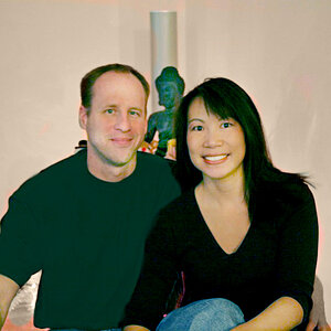
A few from this evening with a friend...he does quite good despair...he's not so good at jolly. :)

Darkness is intentional, but feel free to critique as you will. :)


4-5-2012 Andy Sadness Despair v8 by http://bendthelight.me.uk, on Flickr


4-5-2012 Andy Sadness Despair v5 by http://bendthelight.me.uk, on Flickr


4-5-2012 Andy Sadness Despair v1 by http://bendthelight.me.uk, on Flickr


4-5-2012 Andy Sadness Despair v2 by http://bendthelight.me.uk, on Flickr


4-5-2012 Andy Sadness Despair v4 by http://bendthelight.me.uk, on Flickr


4-5-2012 Andy Sadness Despair v6 by http://bendthelight.me.uk, on Flickr

All your constructive thoughts gratefully accepted. :)
 
I like the idea, darkness included, but to me "dark" should mean that I'm still able to perceive details, while perceiving them as dark. Solid black is different and does not carry details by itself. So, I would try to achieve separation from background -not that I know exactly how, however the subject should be visible, even if dark. #2 and last the best.
 
I like the idea, darkness included, but to me "dark" should mean that I'm still able to perceive details, while perceiving them as dark. Solid black is different and does not carry details by itself. So, I would try to achieve separation from background -not that I know exactly how, however the subject should be visible, even if dark. #2 and last the best.

Thanks for the reply. I know what you are saying, and in some cases would agree. I do, however, think there is a call sometimes for a lack of detail...after all, were this a journalistic image rather than a set-up, the details hidden in shadow would be part of the image. I know from talking at length to my brother, who does film and TV lighting, that there is now more call for realistic lighting (or lack of it!) in film and TV, and that lighting everything all the time to make everything clear on the TV screen is not what is "current".

but anyway, appreciate the time to comment, and I will have a go at dark, with separation, at another stage...it would be a good skill to have, and I have only achieved it well (I think) on one other photo. :)

Cheers
 
I like dark b/w's and your friend is a good model. My favourite is the pensive mono one because even though it is still dark you can see more detail in his face which is lost in the first ones. Having said that, I think photo 5 works well as his legs are pulled in and his pose more huddled so he is diminishing into the darkness which, I think, portrays despair very well. :thumbup:
 
I like dark b/w's and your friend is a good model. My favourite is the pensive mono one because even though it is still dark you can see more detail in his face which is lost in the first ones. Having said that, I think photo 5 works well as his legs are pulled in and his pose more huddled so he is diminishing into the darkness which, I think, portrays despair very well. :thumbup:

Thank you. :)

In 5, and a few others, we were basing it on real life, in a way. Andy is a religious man, and we/he decided some of his poses were bordering on how he would be were he praying etc. So we used some of that...

...we also were talking about him modelling, and how he isn't particularly a "looker". We decided that a real, perhaps craggy, perhaps even slightly ugly didn't bother us in the slightest, and in fact was much more appropriate in these cases. Characterful faces and mannerisms work so well where a pretty boy, smooth faced, fashion model wouldn't work here. I'm lucky to have him as a mate. :)

Cheers
 
I like what you are exploring with the lighting. Some of my thoughts are below.

1- I would have preferred to have the main light slightly more forward to illuminate his eye. It appears rather hot on the shoulder, and the brightness difference between the right and left arms implies that the light source was rather close to him. You had a fill on the left which worked well on his shirt, but I would have liked just a little more illumination on the left side (his right) of the face.

2-I like what you did with the light there, but again, I think if the light was slightly more forward, the image on the face would be better.

3 – The pose is good, the image conveys “despair” quite well. But the way the head disapears between his shoulders reduces the visual power, as we have to search for what happened to the head. If you could find a way to tone down the brightness on the shoulder while still illuminating the face and arms, I think the image would be stronger.

4 – Probably the strongest in the set conveying “despair”. The head is more visible although I am still wishing the light was slightly more forward, and the shoulder illumination less hot.

5 – I find this one the least convincing, both in terms of pose and the light. Head disappears, and although we “know” that the hands are in front of the face, visually the head almost isn’t there.

6 – This close up suffers from the same issue as the previous shot – no detail in the head, and the hand position does not in itself convey the emotion you want us to feel.

It is my impression that if we saw more of his face (not too much, but a tad more than you did in this series) we'd be able to relate to Andy better, and appreciate the anguish/despair that he is modelling. As for his looks, he's a great model and there is lots of character showing in the other images you have of him.

Thank you for posting, your efforts are helping me think about how to use light in portraiture and in conveying emotion.

Great critique, and yes, it boils down to that light on the right, i think. it's both blowing out the shirt (well, not uite, actually, but it is too bright) and it's in the wrong position to light the face a little. I didn't want everything exposed to be seen, but a tad more might just do it. Andy is a good mate, and an amateur photographer and so is keen to just BE in the studio, whether modelling or taking a few pictures. Plenty of opportunity for further play! :)
 
Not too bad. Maybe tone it down a bit on the darkness but poses worked well.
 

Most reactions

Back
Top