Don't shoot me!

JeffieLove

No longer a newbie, moving up!
Joined
Feb 8, 2010
Messages
1,601
Reaction score
15
Location
Elkton, MD
Can others edit my Photos
Photos OK to edit
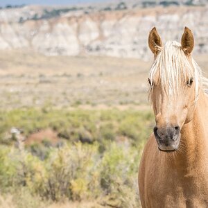
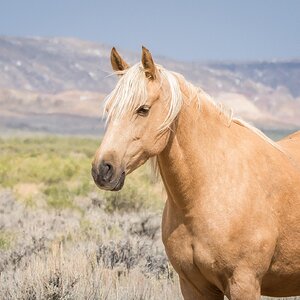
I know everyone hates the watermark/logo questions and all that, but I'm just curious (I doubt I'm going to get any REAL answers here, but figured I'd try anyway...) what you all think of this type of logo... I've seen different renditions of this on LOTS of semi-pro photos and I've had this "envisioned' for a while now, just needed to get it made... So, I'm asking about the watermark/logo thing NOT the actual image itself :) This is NOT one of my best images, just the first one I happened to open...


*Deleted images because I got the help I needed and didn't want tons of "logo" tests taking up my photo stream..*
 
Last edited:
I like it! Maybe might make a little bit smaller? And loooove the image! How freak'n cute is that! and I love the bow!!!
 
I like it! Maybe might make a little bit smaller? And loooove the image! How freak'n cute is that! and I love the bow!!!

I agree....make it smaller and maybe lower the opacity a bit...
 
I like the script font. and it works really well.

Since this would be for a logo, I would manually track in the space between "T" and "i" in Time, as well as the "o" and "g" in photography and so on. Just looks like the standard kerning is off a bit and needs some adjustments.

Smaller and less opacity as others have mentioned would be a nice add too.
 
Why not put it over there in the left corner? You know, where the subject isn't.
 
because for some reason, my mind just sees these "marks" in the bottom right... IDK :/ lol
 
K, here's one with the "mark" shrunk a little and opacity lowered...

*Deleted images because I got the help I needed and didn't want tons of "logo" tests taking up my photo stream..*
 
Last edited:
IMHO its still too large. The first thing my eye is drawn to is the logo.

I like the logo... just that it competes with the photo. I think it should be 1/3 - 1/4 of its current size. If not smaller... But that is my personal point of view.
 
I agree, way to big. And it should be in the lower left corner, where there is a giant empty space, instead of covering 1/2 of the subject.

Also, just for the record, I hate all photography names that have anything to do with time. Moments In Time, Slices Of Time, Nuggets of Time, Traveling In Time, Time To Get A Picture... I hate them all. We get it. Photography captures pieces of time, and preserves them. Sorry. Not necessarily trying to be a jerk, but I just can't hold it in any longer.
 
Oh well, my name ismt changing. I like it and so do my clients. I considered changing it and had taken votes from friends and they all agreed that I should stick with this. It fits me :)
 
So, I'm asking about the watermark/logo thing NOT the actual image itself :) This is NOT one of my best images, just the first one I happened to open...
Cuz, well, you know, it's all about the logo, not about quality photography.
 
I like it! looks better smaller. And i might be wrong but I thought a water mark was so ppl dont steal your images. I have seen some right on the face of the image.. lol. All personal preference I think.. : )
 
...... I'm only the piano player.

My idea of the watermark/logo, if in a self-promotional use, is to NOT interfere with viewing the main subject. Perhaps I'm mistaken. I really don't know because I don't use them.
 

Most reactions

New Topics

Back
Top