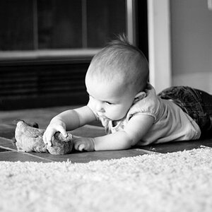
On the shot of the toddler, I would be tempted to reallllly add a lot of "digital fill light" to the face. Not sure what editing app you are using, but fill light is what I would add, one way olr another. Then, re-intensify it by changing the black point, or by adjusting the curves, and/or by boosting the clarity a bit, or maybe a little bit of all three of those tools.
The shot of the older boy/young man in red cap with the baby on his lap...cute situation, and it is instructive as to how the face position relates to the light placement. As Tirediron mentions, the nose shadow of the red-hatted guy is not good, but the light is hitting the baby full-face, so he has no objectionable shadows. If the older boy had been say, turned toward the flash, then he too would be lighted in the same way. I think the nose shadow on the red-hatted guy hurts the image. Had the flash been placed more at say 7 o'clock instead of 9 o'clock, the lighting effect would have been different. Still, the shadow does give a strong, strong depth clue on the face, and it also makes his t-shirt look textured. And that's one thing this strong side-lighting is doing--it is showing a LOT of texture, and giving a LOT of depth clues, which can be a good thing. The carpeted stairts, and even the floor, are showing in really good relief in the shot of the baby--no mistaking either of these for a flat, on-camera,straight ahead flash snap. THEY BOTH look "lighted".



 Pixmedic's Photo Contest! ($100 prize)




![[No title]](/data/xfmg/thumbnail/32/32003-70dfe149c27224e28ba98e975984e01e.jpg?1734160786)