Several comments:
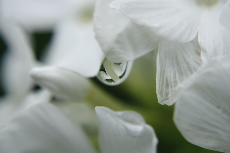
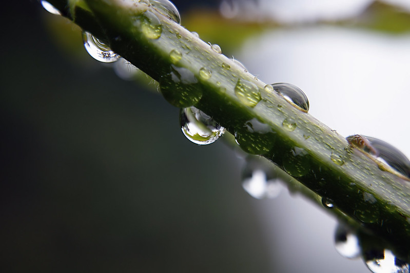
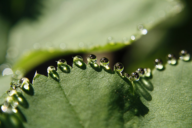
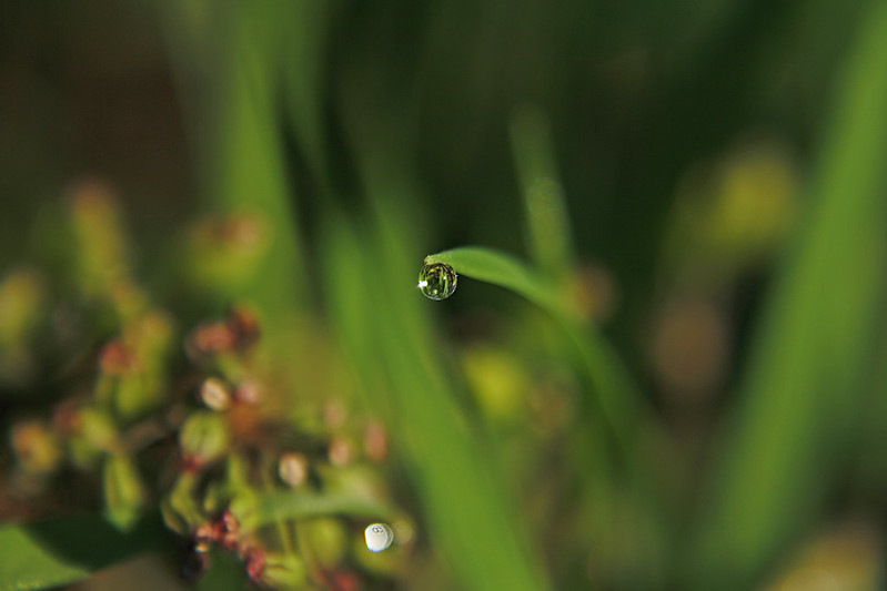
All the images have the drops centered in the image. While that makes it clear to the viewer what you want us to look at, it also generally creates a static image. Why static? because you are not giving the viewer's eye anything to explore in a "guided" way. When we initially perceive an image, our eyes are usually attracted to the brightest and sharpest parts of the image. From there, the eye tends to follow lines and gradations of shade and explore the opposites (dark, contrasting colors). Using diagonals and curves in the image usually invites the eye to follow them – so photographers (and visual artists) use these elements to guide the viewer to different parts of the image.
My second comment is the role of the background and foreground to establish the visual context. If it is brighter than your main subject, you have a conflict between the bright areas attracting the eye, and the main subject which "should" be where the eye gaze should fall. As well, does the background or foreground complement the subject, or does it compete? Often times, if the background is TOO distinct, then the visual impact of the main subject is diminished.
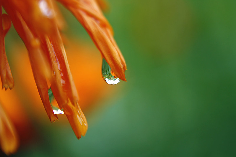
#1 – the drop in centered, but the drop itself is somewhat out of focus. The out-of-focus petal immediately to its left is brighter, and competes with the drop. The in-focus petals on the right also compete because they are more detailed than the drop. The petals lensed by the drop are sharp, but not very distinct as to what they are. So, good concept, but execution needs a bit more work.
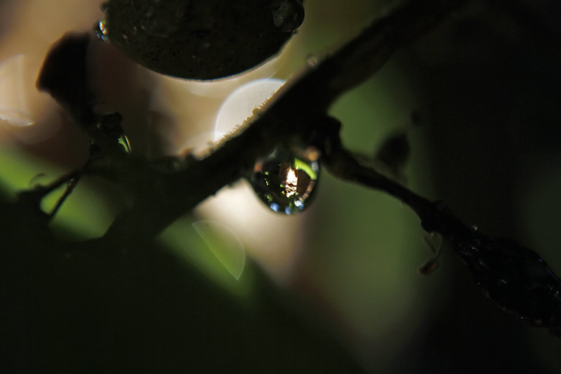
#2 – You have a strong diagonal in form of the branch/stem on which the drops are found, but it does not directly contribute to guiding our eye. Again, the brightest area is at right, out of focus, and it pulls the eye away from the drop. The drop itself is in focus, but the image it lenses is not particularly interesting. To improve the picture, I'd suggest moving slightly to the right, and adjust the view to the left, so that the bright background is not visible, or at least is not as prominent.
#3 – beautiful image. The drops are well focused, on a s-curved shape (edge of leaf), and definitely catch our attention. However... the backround leaf is sufficiently distinct to compete a bit with the drops in the center. Here again a little shift (downward) would move the competing background out of the way.
#4 – another very nice image. Here, the right third of the image does not contribute, while the out-of-focus lower left plant parts seem to echo the roundness of the drop and therefore contribute to the image. I'd recrop the image to eliminate the right 1/3 of the frame.
#5 – nice image. The green background complements the flower petals, and the out-of-focus orange area behind the drop does not compete with the drop as the drop is much sharper and distinct. However, the right quarter of the frame has essentially empty space which can be cropped out. That cropping would also serve to move the drop away from the center, and allow the eye to make a visual diagonal to the other drop on its lower left.
#6 – While the drop itself is well framed, it again is rather indistinct, and the darkness surrounding it is not very pleasing, at least to my eye. The out-of-focus semicircle of brightness behind the branch competes somewhat with the drop. Of the series you posted, I would consider this one the weakest.
In summary, I will complement your vision for seeing the beauty in these drops, and would encourage you to consider how to present the subjects so that their attributes are best seen, and supported by the background/foreground.






![[No title]](/data/xfmg/thumbnail/39/39185-29433e4f46e4b0bd394d10962886594c.jpg?1734173059)