Drumheller.

noescape

TPF Noob!
Joined
Jun 7, 2007
Messages
385
Reaction score
0
Location
Wow, stalker much?
Can others edit my Photos
Photos OK to edit
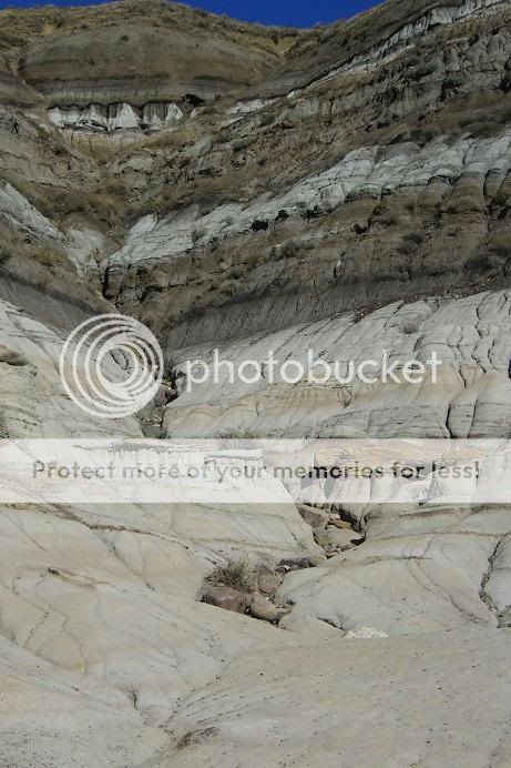
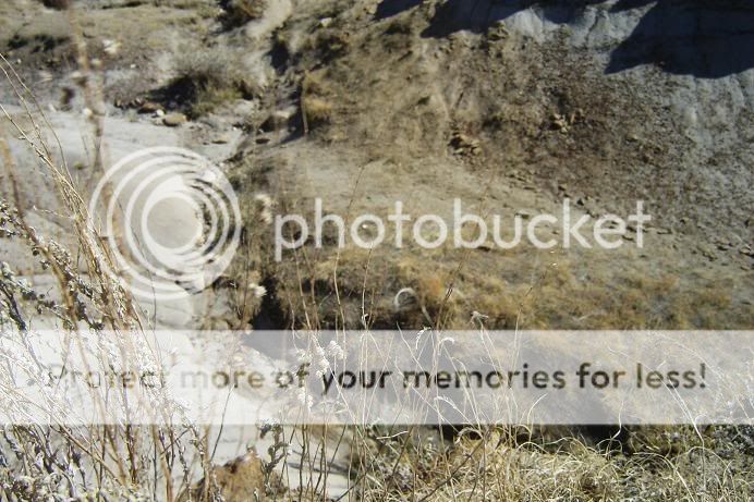
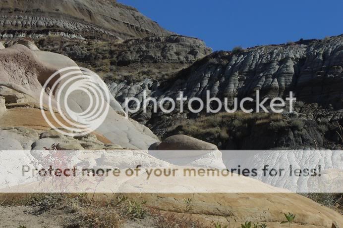
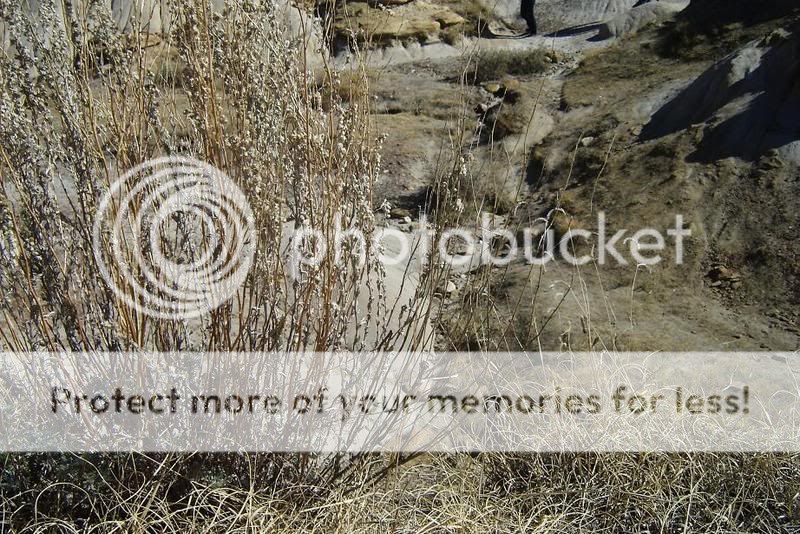
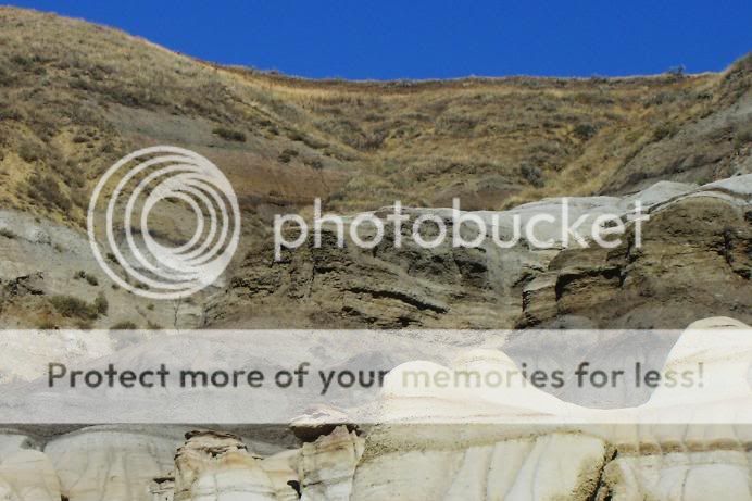
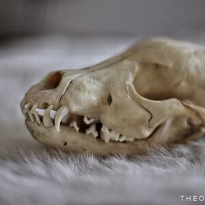
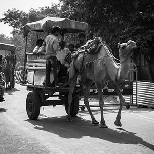
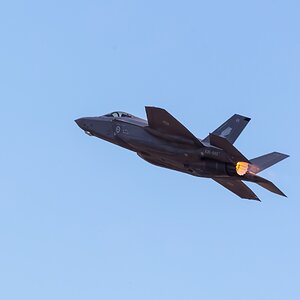
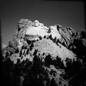
These were taken in Drumheller, Alberta.
Don't yawn too hard... rofl. :er: Critque is welcome.


1.

drumheller5.jpg


2.

drumheller1.jpg


3.

drumheller6.jpg


4.

drumheller2.jpg


5.

drumheller8.jpg


6.

drumheller12.jpg


Wow. These truly are boring. Let me know what you think... BTW I highly recommend a visit here- absolutely amazing to see in person.
 
Drumheller! We used to go through there on our way from Saskatoon to Banff a couple times each summer... It's been too long since the last visit :(

I like 1, 3 and 5 best. They could use a little tweaking though to add some 'Oomph'... A little bit of levels and saturation.
 
Thanks Kate! Yes I really wish I could edit them....... but my computer crashed and I lost Photoshop!!! (stop the world... It kills me!)
 
3 and 5 do suggest that one should really go look at that area of the world in person! They are easily the best of the bunch, I think.

Geologist's dorado?
Maybe eventually my son will go there on excursion. He might then invite his old mother to come along... ;).
 
I was there this past summer for the first time! Visited my wife’s aunt who lives in Calgary and spent a week in Banff and Drumheller. Really cool place.

Here are my 2cents, for whatever they are worth:

1- Clear and good focus in picture, but the composition doesn’t do it for me. There is too much in the foreground (where there is less detail too look at) and less in the background (which has more interesting detail). Not sure how you would make this one more interesting

2- I see what you were going for, and technically it’s a well done and exposed picture, but it’s a bit boring. Dead branches or stems with a background that is similar in colour and look. The shadows at the top of the picture are also a bit distracting.

3- Now this brings back the images I saw this past summer. Nice sky, great 3d look (depth), with a funky little red plant/flower in the front for contrast. My fave of your set

4- Same as #2

5- Interesting perspective shot but I feel that if you caught the top of the those hills that are at the top and top left of your image, it might of given a better sense. The colours really do capture what the place is like though

6- For the shot itself, I think this would have been better with a sharper image in the back. For the look you were going for, getting in closer to those two white things in the lower right hand side and re-composing, using those in the foreground might work.
 
Thanks guys!!! Yea I know there are some serious technical errors going on... I took these with my pitiful little PNS that has since kicked the bucket. Not an excuse of course... but yea. I hope to go out there again in the future... with a MUCH better camera and more time!!!Thanks for the critique! :)
 

Most reactions

New Topics

Back
Top