Eastern University, Diversity (BESP numero duos)

Why? The viewer can tell immediately what each image is.
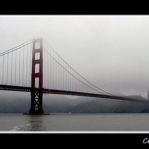
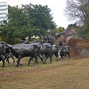
I find the composition in #3-4 boring. There is no impact.

Ask questions.
I give the project, nobody asks questions.
I ask midway through if anyone has any questions...

So is the project lines ?
 
Concerning the abstract submission, the colors are complimentary. I think I would like to see the whole thing within the DOF though. There isn't anything particularly striking about it.

I think there are probably a million & one abstract compositions available with that piano, but you might need a macro lens or a tube.

tube?
 
Bitter did state in the assignment that the viewer should wonder what you took a picture of....
However, im in the same situation with the ones i posted. I just couldnt get anything abstract that looked good to me....
I like your photos, but as already been said...not abstract. Im sure the same will be said about mine. :(
That art class i took several years ago didnt help me at all!! LOL
 
I think you got the lines, the perspective, the patterns, the colors which were part of the assignment. The only thing left was to hide the subject. Unfortunately anybody can tell you what the object was.

The are some tricks that you may want to apply next time like shooting really close to the subject hiding the key parts that could identify the subject and leaving those elements which could show lines, patterns etc. Notice that I am not talking about macros or tubes. A regular 18-55 could do it, if you shot it really close to your subject.
 
The second image of piano keys is really nice. I don't think it is the most "abstract" of the bunch but I really like it anyways. The broken key makes a nice focal point and the DOF works.

I like the DOF of the second to last image, but the angle of the last. Alternatively moving the focal point of the last to an intersection of lines but keeping the smaller DOF might have been pleasing as well I think.

For the first, I like the lines of specular highlights. The only nit would be the in focus reed/branch running straight across the frame and out the other side makes my eyes do just that.
 
#1 - WTF?

#2 - This shot has been done to death, but the real question is....... How is this an abstract?

#3 & 4 - Each have an arbitrary focal point that has NO point. Neither the point of view nor the tilt works for me.

Sorry, :thumbdown: on the assignment.
 
Did any of you scroll down the 1st page to see the second upload i did to meet bitter's req?
 
Did any of you scroll down the 1st page to see the second upload i did to meet bitter's req?

More along the lines of abstract than the others, but it still looks very common like a boardwalk with flaking off nonskid paint.
 
On a note totally unrelated to photography... I have a friend who graduated from Eastern last year, who is actually back visiting right now. She loves it there, seeing some of you pics I can see why

-tim
 

Most reactions

Back
Top