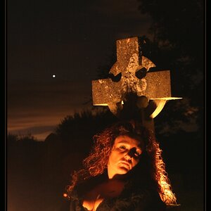
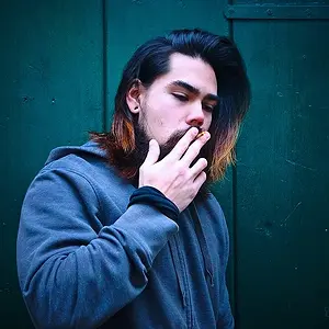
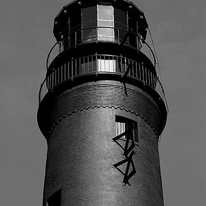
No, I wasn't high at that point...I was still at work and I don't feel like being disrespectful to the organization I work for. But, yes...I was facetious with the logo and what-not. Although the font being masculine isn't the reason why I chose to the use the one I did, but now that I look at it, it does give off that feel doesn't it. I did use the big font on purpose though. It sometimes feels as though the logo is the dominating piece of some photographs that include it and so wanted to convey that same feeling with this photo. Actually, while attempting a re-edit, I noticed I was screwing it up and making it look worse. I figured, hey, other people put logos on crappy photos, maybe that's what makes a "prize-winning" photo...take a turd and put a ribbon on it. Woo-hoo...county fair, here I come! Booking weddings as you read this. Oh yeah, and for a very limited time, at the low, low price of only $2500, I can take snapshots of your babies...Don't worry I am professional...what do you mean what am I wearing underneath this trenchcoat? A pacifier obviously.