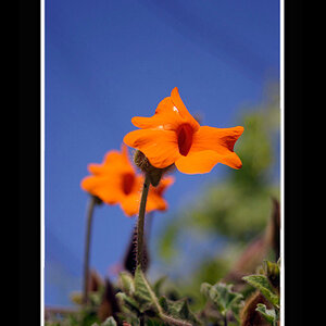
I'm confused as to whether or not this is intended as a graphic design piece or a photo?
The "watermark" doesn't even look subtle like a watermark, it looks more like a logo.
If it's a graphic design piece to be used for a brochure or ad, then I like the border but the name should be a little darker because the "PHO" get lost in the tower...
If it's simply a photo with a border and "watermark", the watermark is really distracting and the border is a little much. Nice photo otherwise.