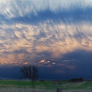
I'm seeing two images; how many did you post?
C&C per req:
1. A nice concept, but I think the sun would have been better placed just above their heads. this makes them look like they're engaging in a Vulcan Mind-meld gone horribly wrong. I think just above their heads, shining down would have worked better. As well, watch the details; would it really have been too much effort to move the garbage bag, and the fellow has soemthing growing out of his back. I think too, a tighter framing might not have gone amiss.
2. This should definitely have been shot in portrait aspect IMO. You've got a lot of wasted space behind her and a cropped elbow. Additionally, while the railing behind her is perfectly level, the horizon is wayyy off. In case like this, you need to middle them, or level so that it looks right.








![[No title]](/data/xfmg/thumbnail/37/37280-a7e70a01ccd331918e71645cd4c1f16e.jpg?1734170137)