What's new

Engagement-Shooting Italy - Malcesine 2011

SteffenL

TPF Noob!
Joined
Feb 24, 2011
Messages
5
Reaction score
4
Location
Fulda Germany near Frankfurt
Can others edit my Photos
Photos NOT OK to edit
More Pictures on my Blog

http://www.hochzeitsfotograf-fulda.de/index.php?/Blog/

or on Facebook Fanpage

Steffen Löffler www.Hochzeitsfotograf-fulda.de | Facebook

Have Fun :-)
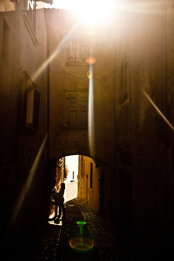

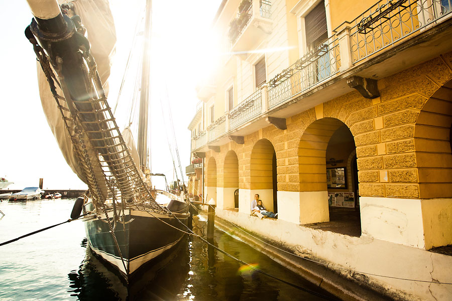
110516_hochzeitsfotograf-fulda_001.jpg


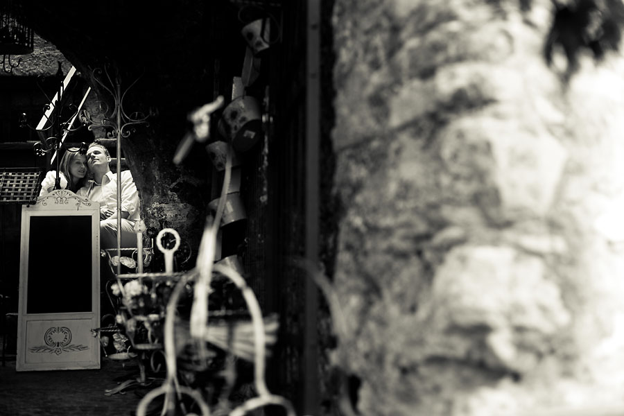
110516_hochzeitsfotograf-fulda_028.jpg


110516_hochzeitsfotograf-fulda_038.jpg
 
Maybe it's just me, but the subjects don't appear to be obvious enough in the frames you posted. I would figure the couple would like more emphasis placed on them, since they're getting engaged, ya know?
 
I had to struggle to find the subjects in each frame.
 
oooo it's like wheres waldo...


edit*

YES! i just found them in #1...can someone give me a clue on 2 and 3? :blushing:
 
i see what you where trying to do but you placed your subjects way too far to be noticed. The second one is a perfect example of that, if you didn't tell me there would be people in the image i would think your taking a picture of the sail boat. The first and last one where almost there but again you put too much ephasis on the foreground. Also in the first one, there is too much sun being exposed, it almost kills the romantic mood of the photo, a slight drop of the camera which would have cut the sun in half would have worked perfectly and most likely got rid of the green flare.

Cheers
 
I like them. Tyler brought up a good point but these are fine to complement other "usual" photos. #1 is fantastic. I love everything about it.
 
I second the 'Where's Waldo?' effect. In the second photo, my eye was immediately drawn to the ship. If I didn't know it was an engagement photo, I wouldn't have even looked for them (the ship does look great, though). In the final one I'm not sure how I feel about such a large portion of what seems like a brick wall in the right side of the frame. I like that you went out of the box, but I agree that the couple need to be highlighted a bit more.
 
Well, I really like the first and third. I would have like to have seen a tad more of them in the third, but I still like it. The second is entirely too hiden for my tastes, but still cool. I would have liked to have seen 1 without the glare as well to see what it would look like, but what you have is still cool. I just hope you have formal portraits as well to coincide with these good artistic ones.

Mark
 

Create an account or login to comment

You must be a member in order to leave a comment

Create account

Create an account on our community. It's easy!

Log in

Already have an account? Log in here.

Back
Top Bottom