Family portraits.

ronlane

What's next?
Joined
Aug 3, 2012
Messages
10,224
Reaction score
4,961
Location
Mustang Oklahoma
Website
www.lane-images.com
Can others edit my Photos
Photos OK to edit
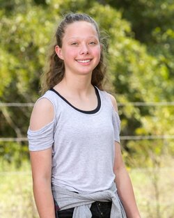
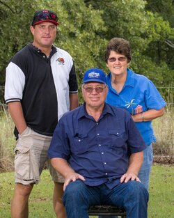
Went back home over the weekend and took portraits for my family. (Mom's request) I got everything set up on Sunday morning and was hiding from the sun. Used strobes to help fill in. This is one of my parents and my brother. Was looking for a shaded area with minimal distractions in the background. Used a 70-200mm f/2.8 at about 93mm (was wanting it at 100mm). It is cropped at 8x10 size in LR with camera profile, wb and basic panel adjustments with a local adjustment on the eyes.
29462550251_d78f494d34_b.jpg
 
Nice job on the lighting; that's just about a perfect match as far as you can get. Was that using the Godox? As far as the image itself, the only thing that I see that I would have done differently is the posing. To me it looks a little odd having Dad seated, Mom behind and brother on the side. I think given the casual clothing I would have placed Dad on the right, Mom close against him in the middle and brother just a bit separated on the left. Also, don't forget to check the glasses; in this case, the frames aren't cutting through the eyes, but they are close.
 
Last edited:
Nice job on the lighting; that's just about a perfect match as far as you can get. Was that using the Godox? As far as the image itself, the only thing that I see that I would have done differently is the posing. To me it looks a little odd having Dad seated, Mom behind and brother on the side. I think given the casual clothing I would have placed Dad on the right, Mom close against him in the middle and brother just a bit separated on the left. Also, don't forget to check the glasses; in this case, the frames aren't cutting through the eyes, but they are close.

Thank you John. I remembered the triangles but there is always room to be better. I see what you are saying and this one would have been better if they all were standing. I used the seat because I brought in the kids (grandkids) they are shorter and I think it tied together better. (I'll get one of those posted to show you the big group) Actually I used 3 lights on this one. The 360 was camera left along with a monolight and then another monolight on the camera right to help fill in shadows there. I was trying to be really careful not to flat light the images but I didn't want dark shadows either. I saw the glasses too, lesson there is to lower the tripod just a little more.

Nice portrait and fantastic info from tirediron, very useful.

Thank you JC. I agree John offers some really good information to help me improve.
 
...I saw the glasses too, lesson there is to lower the tripod just a little more..
Actually, just tell them to push their glasses further back on their nose. It will feel un-natural to them, but it will look better in the photo.
 
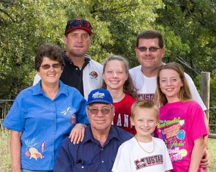
Here is one of the group. (My wife pressed the shutter button on this one.) I had some shadows on a couple of faces but this was the group shot that I originally had in mind with the chair.

29258382830_f79fb2b1e7_b.jpg
 
lso, don't forget to check the glasses; in this case, the frames aren't cutting through the eyes, but they are close.

Actually, just tell them to push their glasses further back on their nose. It will feel un-natural to them, but it will look better in the photo.

And here's another tidbit to add to my cheat sheet notebook I'm building
 
Not bad; there are a few shadows, but they're relatively light and unobtrusive. Their position tells me that your lights were probably a bit lower than they should have been.
 
lso, don't forget to check the glasses; in this case, the frames aren't cutting through the eyes, but they are close.

Actually, just tell them to push their glasses further back on their nose. It will feel un-natural to them, but it will look better in the photo.

And here's another tidbit to add to my cheat sheet notebook I'm building

100% agree with you Smoke. I didn't notice it until I got home and was editing them. I wasn't happy with all of our transition lenses but that is what it is.
 
Not bad; there are a few shadows, but they're relatively light and unobtrusive. Their position tells me that your lights were probably a bit lower than they should have been.

I wondered that. I didn't raise them all the way but I did have them up about above 6.5' maybe 7'.
 
Generally speaking I like to have my lights high enough to be angled down at about 30 degrees or so.
 
Actually, I don't see any real lighting issue there at all. It's a bit flat, but for an outdoor image like this, I don't see that as a bad thing. The shadows I was referring to are the ones in the group image which are being cast by people's heads. If you look at your brother's chin/chest, there's a distinct shadow cast by your mother's head and on your shirt, the shadow from your daughter's head is apparent. Raising the light so that it's hitting the subjects from above rather than the side will help to eliminate that [relatively minor] problem.
 
Actually, I don't see any real lighting issue there at all. It's a bit flat, but for an outdoor image like this, I don't see that as a bad thing. The shadows I was referring to are the ones in the group image which are being cast by people's heads. If you look at your brother's chin/chest, there's a distinct shadow cast by your mother's head and on your shirt, the shadow from your daughter's head is apparent. Raising the light so that it's hitting the subjects from above rather than the side will help to eliminate that [relatively minor] problem.

Right, those are the shadows that caught my eye too in post. (why couldn't I catch it earlier??) I just say that about this one because a little higher here would give it the Rembrandt lighting with the nose.
Okay, I see what you mean. Honestly though? I like the look you've got here for an outdoor fill/ambient scheme.
 

Most reactions

Back
Top