Samerr9
TPF Noob!
- Joined
- Jan 15, 2011
- Messages
- 683
- Reaction score
- 46
- Location
- Abu Dhabi,UAE
- Can others edit my Photos
- Photos OK to edit
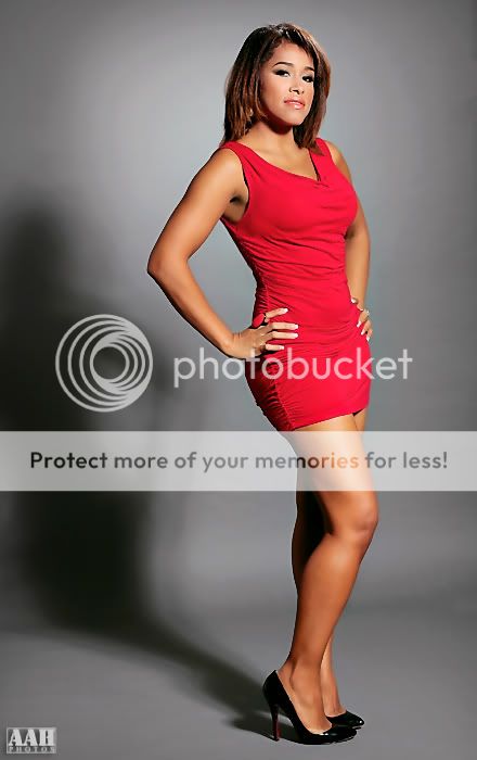
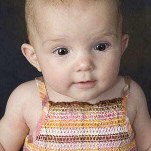
Hi guys..
I have been to a fashion workshop
and here is a couple of photos. This is my first attempt in a studio with
strobes. C&C is much appriciated.
Best
regards,
AAH
1.
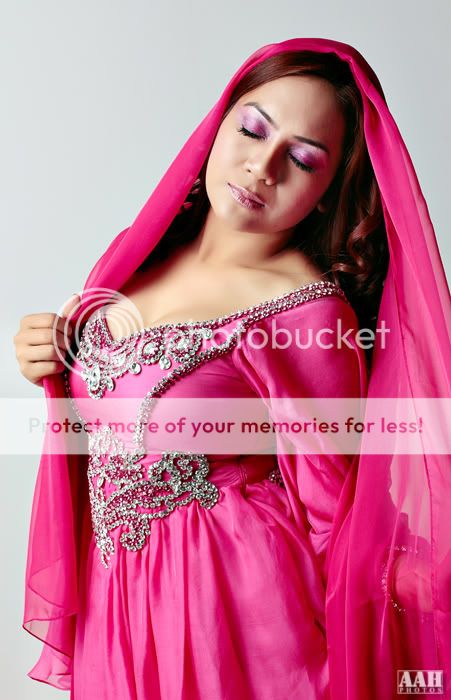
2.
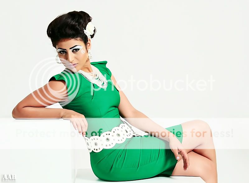
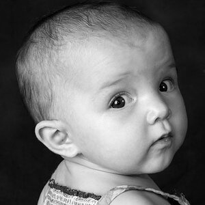
I have been to a fashion workshop
and here is a couple of photos. This is my first attempt in a studio with
strobes. C&C is much appriciated.
Best
regards,
AAH
1.
2.
") The shadow is very distracting in the first one.
The shadow is very distracting in the first one.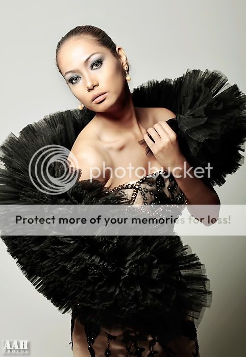
![[No title]](/data/xfmg/thumbnail/34/34053-89f2960a2f30add00b9b4379abd6dd12.jpg?1619736253)
![[No title]](/data/xfmg/thumbnail/32/32005-d13a0bcc56327c42bd32dff4b0776658.jpg?1619735150)