Faulkner's Ivy

mygrain

Friend to nose goblins everywhere
Joined
Aug 11, 2004
Messages
3,660
Reaction score
25
Location
in a cool dry place
Can others edit my Photos
Photos NOT OK to edit
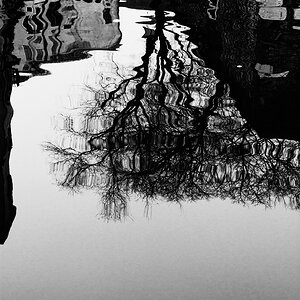
I paid a visit to William Faulkner's house, Rowan Oak, over the weekend with a couple of friends. Here is a shot that I thought turned out pretty well but i want the opinion of the rest of the posse. be brutal if ya like I need the hearty crit.

ivy1bww.jpg


Thanks!!
 
I'm not qualified to pass judgment on the merits of your photo. Still, one Faulkner quote hit upon me when I saw it:

"The aim of every artist is to arrest motion, which is life, by artificial means and hold it fixed so that a hundred years later, when a stranger looks at it, it moves again since it is life. Since man is mortal, the only immortality possible for him is to leave something behind him that is immortal since it will always move. This is the artist's way of scribbling 'Kilroy was here' on the wall of the final and irrevocable oblivion through which he must someday pass. "

Was Faulkner keenly conscious of the importance of this wall while living there?

Thanks for sharing this picture, I like it.
 
LOL. Faulkner was keenly conscious of absolutely everything. He was probably the keeniest observer of the obvious and sub- obvious. :D Thanks T!!
 
Sorry if my post is out of place for this thread, but I am looking for a lesson. Without going into too much detail, an "artist" I am not. Give me math/science anything analytical and I can rocknroll all day. That being said, I don't get this picture. The subject seems uninteresting, is that the point? Someone help me out here
 
Hi Mygrain, I bet the entire grounds there were gorgeous! :D

I do like your composition here, but the image itself seems soft, or even slightly out of focus. Are you digital? Cause I can't place my finger on the strange tone of the image, either, and wonder if you desaturated it somehow, or if it's a real toned print. It could also use less contrast (I seldom say that), but the shadow under the eaves is quite dense, and I'd like to see a little more open detail there. I want to be able to feel the texture of that great brick wall, but I just can't.

Does this make any sense? :scratch:
 
i don't get it. sorry.

Brick walls don't do it for for me for some reason.

But then I am just as analytical as Algoessailing.

I mean... you get that "old" feel because it's black and white... and it's a wall. With bricks...

Is this some "red square" avant garde stuff ?
 
terri said:
Hi Mygrain, I bet the entire grounds there were gorgeous! :D

I do like your composition here, but the image itself seems soft, or even slightly out of focus. Are you digital? Cause I can't place my finger on the strange tone of the image, either, and wonder if you desaturated it somehow, or if it's a real toned print. It could also use less contrast (I seldom say that), but the shadow under the eaves is quite dense, and I'd like to see a little more open detail there. I want to be able to feel the texture of that great brick wall, but I just can't.

Does this make any sense? :scratch:

Yep it's digital and I was playing around with the tone...red and green make an unusual tone no?


And yes it is boring but at the sametime it shows a lot of the gothic south which is what Faulkner was all about. It's a tribute to the gripe that is Faulkner. And BTW thanks for the honesty Doc and Algoe...that's why I dropped it in here...to get mauled. You guys got any input on how to improve though?
 
Frame it so that you don't see the actual brick wall... Basically only the right half of the image.

I think the light was overcast on that day. Makes it a bit boring... Add smoke/mist and more interesting light (don't ask me what that means, i don't know)

Maybe add some ghost in white clothes...

Or don't focus on the wall. Focus on the plants and the background... Cause IMO it's more interesting.
 
I asked a friend about this picture (my usual response to art that I don't get) and she loved it. She said something about the character of the wall and the odd shape of the tree. She liked it enough that I burned her a copy so she could paint a picture of it. After some discussion I agreed that I would like it more if it was cropped at the window, still revealing some of the brick, but focusing on the vegetation. But then it would need adjusted to show more detail, the section between the right edge of the roof and the tree is pretty dark. Like DocF, I enjoy vegetation to construction.
 

Most reactions

New Topics

Back
Top