Few for C&C

Xavi

TPF Noob!
Joined
Jul 22, 2009
Messages
125
Reaction score
0
Location
Corona
Can others edit my Photos
Photos OK to edit
I'd like to see what you guys think about these pics. I would really appreciate some feedback on the composition or the technical aspects of the photographs. If they're boring, uninteresting or whatever feel free to say that.

I shot these using my D40x 18-135mm || 35mm f/1.8

Many thanks for your time :)

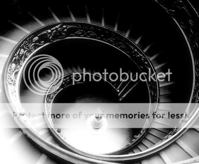
1. ISO: 1600 || Mode: Av || F-Stop: f/1.8 || Exposure: 1/1000 sec ||
DSC_0824.jpg


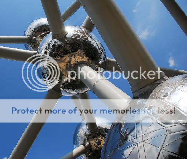
2. ISO: 800 || Mode: Av || F-Stop: f/5.6 || Exposure: 1/60 sec ||
DSC_0819.jpg

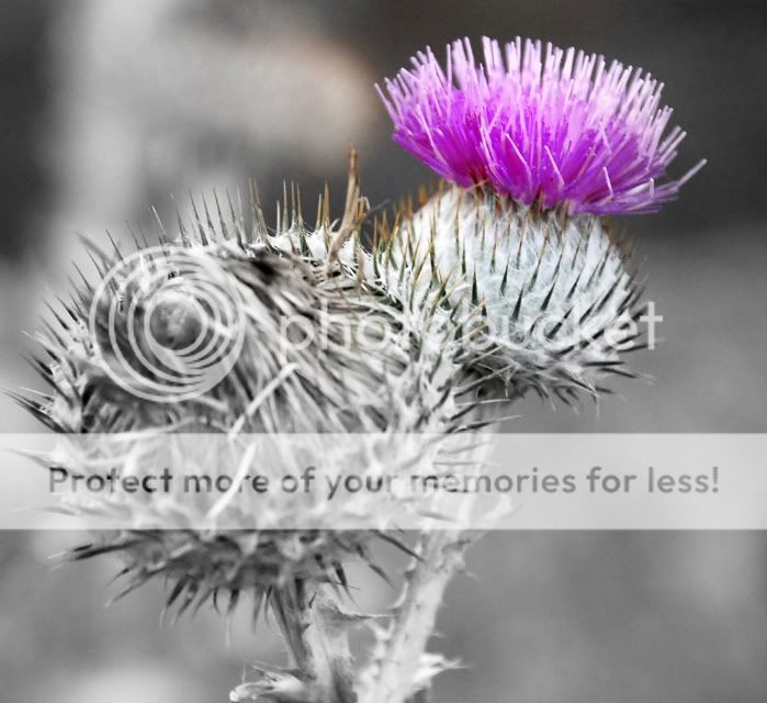
I don't usually like selective coloring but in this pic I really wanted to emphasize the new flower.

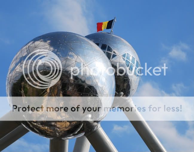
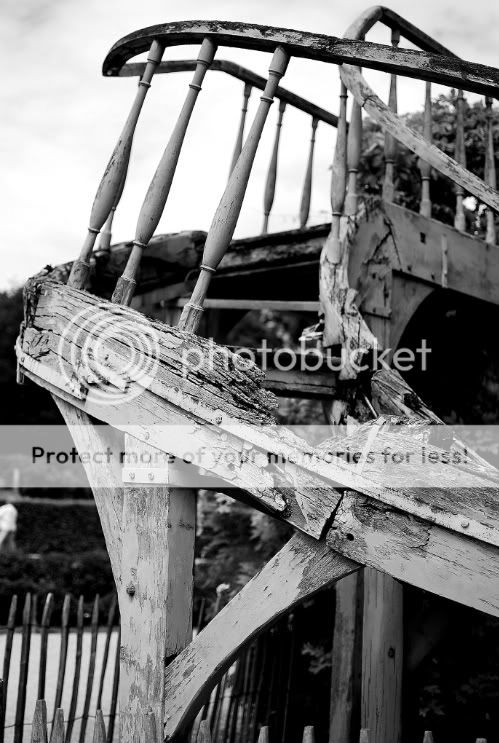
3. ISO: 1600 || Mode: Av || F-Stop: f/3.5 || Exposure: 1/40 sec ||
DSC_0621.jpg


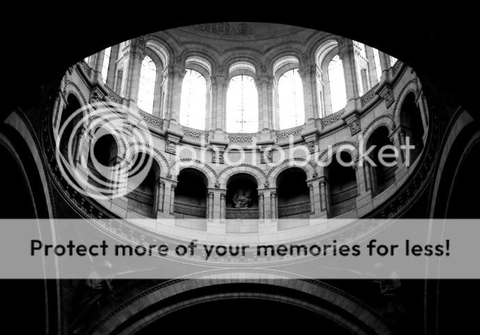
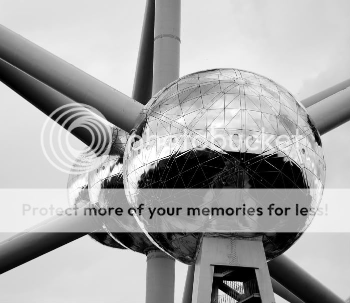
4. ISO: 100 || Mode: Av || F-Stop: f/2 || Exposure: 1/2500 sec ||
DSC_0561.jpg


5. ISO: 100 || Mode: Av || F-Stop: f/5.3 || Exposure: 1/250 sec ||
DSC_0273.jpg
 
Here are my thoughts

1. looks a little crooked, the light from the windows is really blown, it would have been nice to be able to see the sectioning in them.

2. selective coloring is a viewers choice for sure but if your going to do it make sure you get all the color out of all of your image. the front catus is grey but there is some brown on it and same with the back flower. I also think the purple is to saturated makes it look fake imo.

3. I like this the lower left corner being so blown distracts me a lot if you could retake this and be able to maintain the detail through this section I would simply love this photo.

4. I just don't see anything in this photo, does not appeal to me at all

5. I am up in the air about this photo, maybe I just don't know what it is and that makes me on the fence. I like this Composition though.

You have some creative shots keep it up.
 
c&c per req:

1. Agree; this one really needed to be shot as an HDR (I'll go out on a limb and guess that fill light wouldn't have been an option ;) ) which would have allowed you to see much more detail and avoid the blown highlights, while bringing in more detail below. A perspective correction wouldn't go amiss either.

2. This one does nothing for me. There seems to be no reason for the selective desaturation, and the large, unfocused seed head in the foreground is very distracting. Perhaps clipping this off and composing a tight image on the full bloom would have made it a stronger image.

3. Very nice, again I think this would have worked as an HDR. This image really does need more detail in the shadow areas.

4. I think a slightly different composition to eliminate the person in the background image left. As well, I think a different time of day which would have provided more even lighting and perhaps a less blown sky.

5. This one has potential, but I'm not sure you've maximized it. I think the square girder below the centre of the main sphere is rather jarring against all the other 'round-ness'. Perhaps a tighter crop or different position?

Just my $00.02 worth - your mileage may vary.

~John
 
Here are my thoughts

1. looks a little crooked, the light from the windows is really blown, it would have been nice to be able to see the sectioning in them.

2. selective coloring is a viewers choice for sure but if your going to do it make sure you get all the color out of all of your image. the front catus is grey but there is some brown on it and same with the back flower. I also think the purple is to saturated makes it look fake imo.

3. I like this the lower left corner being so blown distracts me a lot if you could retake this and be able to maintain the detail through this section I would simply love this photo.

4. I just don't see anything in this photo, does not appeal to me at all

5. I am up in the air about this photo, maybe I just don't know what it is and that makes me on the fence. I like this Composition though.

You have some creative shots keep it up.


1. I agree, how can I go about eliminating/reducing blown out parts like these in the future?
2. I can definitely see what you're saying about the color and the selective coloring. I'll keep that in mind.
3. What do you think of this new crop?
DSC_0621x.jpg

I wish I could retake it though. Unfortunately I won't be able to for a long time. It was taken exiting the Vatican Museum in Italy. That's the only shot I took.
4. cool cool, no prob ;) I really liked this staircase when I saw it. I wanted to showcase its age and its loss of functionality by cropping a close up of the missing steps and splintered wood. I'll keep working with it and see if I can make something out of it. The staircase is in Versailles in Marie Antoinette's estate.
5. This is of the Atomium in Brussels, Belgium. Its the only shot I have of this angle unfortunately but I really like it.

Thanks for your time and feedback, I really appreciate it!
 
c&c per req:

1. Agree; this one really needed to be shot as an HDR (I'll go out on a limb and guess that fill light wouldn't have been an option ;) ) which would have allowed you to see much more detail and avoid the blown highlights, while bringing in more detail below. A perspective correction wouldn't go amiss either.


2. This one does nothing for me. There seems to be no reason for the selective desaturation, and the large, unfocused seed head in the foreground is very distracting. Perhaps clipping this off and composing a tight image on the full bloom would have made it a stronger image.


3. Very nice, again I think this would have worked as an HDR. This image really does need more detail in the shadow areas.

4. I think a slightly different composition to eliminate the person in the background image left. As well, I think a different time of day which would have provided more even lighting and perhaps a less blown sky.

5. This one has potential, but I'm not sure you've maximized it. I think the square girder below the centre of the main sphere is rather jarring against all the other 'round-ness'. Perhaps a tighter crop or different position?

Just my $00.02 worth - your mileage may vary.

~John

1. hehe Yes fill light was not the best option indeed. What is another way in addition to HDR to go about avoiding blown highlights like these? I'm not too familiar with HDR yet but am still learning. Would something like a ND filter help in this situation?


2. When I first saw this I thought "Oh cool, one bloomed and other is still inside, cool contrast". The focus is terrible. I wanted to mask it by going B&W with it in the hopes that it would work but its still funky. What do you think of this tighter crop?

DSC_0818.jpg


3. cool, I'll see if I can make something out of it in the future.

4. I totally missed the guy in the back! This is the original. Do you think it has potential?

DSC_0560x.jpg


5. Unfortunately it is the only one I took of this angle with all three spheres lined up. Here are two others that are similar though. I'll work with the other one by removing the girder and see how it turns out.

DSC_0263.jpg


DSC_0259.jpg


Thanks for your time John. You've given me some things to think about. very much appreciate it. cheers
 
No, an ND filter isn't going to help in that situation. You only have two options; add more light to even out the dynamic range, or account for it through exposure (HDR). It's not difficult as long as you can shoot from a tripod; if you're really steady, you can hand-hold it and get decent results. If it's over-done it looks cartoon-like, but if you're careful, it can produce some amazing images.
Ummmm... I'm afraid I'm still 'bleah' on the thistle. I undersand the contrast you saw, but the focus really kills it for me.

The staircase with the cottage in the background has a LOT of potential. It would be easy to 'remove' the fellow in the background of the mono version with the clone tool of whatever photo-editing applicaiton you're using.

Those 'ball on a stick' shots are great. I think the first of the two in your second post is the strongest. That's the sort of thing that when you see it, you have to shoot LOTS!
 
I think they're all outstanding except for #2. I like the black and white edits... nice and contrasty.
 
No, an ND filter isn't going to help in that situation. You only have two options; add more light to even out the dynamic range, or account for it through exposure (HDR). It's not difficult as long as you can shoot from a tripod; if you're really steady, you can hand-hold it and get decent results. If it's over-done it looks cartoon-like, but if you're careful, it can produce some amazing images.
Ummmm... I'm afraid I'm still 'bleah' on the thistle. I undersand the contrast you saw, but the focus really kills it for me.

The staircase with the cottage in the background has a LOT of potential. It would be easy to 'remove' the fellow in the background of the mono version with the clone tool of whatever photo-editing applicaiton you're using.

Those 'ball on a stick' shots are great. I think the first of the two in your second post is the strongest. That's the sort of thing that when you see it, you have to shoot LOTS!

Thank you John I will keep everything you mentioned in mind. Im going to have to toss out #2 after all. It just isn't working for me either. best wishes

I think they're all outstanding except for #2. I like the black and white edits... nice and contrasty.

Thanks reznap! Yea that #2 is just not cutting it. Off to the recycle bin it goes. I appreciate your comments.

best wishes
 
I love #1 and #3 as they are exposurewise.

To me #1 needs rotated and cropped symetrical.

Something that tends to be the norm here, is for perfect exposures. Sometimes blown highlights work, sometimes the lack of detail in the shadows works.

Again, I like those two as they are. The second is kinda dreamlike.

Hows this Bitter J ? A little better?

DSC_0824x.jpg


I'll admit that when I initially took this picture I never wanted those windows to be blown out like that. I'm trying to learn how to develop well exposed and uniquely composed images. I guess it was a good accident that the picture ended up the way it did. However, I see what you're saying about overlooking convention sometimes and seeing details from a different perspective. Your work, "BlueGreen" is a good example of that idea, those pics are great by the way.


That 2nd one I'm still iffy about. When I reviewed the pic from my camera, it appeared well focused so I just moved on. I load it up to my computer and end up seeing something completely different. "dreamlike"?, I definitely wasn't thinking that but I like that association.

Thanks for your feedback and time Bitter J

best wishes
 

Most reactions

Back
Top