Bitter Jeweler
Been spending a lot of time on here!
- Joined
- Apr 27, 2009
- Messages
- 12,983
- Reaction score
- 4,994
- Location
- Cleveland, Ohio
- Can others edit my Photos
- Photos OK to edit
Follow along with the video below to see how to install our site as a web app on your home screen.
Note: This feature may not be available in some browsers.
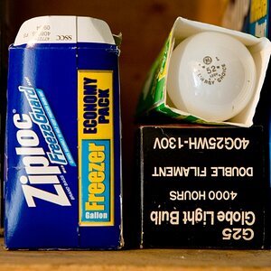
Does that number have significance for you, such as year born/age?

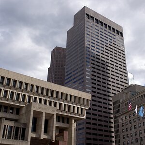
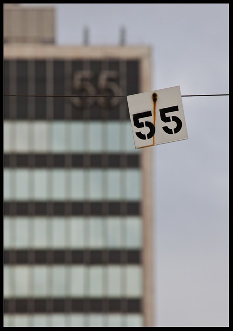
I think this pictures great... the rust and angle of the Sign itself, and the building faded off in the background, but still you can make out the buildings importance to the sign.
I really like this!
You have my attention.0
I'm not one of your fanboys.
I'll give you an honest critique.
Yeah. I've also done worse.You've done much better than this.
Is anyone who may have a better understanding of art, or a high regard for it, crackpot in your eyes?This is right up there with the tilt shift lens.
Some crackpot from California may find this, abstract and verse many reasons why it's wonderful.
Ah, yes. But you are giving us absolutely no context to your green peas, or yellow lines. Besides, just because you don't *get* something, doesn't negate everyone elses opinion. Also, this image is not abstract. It is quite representative.Then give you the same reasons green peas are interesting, or double yellow lines on a state highway.
Does every image a person produces have to be a stand alone, defining moment? Would you say some weaker images may work in the context of a "series"? I posted a link to more '55' imagery. Wouldn't this series look cool in the lobby of, let's just say for example, the lobby of the '55' building? Would it have more impact there?This isn't an insult. I've seen your work and admire some of it.
This thing......some creation, isn't you. It's not a defining moment.
I agree completely. Your RoT's debacle showed how little you understand it. Which make your critiques questionable at best.It's as bad or worse than my rule of thirds debacle.
It's worse than the tilt shift fiasco and that was pretty bad.
Now post some of the other stuff you have on Flickr. Some of that stuff is mind blowing.
This isn't , and keep your fanboys off me.
I like this Bitter. I like the way all the lines and corners intersect - the rust in the sign lines up with the edge of the building, the wire intersects nicely with the bottom curve of the fives on the building, the corners of the sign touches but does not interfere with the verticals on the building.
For my taste, I think the photo may be a bit top heavy. I think the square of the white sign could be another continued theme by using a square crop instead, and squaring off the top outcrop of the building with a slightly tighter crop on the left.
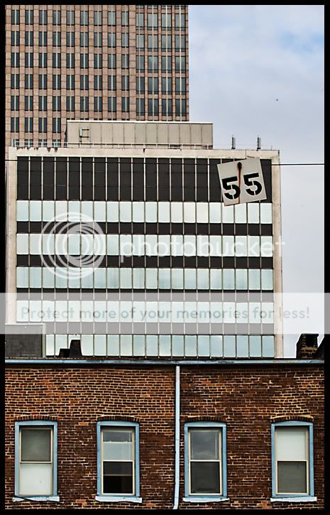
![[No title]](/data/xfmg/thumbnail/42/42061-9f4eb186c434652d6587c8bcdde59502.jpg?1619739997)