Finally I got out to practice...(pics)

giorgio

TPF Noob!
Joined
Jan 29, 2009
Messages
79
Reaction score
0
Location
Mexico
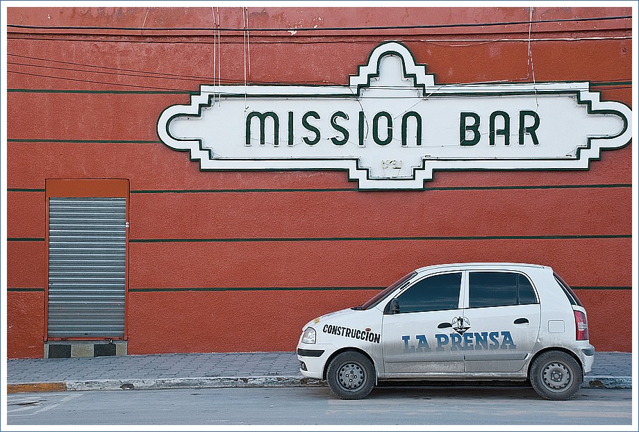
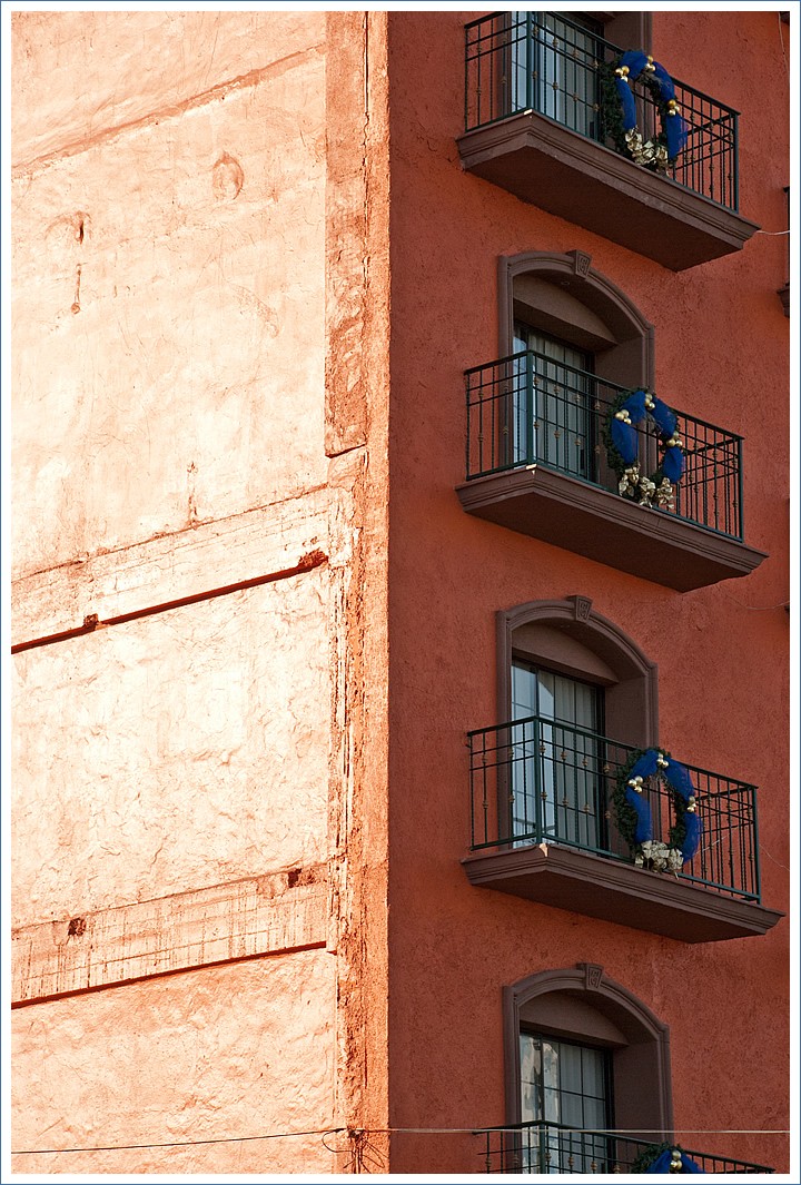
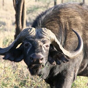
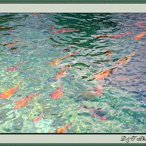
After several months of just reading theory and little practice I got out to take some pics.

I still yet have to practice with Flash, People and Social events in low light conditions, etc.

Complete photos here (22)
But here are 6 photos:
What do you think?

4237045766_a910d0e36b_o.jpg


4236269107_844616a10f_o.jpg


4236269477_68e3873eef_o.jpg


4237046574_c91200d028_o.jpg


4237046494_6afb13fc6d_o.jpg


4237046862_3de5d23d59_o.jpg
 
I don't like #3 & #4, but the others are interesting. Post fewer to get more detailed responses me thinks.
 
Nice ones. I like #2 & #5 best, with #1 a close second. For my liking I might have cropped out the power line at the bottom of #2, but I don't think it's entirely necessary.
 
your reading is paying off. I like the first 3, they may not be perfect but they show a nice eye and a consistent interest in a concept. Congrats, keep at it.
 
I really like number 2. I might crop it though so that it is tall but narrow. Maybe get rid of the lighter side of the building. thought the balconies made a really cool pic. That's just me though and I still have a lot to learn.
 
I like these types of city scenes--small segments of the larger whole, with a relatively narrow lens angle of view. I like the car, the building with balconies, I like the salida photo, and I also like the way you saw la luz en los dos mujeres. I think you have a good fundamental way of approaching urban landscapes; pick a small, but interesting thing, and make a photo of it.
 
thank for you comments guys..

Bazooka
Strange, I like #3 because it has something, like simple and meaningful at same time, and combined with colors from the 60's(the whole word was "Multicinemas" but I took just "cine" which means "Movies" or "Cinematography"... or maybe I like it because I like movies very much :p

Lazy, Rocdoc, Hereto..
Interesting how most of us like #2, I took it because of the contrast in the color.
#1 is one of my favorites, because I luckly found the little car, which has the right size, and well parked in relation with the other 2 elements(door and sign) and all 3 against this strong color.The car logos suggest a utility car, in spanish so it tells something about the place, etc.

Derrel
Glad you like it, I spected to start somehow to see the photos I took in another way(or with another eye) after some time, so I'll hope to get better next time.


Im glad some of you noticed I could have some eye or way of trying to capture things, that's important for me.

Salutes

Giorgio
 
I like the composition in #1. #2 would have been better if you had 3 full balconies, instead of cutting off part of 2, but it was still very nice.

The rest look pretty good.
 
Love the first 2
 
1,2,3 are all great, nice and crisp, great perspective too
 

Most reactions

New Topics

Back
Top