What's new

First ACTUAL shoot with the new cam, also a website change I'd like your opinion on!

AmberAtLoveAndInk

No longer a newbie, moving up!
Joined
Dec 15, 2013
Messages
371
Reaction score
98
Location
Carol Stream, IL
Can others edit my Photos
Photos NOT OK to edit
Hello forumers! I have been MIA in the forum the past 2 weeks or so, having little to shoot and a wedding to plan. Anywho, I have come to post the fruits of my labor (financial labor) from my 5D Mark III :)

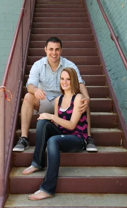
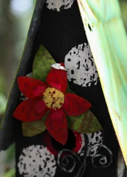
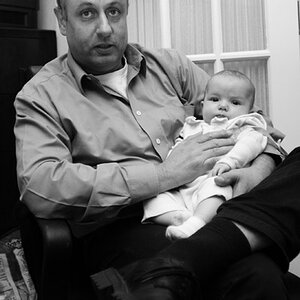
This was over the weekend in a cute little old square in the historical district of Frankfort, IL. I had a brunch meeting with one of my wedding clients there and decided after we hit it off, to have a little impromptu session. C&C appreciated!!

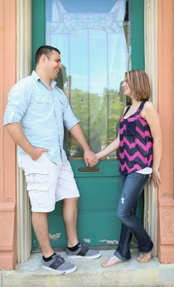
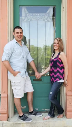
$Final SMALL (1 of 15).webp$Final SMALL (4 of 15).webp$Final SMALL (5 of 15).webp$Final SMALL (6 of 15).webp$Final SMALL (8 of 15).webp$Final SMALL (9 of 15).webp$Final SMALL (3 of 15).webp$Final SMALL (14 of 15).webp


Also, I updated my site to have a sleeker and less cluttered look, I'd love to get your opinion on the look and userfriendliness of my new site!!

Love & Ink Photography
 
The shoot looks like it went well; a little more DoF than I like, but that's a purely personal thing. As for your 'site; I can't find the door! I knocked and knocked, but I couldn't get in. The landing page seems to be nothing more than an image; I can't find a link anywhere.
 
The shoot looks like it went well; a little more DoF than I like, but that's a purely personal thing. As for your 'site; I can't find the door! I knocked and knocked, but I couldn't get in. The landing page seems to be nothing more than an image; I can't find a link anywhere.

Thanks!!
And oh wth!! I have configured that site until my eyes bulged out of my head... Ughh! What browser are you using? It looks good to go on google chrome?
 
I'm on IE and I can't access it either. I get the title page and then nothing to click on.
 
Ok, on Firefox it works. There's a list of icon on the top right of the page. On IE, they aren't there.
 
Ok, on Firefox it works. There's a list of icon on the top right of the page. On IE, they aren't there.

Thanks Barb! Ya its a pain in the rear end to get it to show up on every browser platform correctly.. Guess ill have to do a bit more work!!
 
This is purely personal preference, and my mindset when it comes to portfolios, but.....

In every category you had a lot of images, just estimating 20-30.

Some were awesome shots, but some where just good.

I would take 10 of my top photos for each category and let those be the only images there.
 
This is purely personal preference, and my mindset when it comes to portfolios, but.....

In every category you had a lot of images, just estimating 20-30.

Some were awesome shots, but some where just good.

I would take 10 of my top photos for each category and let those be the only images there.

Thanks for viewing! I actually cut quite a few this time but I was wondering the same thing, should I cut more? Obviously yes! It just stinks because all of my "great shots" are from new sessions this year and feature only a handful of tue same people. I agree some photos just don't need to be up, but from a clients perspective I would be kind of concerned if my photographer only had images of the same 3 people, and assuming they are just family members instead of "real clients". You know?
 
I never cared for sites that start with a static page that has no content other than a link to see more. You could make that page fade and redirect to an actual home page after a few seconds (any longer and you lose visitors), if you feel it's important to show that initial image.

Menu: "How L&I Started" isn't appearing on the landing page, so when you click Home, you go nowhere. I would change the list of links for Pages to About Me, DIY With Amber, Blog, FAQ, Testimonials. I'd also reorder the list under Portfolio. Change Pricing to Terms and use a drop-down to show a link to Pricing, Payments & Deposits and add a link to your ToS document (all sites should have a ToS).

On the "How L&I Started" page, each item should include a link to the stand-alone page about that item (About should have a link to the About Me page, HS Seniors should have a link to that page, etc.).

Some pages, like the DIY landing page, have images that are wider than the page width. One image is 1,056px when the page is only 960px wide. If your site automatically detects the screen width of the user's device, then your images should be pictures no wider than that page (and don't forget margins and padding need to be figured into the equation).

You use graphics for section headers (on the Pricing page) with white lettering on very light background colors. Very difficult to read, even on a good monitor.

You have zero security on your contact form. I didn't have to do anything to send you an email, which means as your site gains ranking on search engines, spammers and ne'er-do-wells will find you and send you all kinds of stuff you wish you never got.

The site is a beautiful package and I enjoy looking at your photography. I know less about making pictures than I do about making websites, so I hope you don't mind that my C&C is more about your site than it is about the pics above.

Best R'gards,

Jim
 
Somebody named Jim left me a message from my contact form on the site... I believe the return email address is a false line... Lol so to Jim, thanks for viewing my site and testing my contact form! It works! Haha!
 
Last edited:
Amber, PLEASE don't post email addresses on the forum, especially mine. I gave you my full name, so it isn't hard to see if it's someone on TPF, like I said in the email. Please edit your message above to remove my email address.

Thanks,

Jim
PS: I posted my C&C above your post.
 
Amber, PLEASE don't post email addresses on the forum, especially mine. I gave you my full name, so it isn't hard to see if it's someone on TPF, like I said in the email. Please edit your message above to remove my email address.

Thanks,

Jim
PS: I posted my C&C above your post.

Oh my goodness I am so sorry!! I really thought you were just giving me a funny email address since my form has no email secure system!! 1000 apologies, the address has been removed!
 
I never cared for sites that start with a static page that has no content other than a link to see more. You could make that page fade and redirect to an actual home page after a few seconds (any longer and you lose visitors), if you feel it's important to show that initial image.

Menu: "How L&I Started" isn't appearing on the landing page, so when you click Home, you go nowhere. I would change the list of links for Pages to About Me, DIY With Amber, Blog, FAQ, Testimonials. I'd also reorder the list under Portfolio. Change Pricing to Terms and use a drop-down to show a link to Pricing, Payments & Deposits and add a link to your ToS document (all sites should have a ToS).

On the "How L&I Started" page, each item should include a link to the stand-alone page about that item (About should have a link to the About Me page, HS Seniors should have a link to that page, etc.).

Some pages, like the DIY landing page, have images that are wider than the page width. One image is 1,056px when the page is only 960px wide. If your site automatically detects the screen width of the user's device, then your images should be pictures no wider than that page (and don't forget margins and padding need to be figured into the equation).

You use graphics for section headers (on the Pricing page) with white lettering on very light background colors. Very difficult to read, even on a good monitor.

You have zero security on your contact form. I didn't have to do anything to send you an email, which means as your site gains ranking on search engines, spammers and ne'er-do-wells will find you and send you all kinds of stuff you wish you never got.

The site is a beautiful package and I enjoy looking at your photography. I know less about making pictures than I do about making websites, so I hope you don't mind that my C&C is more about your site than it is about the pics above.

Best R'gards,

Jim


I rather like the one image opener, kind of dramtic in a way, but I can see how others might lose interest so I might give it another once over. I agree, my menu might not be as organized as some might like, this is due to the fact that I am dreading having to pull each and very page into DW and manually switch each menu to display.... That's gonna be a b**ching task.
I'm not sure what browsers everyone is using but google chrome seems to pull it up as I intended it to display? Another platform barrier I have to cross. Over all thank you very much for taking the time to view and critique my site, your feedback is very helpful! Also, thank you for looking at my work!
 

Create an account or login to comment

You must be a member in order to leave a comment

Create account

Create an account on our community. It's easy!

Log in

Already have an account? Log in here.

Back
Top Bottom