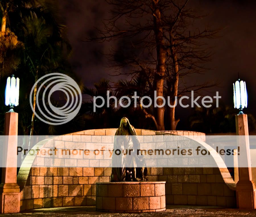
Lights are too light (flared lamps) and darks are too dark (shadows). There are a lot of HDR halos throughout. I don't know if you chose a good scene or it is just processed poorly.
i used photomatix. any tips would be amazing. i want to get it to that still realistic, but very vivid state, and not overly/poorly done like mine but idk how to. anyone know anything that could help me out?
I think it's a good example of overdone HDR... But I think that these types of photos DO have a place. Cartoony looks, to me, are cool even if some don't like them.
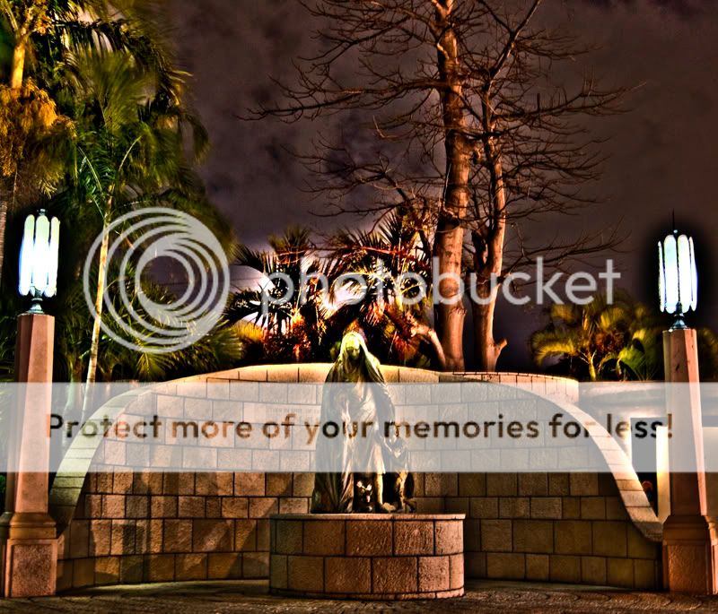
I see HDR as a way to take a picture with high contrast and lots of shadows/bright areas, and end up with an image in which you can easily view the shadows/bright areas. That lighthouse photo is an excellent example of it.
The HDR looks too cartoony and overdone. I don't think the effect suits a memorial. I like the looks of original #1. The sky looks kinda haunted and cool. If you had spiced up the composition on that photo and kept the exposure as is , I think it would have been a cool photo, without HDR or anything.
I'm personally not a fan of photoshopped images and HDRs much. An unusual but realistic looking picture is far more impressive to me.
yeah, so ive pretty much realized this picture is just no good, so i scrapped it.
here is a more subtle merge of some photos during the day.
any better?