jcdeboever
Been spending a lot of time on here!
- Joined
- Sep 5, 2015
- Messages
- 19,868
- Reaction score
- 16,081
- Location
- Michigan
- Can others edit my Photos
- Photos OK to edit
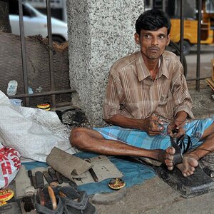
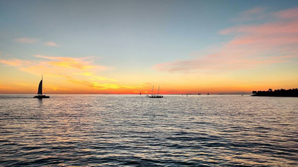
Shot with CanonS90, hand held, on vacation in Key West Florida. I had fun doing them and look forward to doing some with my D3300 some day soon. Direction welcomed. Tried to stay still as possible, practised breathing technique I read about and it worked. I did not crop any of these as I was working on getting it framed correctly. Post edit was noise reduction only.


Sent from my XT1254 using Tapatalk
Sent from my XT1254 using Tapatalk
Last edited: