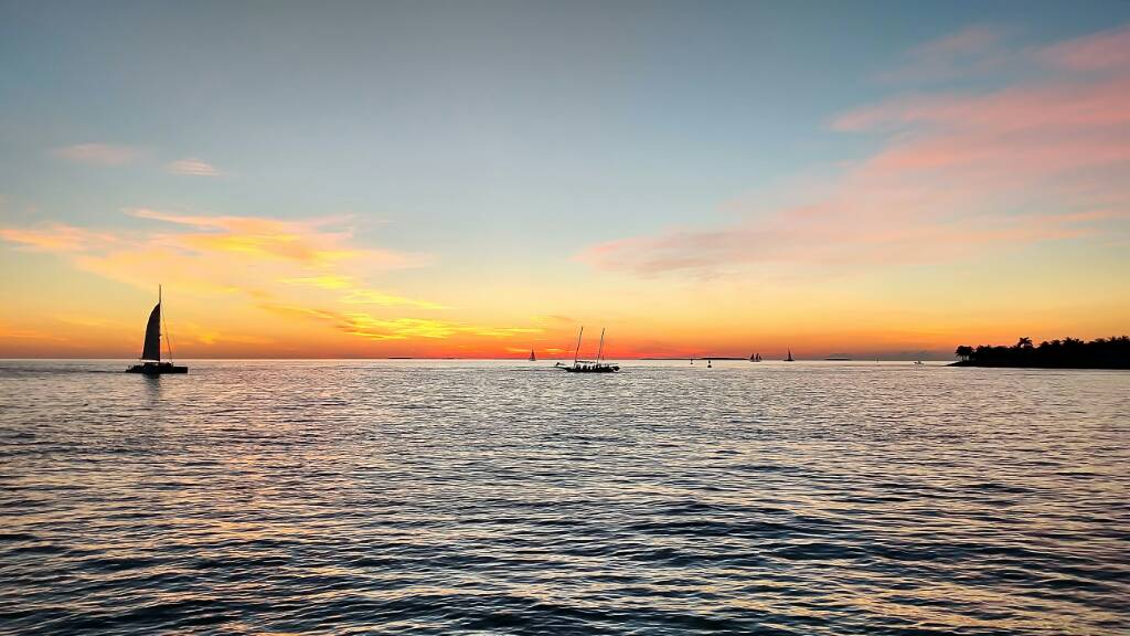
Over-all I like these, however I am seeing one consistent mistake...with all 3 images you've essentially split the pictures across the middle with the horizon. I think the color and processing are very well done, however I think it would be to your benefit to take a few minutes and Google "the rule of thirds".
Just my own opinions...
Thank you Jim.
I understand the rule but when framing (and post), placing the sunset in one of the two planes made it look unbalanced, a fake "Rothko look". I found the sky and water interesting so I placed it in the middle. I used silhouettes the create further interest and balance. I have others taken before and after these exploring horizon on different planes and they look all wrong. Additionally, there were crap loads of people at both spots, good thing I am pretty tall...
I am curious to what you think is correct. I am open to doing it better.
Sent from my XT1254 using Tapatalk
Well...I
think the balance aspect is more a matter of your foreground subjects than the sunset itself. Using image #1 as an example, yes, if you were to just crop "a little off the top", then I suspect the image would indeed look unbalanced as you'd have quite a bit of water up front in the foreground. I think the solution there would have been too zoom in closer to the jetski's, perhaps isolate a few of them and have the sunset itself in the upper third of the image.
I've taken the liberty of doing a quick and dirty Photoshop adjustment to better illustrate what I mean here...

I cropped the image down (using a 4 x 6 ratio) and I moved the jetski's down a little in the foreground and cloned a bit of the water back in to fill the gap...the cloning is rather sloppy, but it should illustrate the point. I suspect that if you had of zoomed in just a bit and maybe adjusted your angle a little, you could have got this same perspective in camera (give or take the crowd...that's
always a pain, LOL).
In an odd way, it's almost like one of those paradigm tests you might encounter in Psyc 101 (like the picture where you might see either a young woman or an old hag), although artistically I believe the term is called "negative space", LOL!. Essentially you have two central subjects competing for dominance in your images...the sunset and whatever is in the foreground. In such a case, it's usually a good idea to ask yourself "what's this image about?" then isolate the subject and eliminate anything that doesn't contribute to the composition. Using this same image as an example, if the image was about
the sunset, then you might have tried using a longer lens (200 - 300mm) and got more of the sunset and sky in the image...

This is an extreme crop of the same image...at this crop, it's too low rez to be effective, however again it should demonstrate the point. Had you of framed the image like this, there would be no question the image was about the sunset. Because you have so many foreground elements in the image however (all 3 images in fact), balance becomes an issue. There's nothing wrong with a good, isolated sunset, however when you choose to include something in the foreground, generally speaking, the sunset becomes more about the negative space that supports the composition as a whole...I hope that makes sense.
I will say that for a "first attempt", I do think you're off to a smashing start...looks like you have a VERY lovely area there to work with. I think it you put a little more thought into the framing and the composition aspect of the images, you could have some work there that's truly sensational!
Okies...hope that helps!


![[No title]](/data/xfmg/thumbnail/36/36400-97a007ae878e1032155c7a7d47eeba73.jpg?1734168786)


![[No title]](/data/xfmg/thumbnail/31/31094-f975d7e61424996edc28cec3b9dd70a8.jpg?1734159245)