What's new

First backdrop, Hubby "Models" C&C please

kric2schaam626

TPF Noob!
Joined
Jul 5, 2009
Messages
361
Reaction score
17
Location
Fox Cities, WI
Can others edit my Photos
Photos OK to edit
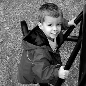
I got my first backdrop - not sure what material most people use for their backdrops but this one is vinyl. We shot these in our tiny apartment living room, so if I had the room I would have taken advantage of it, especially in the case of the lighting. First one is my husband and the other two is a friend of ours who didn't mind having his photo taken. Any critiquing on the lighting and composition would be great. Thank you!

1.

DSC_0299.jpg


2.
DSC_0345.jpg


3.
DSC_0344_2_BW.jpg
 
I see "lines" running acros the backdrop...perhaops after it hangs for a few days, those will disappear. I have always liked gray to charcoal backdrops....they work well,and are generally unassuming and easy to coordinate with many colors of clothing. One way to avoid lines in the backdrop is to watch very closely the angle at which background light hits the backdrop fabric, paper, or material...if a background light is for example, placed LOW, and then aimed upward, it will create shadows ABOVE creases in the background material, which looks INSTANTLY WRONG TO THE HUMAN EYE in most cases where the main light comes from higher than the subject and is aimed downward. Same with background lighting that comes in from the sides of the backdrop at a steep angle...that type of side-lighting can create a high degree of visual "texture" by creating shadows in the backdrop, and that too does not look very good. The height of a background light or lights determines the way the background is lighted...it's important not to make the backdrop look too visually compelling, and to never allow it to look "weird".

In the second two shots they look overexposed...
 
I see "lines" running acros the backdrop...perhaops after it hangs for a few days, those will disappear. I have always liked gray to charcoal backdrops....they work well,and are generally unassuming and easy to coordinate with many colors of clothing. One way to avoid lines in the backdrop is to watch very closely the angle at which background light hits the backdrop fabric, paper, or material...if a background light is for example, placed LOW, and then aimed upward, it will create shadows ABOVE creases in the background material, which looks INSTANTLY WRONG TO THE HUMAN EYE in most cases where the main light comes from higher than the subject and is aimed downward. Same with background lighting that comes in from the sides of the backdrop at a steep angle...that type of side-lighting can create a high degree of visual "texture" by creating shadows in the backdrop, and that too does not look very good. The height of a background light or lights determines the way the background is lighted...it's important not to make the backdrop look too visually compelling, and to never allow it to look "weird".

In the second two shots they look overexposed...

I definitely noticed the lines. If we had more space I would have pulled them further away from backdrop for that reason, hoping any DOF would make them less obvious.
 
In #1, it appears that the point of focus is on his shirt. The face looks slightly soft, but the ribbing on his shirt seems very crisp.
 
You can get rid of the lines from the backdrop in post processing. I won't comment on the lighting or composition but as tirediron pointed out, # 1 isn't very sharp. I took it to photoshop and got rid of the lines and sharpened it. I think the others can do with some sharpening as well...

Edit-16.jpg
 
In #1, it appears that the point of focus is on his shirt. The face looks slightly soft, but the ribbing on his shirt seems very crisp.
I don't know how this happens, I forever and always focus on the eyes. :/
 

Create an account or login to comment

You must be a member in order to leave a comment

Create account

Create an account on our community. It's easy!

Log in

Already have an account? Log in here.

Back
Top Bottom