BrandonLaw
TPF Noob!
- Joined
- Apr 9, 2013
- Messages
- 104
- Reaction score
- 9
- Location
- Massachusetts, USA
- Can others edit my Photos
- Photos OK to edit
I love how easy LR is to use I will definitely be picking it up. Thanks for looking at my photos! ")

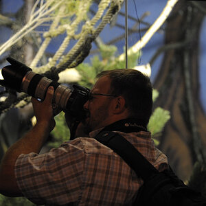
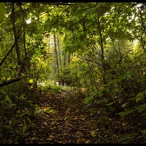
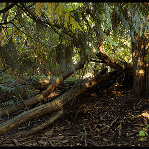
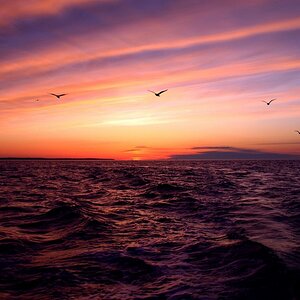
StacksVig by BrandonLaw87, on Flickr

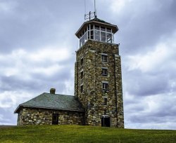
Tower 005 by BrandonLaw87, on Flickr
StacksVig by BrandonLaw87, on Flickr
Tower 005 by BrandonLaw87, on Flickr


![[No title]](/data/xfmg/thumbnail/32/32155-5dfb2c8aee58498ba1862d4f34389669.jpg?1619735234)

![[No title]](/data/xfmg/thumbnail/32/32153-05f63098d8752b05df53dfa6ae8d6e7d.jpg?1619735234)