
Austin Greene
Been spending a lot of time on here!
- Joined
- Jan 6, 2012
- Messages
- 1,472
- Reaction score
- 855
- Location
- Mountain View, California
- Website
- www.austingreenephotography.com
- Can others edit my Photos
- Photos NOT OK to edit
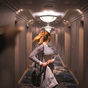
I came into contact with a local, fashionista? She runs a very popular, and quickly growing Youtube channel where she gives fashion advice and the like. Anyways, we did a quick shoot today to see how we work together. She had very specific tastes on her outfits and how they were shown. The bag had to be shown as it was a sponsored item.
In any case, I'm wondering if you all have any thoughts or critique for me. I have some minor things, but overall I'm quite happy for how spur of the moment the whole deal was. Being that she is a very trendy fashion gal, I wanted to bump up the flash and shoot with as much vibrancy of colors and contrast as possible. The white outfit is just on that line of "too bright" but not quite blown out, at least in my thoughts.
Please, give me some critique on these ones guys. It is highly likely that I'll be shooting for her on a weekly basis, so I want to know right off the bat if I'm missing something egregious.
I know it is a lot of images, so by all means be brief, or just pick one or two to CC if you wouldn't mind.
Note: I've already noticed that I wish I had used more of a hairlight in most of these. An assistant dropped a flash last week and I'm waiting for the replacement parts.
1. Probably my favorite of the set. I wanted to line up her red skirt with the red flooring, and then have the contrast of the grey sweater and yellow wall. I wanted to try my hand at balancing the negative space with color and her contrast.

Karen by TogaLive, on Flickr
2. Second favorite. I saw the staircase and really liked the orange wall. Had to incorporate the handrail somehow to keep it from seeming out of place. I'm debating on whether or not to clean up the dusty stairwell. Vignette is actually from placement of the flash.

Karen by TogaLive, on Flickr
3. Probably my least favorite from the shoot, but it was her "Sponsored Item"

Karen by TogaLive, on Flickr
4. I like this one a bit better if the bag has to be in a photo. Wanted to use the joint of the staircase as a leading line.

Karen by TogaLive, on Flickr
5. A little unsure of the crop in this one. It's the same brick wall as my last shoot, but I tried to revisit it. It's an incredibly small area to shoot in, but I like how I used the space more this go around. EDIT: Removed a leaf in the top right.

Karen by TogaLive, on Flickr
So, thoughts? I know five images is quite a bit, so I'm not looking for anything too in depth. A simple yay or nay would be fantastic. Or just pick one out and rip it to shreds.
Best,
Austin
In any case, I'm wondering if you all have any thoughts or critique for me. I have some minor things, but overall I'm quite happy for how spur of the moment the whole deal was. Being that she is a very trendy fashion gal, I wanted to bump up the flash and shoot with as much vibrancy of colors and contrast as possible. The white outfit is just on that line of "too bright" but not quite blown out, at least in my thoughts.
Please, give me some critique on these ones guys. It is highly likely that I'll be shooting for her on a weekly basis, so I want to know right off the bat if I'm missing something egregious.
I know it is a lot of images, so by all means be brief, or just pick one or two to CC if you wouldn't mind.
Note: I've already noticed that I wish I had used more of a hairlight in most of these. An assistant dropped a flash last week and I'm waiting for the replacement parts.
1. Probably my favorite of the set. I wanted to line up her red skirt with the red flooring, and then have the contrast of the grey sweater and yellow wall. I wanted to try my hand at balancing the negative space with color and her contrast.
Karen by TogaLive, on Flickr
2. Second favorite. I saw the staircase and really liked the orange wall. Had to incorporate the handrail somehow to keep it from seeming out of place. I'm debating on whether or not to clean up the dusty stairwell. Vignette is actually from placement of the flash.
Karen by TogaLive, on Flickr
3. Probably my least favorite from the shoot, but it was her "Sponsored Item"
Karen by TogaLive, on Flickr
4. I like this one a bit better if the bag has to be in a photo. Wanted to use the joint of the staircase as a leading line.
Karen by TogaLive, on Flickr
5. A little unsure of the crop in this one. It's the same brick wall as my last shoot, but I tried to revisit it. It's an incredibly small area to shoot in, but I like how I used the space more this go around. EDIT: Removed a leaf in the top right.
Karen by TogaLive, on Flickr
So, thoughts? I know five images is quite a bit, so I'm not looking for anything too in depth. A simple yay or nay would be fantastic. Or just pick one out and rip it to shreds.
Best,
Austin
Last edited:
")
![[No title]](/data/xfmg/thumbnail/37/37605-90c8efaef5b7d1f52d4bf8e7dfd33673.jpg?1619738148)
![[No title]](/data/xfmg/thumbnail/41/41820-5b89d2c0ef3c8c232c56fabddbeaee0b.jpg?1619739903)

![[No title]](/data/xfmg/thumbnail/37/37101-cf094d75976427b415711e9c9955c8a3.jpg?1619737881)
![[No title]](/data/xfmg/thumbnail/37/37606-3c9ffb5906173fa2aa489341967e1468.jpg?1619738148)