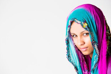
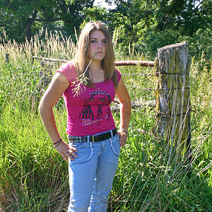
Really enjoy the colors of the 1st but why are both so smushed to one side? I would prefer if they filled more of the frame and got rid of some wasted space or even better: a vertical composition
Agree with Sue; the positioning of subjects and the use of a horizontal composition make no sense to me; what was your intent? Additionally, your key light is either too hot, not diffused well enough; the specular highlights on the skin and the whites in the clothing are definitely too hot.
First thing I noticed was how hot the highlights were. Secondly, I'm not a fan of a subject pointing away from a large negative space. Just keep it up.
Really enjoy the colors of the 1st but why are both so smushed to one side? I would prefer if they filled more of the frame and got rid of some wasted space or even better: a vertical composition
I've always enjoyed the negative space actually. Especially when it's just a shot of the head. I took a few vertical shots has wel but this one stood out for me. I could probably turn the exposure down a bit. Would some of you care to edit the pics according to how you'd like to see them? Appreciate the feedback.
Edit: I should also mention that I'm very very new to editing so that may explain some of the mistakes that you might see that I can't notice
An issue a lot of negative space causes is that it reduces subject scale and subject visual weight in the frame.
Why have all that negative space compete with the viewer's eye for attention?
As mentioned, having the subject facing out of the frame is an issue because we tend to look where others are looking, and the viewer's eye is immediately directed out of the frame.
People have been doing visual art for a couple of thousand years now, and in that time have come to understand that some techniques (composition, lighting) work better than others.
By understanding the whys of long established guidelines of visual art composition, we don't have to redo the trial and error discovery process those before us have already done.
Occasionally, we can make a very successful image by applying the visual art composition guidelines in new ways.
The highlights are hot enough to have lost detail in the skin. Nothing worthwhile we can do with these... if you have the RAWs, you should be able to recover it. Lights were too hot / not diffuse enough based on the contrast on the faces. The negative space issue, and horizontal format? I don't care for it! Very popular with noobs and MWACS, though.
The highlights are hot enough to have lost detail in the skin. Nothing worthwhile we can do with these... if you have the RAWs, you should be able to recover it. Lights were too hot / not diffuse enough based on the contrast on the faces. The negative space issue, and horizontal format? I don't care for it! Very popular with noobs and MWACS, though.
Yeah I probably went too much on the highlights. Regarding the negative space and horizontal "issue", imo, there definitely is something off kilter about it but that's what intrigues me for some reason. Btw, I'm definitely not a mom, but I am for sure a noob! We all are at some level.
An issue a lot of negative space causes is that it reduces subject scale and subject visual weight in the frame.
Why have all that negative space compete with the viewer's eye for attention?
As mentioned, having the subject facing out of the frame is an issue because we tend to look where others are looking, and the viewer's eye is immediately directed out of the frame.
People have been doing visual art for a couple of thousand years now, and in that time have come to understand that some techniques (composition, lighting) work better than others.
By understanding the whys of long established guidelines of visual art composition, we don't have to redo the trial and error discovery process those before us have already done.
Occasionally, we can make a very successful image by applying the visual art composition guidelines in new ways.
I like the edited version much better, her facial tone is much warmer and natural looking to me. The first 2 you posted reminded me of an advertisement I might see in a magazine that would have a slogan/writing to the left of the face in #1 and to the right in #2.
camera orientation, to match her standing, vertical body positioning, would have improved these compositions immensely. The highlights seem over-exposed; perhaps they can be rescued in post, and some detail brought back to them? She's a very pretty subject,and for a first shoot, you did okay on some things.
camera orientation, to match her standing, vertical body positioning, would have improved these compositions immensely. The highlights seem over-exposed; perhaps they can be rescued in post, and some detail brought back to them? She's a very pretty subject,and for a first shoot, you did okay on some things.
Love her eyes on both! The colors in the first one are really nice.. Don't really like that she's on the far side of both photos and there is nothing else there..


")
.jpg")

![[No title]](/data/xfmg/thumbnail/42/42024-bf0604d67b26c7acb5e4d59254692618.jpg?1619739981)


![[No title]](/data/xfmg/thumbnail/42/42021-ffc326f5dc5b4c65ce53935e6e9e4338.jpg?1619739980)